742 Billeder af dagligstue med farverige vægge
Sorteret efter:
Budget
Sorter efter:Populær i dag
1 - 20 af 742 billeder
Item 1 ud af 3
Soggiorno con carta da parati prospettica e specchiata divisa da un pilastro centrale. Per esaltarne la grafica e dare ancora più profondità al soggetto abbiamo incorniciato le due pareti partendo dallo spessore del pilastro centrale ed utilizzando un coloro scuro. Color block sulla parete attrezzata e divano della stessa tinta.
Foto Simone Marulli
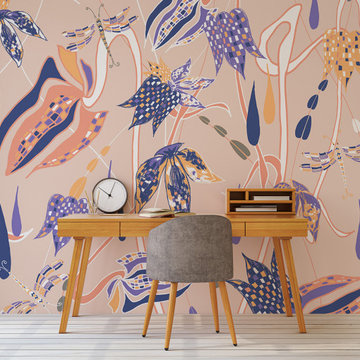
A selection of my designer wallpaper and wall murals currently licensed by Wallsauce.com made to order to fit any wall or space at any scale (vector designs). All inspired by the early Art Nouveau movement of 'La Belle Epoch' meaning 'the beautiful time'.
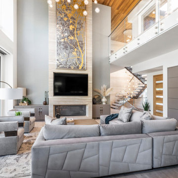
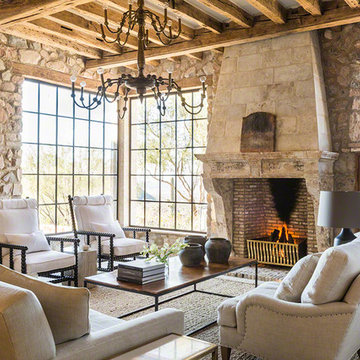
This warm, elegant, and inviting great room is complete with rich patterns, textures, fabrics, wallpaper, stone, and a large custom multi-light chandelier that is suspended above. The two way fireplace is covered in stone and the walls on either side are covered in a knot fabric wallpaper that adds a subtle and sophisticated texture to the space. A mixture of cool and warm tones makes this space unique and interesting. The space is anchored with a sectional that has an abstract pattern around the back and sides, two swivel chairs and large rectangular coffee table. The large sliders collapse back to the wall connecting the interior and exterior living spaces to create a true indoor/outdoor living experience. The cedar wood ceiling adds additional warmth to the home.
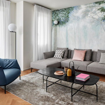
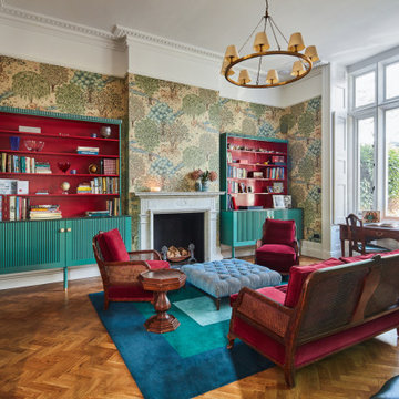
L'angolo conversazione è caratterizzato da un ampio divano con chaise-longue e dalla famosa Archibald di Poltrona Frau. La parete su cui si attesta il divano è una quinta scenografica, decorata a mano e raffigurante una foresta nei toni del verde e del grigio.
this modern Scandinavian living room is designed to reflect nature's calm and beauty in every detail. A minimalist design featuring a neutral color palette, natural wood, and velvety upholstered furniture that translates the ultimate elegance and sophistication.
Lisa Romerein (photography)
Oz Architects (Architecture) Don Ziebell Principal, Zahir Poonawala Project Architect
Oz Interiors (Interior Design) Inga Rehmann, Principal Laura Huttenhauer, Senior Designer
Oz Architects (Hardscape Design)
Desert Star Construction (Construction)
Видео обзор квартиры смотрите здесь:
YouTube: https://youtu.be/y3eGzYcDaHo
RuTube: https://rutube.ru/video/a574020d99fb5d2aeb4ff457df1a1b28/

I built this on my property for my aging father who has some health issues. Handicap accessibility was a factor in design. His dream has always been to try retire to a cabin in the woods. This is what he got.
It is a 1 bedroom, 1 bath with a great room. It is 600 sqft of AC space. The footprint is 40' x 26' overall.
The site was the former home of our pig pen. I only had to take 1 tree to make this work and I planted 3 in its place. The axis is set from root ball to root ball. The rear center is aligned with mean sunset and is visible across a wetland.
The goal was to make the home feel like it was floating in the palms. The geometry had to simple and I didn't want it feeling heavy on the land so I cantilevered the structure beyond exposed foundation walls. My barn is nearby and it features old 1950's "S" corrugated metal panel walls. I used the same panel profile for my siding. I ran it vertical to match the barn, but also to balance the length of the structure and stretch the high point into the canopy, visually. The wood is all Southern Yellow Pine. This material came from clearing at the Babcock Ranch Development site. I ran it through the structure, end to end and horizontally, to create a seamless feel and to stretch the space. It worked. It feels MUCH bigger than it is.
I milled the material to specific sizes in specific areas to create precise alignments. Floor starters align with base. Wall tops adjoin ceiling starters to create the illusion of a seamless board. All light fixtures, HVAC supports, cabinets, switches, outlets, are set specifically to wood joints. The front and rear porch wood has three different milling profiles so the hypotenuse on the ceilings, align with the walls, and yield an aligned deck board below. Yes, I over did it. It is spectacular in its detailing. That's the benefit of small spaces.
Concrete counters and IKEA cabinets round out the conversation.
For those who cannot live tiny, I offer the Tiny-ish House.
Photos by Ryan Gamma
Staging by iStage Homes
Design Assistance Jimmy Thornton
Download our free ebook, Creating the Ideal Kitchen. DOWNLOAD NOW
This unit, located in a 4-flat owned by TKS Owners Jeff and Susan Klimala, was remodeled as their personal pied-à-terre, and doubles as an Airbnb property when they are not using it. Jeff and Susan were drawn to the location of the building, a vibrant Chicago neighborhood, 4 blocks from Wrigley Field, as well as to the vintage charm of the 1890’s building. The entire 2 bed, 2 bath unit was renovated and furnished, including the kitchen, with a specific Parisian vibe in mind.
Although the location and vintage charm were all there, the building was not in ideal shape -- the mechanicals -- from HVAC, to electrical, plumbing, to needed structural updates, peeling plaster, out of level floors, the list was long. Susan and Jeff drew on their expertise to update the issues behind the walls while also preserving much of the original charm that attracted them to the building in the first place -- heart pine floors, vintage mouldings, pocket doors and transoms.
Because this unit was going to be primarily used as an Airbnb, the Klimalas wanted to make it beautiful, maintain the character of the building, while also specifying materials that would last and wouldn’t break the budget. Susan enjoyed the hunt of specifying these items and still coming up with a cohesive creative space that feels a bit French in flavor.
Parisian style décor is all about casual elegance and an eclectic mix of old and new. Susan had fun sourcing some more personal pieces of artwork for the space, creating a dramatic black, white and moody green color scheme for the kitchen and highlighting the living room with pieces to showcase the vintage fireplace and pocket doors.
Photographer: @MargaretRajic
Photo stylist: @Brandidevers
Do you have a new home that has great bones but just doesn’t feel comfortable and you can’t quite figure out why? Contact us here to see how we can help!
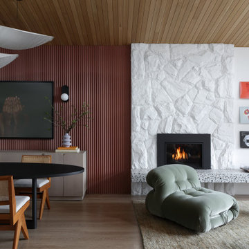
The terracotta-painted wood feature wall and the stone fireplace were both relatively cost-effective updates but they made a huge impact to the overall design look and feel. We replaced the original fireplace hearth with a long linear stone bench to add more entertaining functionality, such as seating and room for the homeowner's record collection. The original ceiling was an orange-pine so we replaced it with a white oak that spans the whole ceiling, elongating the room and making it feel more spacious.
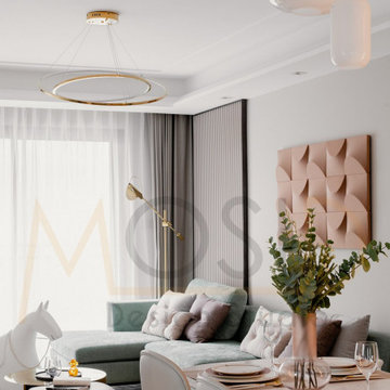
The combination of shades of Pale pink and blush, with freshness of aqua shades, married by elements of décor and lighting depicts the deep sense of calmness requested by our clients with exquisite taste. It accentuates more depths with added art and textures of interest in the area.
1200 sqft ADU with covered porches, beams, by fold doors, open floor plan , designer built
I built this on my property for my aging father who has some health issues. Handicap accessibility was a factor in design. His dream has always been to try retire to a cabin in the woods. This is what he got.
It is a 1 bedroom, 1 bath with a great room. It is 600 sqft of AC space. The footprint is 40' x 26' overall.
The site was the former home of our pig pen. I only had to take 1 tree to make this work and I planted 3 in its place. The axis is set from root ball to root ball. The rear center is aligned with mean sunset and is visible across a wetland.
The goal was to make the home feel like it was floating in the palms. The geometry had to simple and I didn't want it feeling heavy on the land so I cantilevered the structure beyond exposed foundation walls. My barn is nearby and it features old 1950's "S" corrugated metal panel walls. I used the same panel profile for my siding. I ran it vertical to match the barn, but also to balance the length of the structure and stretch the high point into the canopy, visually. The wood is all Southern Yellow Pine. This material came from clearing at the Babcock Ranch Development site. I ran it through the structure, end to end and horizontally, to create a seamless feel and to stretch the space. It worked. It feels MUCH bigger than it is.
I milled the material to specific sizes in specific areas to create precise alignments. Floor starters align with base. Wall tops adjoin ceiling starters to create the illusion of a seamless board. All light fixtures, HVAC supports, cabinets, switches, outlets, are set specifically to wood joints. The front and rear porch wood has three different milling profiles so the hypotenuse on the ceilings, align with the walls, and yield an aligned deck board below. Yes, I over did it. It is spectacular in its detailing. That's the benefit of small spaces.
Concrete counters and IKEA cabinets round out the conversation.
For those who cannot live tiny, I offer the Tiny-ish House.
Photos by Ryan Gamma
Staging by iStage Homes
Design Assistance Jimmy Thornton
742 Billeder af dagligstue med farverige vægge
1