603 Billeder af køkken med rillede låger og betonbordplade
Sorteret efter:
Budget
Sorter efter:Populær i dag
1 - 20 af 603 billeder
Item 1 ud af 3
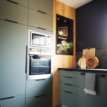
L'ancienne cuisine laquée rouge a laissé place à une cuisine design et épurée, aux lignes pures et aux matériaux naturels, tel que le béton ciré , le bois ou encore l'ardoise et la couleur tendance: le vert
L'idée première pour la rénovation de cette cuisine était d'enlever la couleur laquée rouge de l'ancienne cuisine, les caissons étant en bon état, juste les portes ont été changées.
Cuisine IKEA verte et noire, plan de travail béton ciré, crédence ardoise - Jeanne Pezeril Décoratrice UFDI Montauban GrenadeCuisine IKEA verte et noire, plan de travail béton ciré, crédence ardoise - Jeanne Pezeril Décoratrice UFDI Montauban Grenade
Cuisine IKEA verte et noire, plan de travail béton ciré, crédence ardoise - Jeanne Pezeril Décoratrice UFDI Montauban Grenade
Les portes : le choix de la couleur s'est fait naturellement ayant eu un coup de cœur pour le coloris vert BODARP IKEA , la texture velours à fini de me décider pour ce modèle!
Les poignées très design ont été commandées séparément car je souhaitais une ligne pure pour souligner le plan de travail et la couleur des portes
Les placards supplémentaire ont été créés afin de monter jusqu'au plafond et ainsi optimiser l'espace; ajout également de placards dans le retour Bar
Cuisine IKEA verte et noire, plan de travail béton ciré, crédence ardoise - Jeanne Pezeril Décoratrice UFDI Montauban GrenadeCuisine IKEA verte et noire, plan de travail béton ciré, crédence ardoise - Jeanne Pezeril Décoratrice UFDI Montauban Grenade
Cuisine IKEA verte et noire, plan de travail béton ciré, crédence ardoise - Jeanne Pezeril Décoratrice UFDI Montauban Grenade
Le retour Bar a été complétement créé, en effet l'ilot central en haricot, un peu démodé, a été supprimé, pour laisser place à un grand plan Bar en chêne massif traité à la résiné époxy pou un maximum de facilité d'entretien. Des placards supplémentaires ont ainsi pu être créés et un grand plan de travail également
Les luminaires ont été ajoutés au dessus du bar afin de souligner cet espace
La crédence en ardoise a été posée sur tout le tour du plan de travail qui lui a été travaillé en béton ciré noir
L'association des ces deux matières naturelles matchent bien, leur couleur étant irrégulières et profondes
Le mur noir côté fenêtre apporte du caractère à la pièce et souligne la crédence et le bois , Les stores vénitiens en bois viennent donner le rappel du bois massif de l'alcôve et du bar
Cuisine IKEA verte et noire, plan de travail béton ciré, crédence ardoise - Jeanne Pezeril Décoratrice UFDI Montauban GrenadeCuisine IKEA verte et noire, plan de travail béton ciré, crédence ardoise - Jeanne Pezeril Décoratrice UFDI Montauban Grenade
Cuisine IKEA verte et noire, plan de travail béton ciré, crédence ardoise - Jeanne Pezeril Décoratrice UFDI Montauban Grenade
L'alcôve déjà présente dans l'ancienne cuisine a été conservé et agrandi afin d'y insérer de la déco et créer un bac végétal pour des plantes aromatiques par exemple. De l'éclairage a été mis en place afin de mettre en valeur la décoration de l'alcôve mais aussi un luminaire spécifique aux plantes afin de leur permettent de pousser dans de bonnes conditions.
Les tabourets quand à eux, ont été dessinés par moi même et créé par un artisan métallier sur mesure
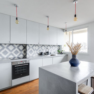
Cuisine en béton ciré, cuisine contemporaine et épurée, ouverte en L
placards Ikea peints en gris clair, plan de travail et ilot en béton ciré gris clair
carreaux de ciment motif géométrique
suspensions ampoules
vue sur l'escalier contemporain en métal et bois peint
parquet en chêne huilé
tabourets de bar type industriel
Photo Meero
Interior - Kitchen
Beach House at Avoca Beach by Architecture Saville Isaacs
Project Summary
Architecture Saville Isaacs
https://www.architecturesavilleisaacs.com.au/
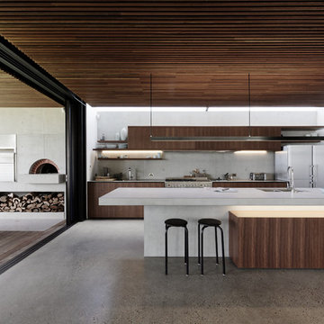
The core idea of people living and engaging with place is an underlying principle of our practice, given expression in the manner in which this home engages with the exterior, not in a general expansive nod to view, but in a varied and intimate manner.
The interpretation of experiencing life at the beach in all its forms has been manifested in tangible spaces and places through the design of pavilions, courtyards and outdoor rooms.
Architecture Saville Isaacs
https://www.architecturesavilleisaacs.com.au/
A progression of pavilions and courtyards are strung off a circulation spine/breezeway, from street to beach: entry/car court; grassed west courtyard (existing tree); games pavilion; sand+fire courtyard (=sheltered heart); living pavilion; operable verandah; beach.
The interiors reinforce architectural design principles and place-making, allowing every space to be utilised to its optimum. There is no differentiation between architecture and interiors: Interior becomes exterior, joinery becomes space modulator, materials become textural art brought to life by the sun.
Project Description
Architecture Saville Isaacs
https://www.architecturesavilleisaacs.com.au/
The core idea of people living and engaging with place is an underlying principle of our practice, given expression in the manner in which this home engages with the exterior, not in a general expansive nod to view, but in a varied and intimate manner.
The house is designed to maximise the spectacular Avoca beachfront location with a variety of indoor and outdoor rooms in which to experience different aspects of beachside living.
Client brief: home to accommodate a small family yet expandable to accommodate multiple guest configurations, varying levels of privacy, scale and interaction.
A home which responds to its environment both functionally and aesthetically, with a preference for raw, natural and robust materials. Maximise connection – visual and physical – to beach.
The response was a series of operable spaces relating in succession, maintaining focus/connection, to the beach.
The public spaces have been designed as series of indoor/outdoor pavilions. Courtyards treated as outdoor rooms, creating ambiguity and blurring the distinction between inside and out.
A progression of pavilions and courtyards are strung off circulation spine/breezeway, from street to beach: entry/car court; grassed west courtyard (existing tree); games pavilion; sand+fire courtyard (=sheltered heart); living pavilion; operable verandah; beach.
Verandah is final transition space to beach: enclosable in winter; completely open in summer.
This project seeks to demonstrates that focusing on the interrelationship with the surrounding environment, the volumetric quality and light enhanced sculpted open spaces, as well as the tactile quality of the materials, there is no need to showcase expensive finishes and create aesthetic gymnastics. The design avoids fashion and instead works with the timeless elements of materiality, space, volume and light, seeking to achieve a sense of calm, peace and tranquillity.
Architecture Saville Isaacs
https://www.architecturesavilleisaacs.com.au/
Focus is on the tactile quality of the materials: a consistent palette of concrete, raw recycled grey ironbark, steel and natural stone. Materials selections are raw, robust, low maintenance and recyclable.
Light, natural and artificial, is used to sculpt the space and accentuate textural qualities of materials.
Passive climatic design strategies (orientation, winter solar penetration, screening/shading, thermal mass and cross ventilation) result in stable indoor temperatures, requiring minimal use of heating and cooling.
Architecture Saville Isaacs
https://www.architecturesavilleisaacs.com.au/
Accommodation is naturally ventilated by eastern sea breezes, but sheltered from harsh afternoon winds.
Both bore and rainwater are harvested for reuse.
Low VOC and non-toxic materials and finishes, hydronic floor heating and ventilation ensure a healthy indoor environment.
Project was the outcome of extensive collaboration with client, specialist consultants (including coastal erosion) and the builder.
The interpretation of experiencing life by the sea in all its forms has been manifested in tangible spaces and places through the design of the pavilions, courtyards and outdoor rooms.
The interior design has been an extension of the architectural intent, reinforcing architectural design principles and place-making, allowing every space to be utilised to its optimum capacity.
There is no differentiation between architecture and interiors: Interior becomes exterior, joinery becomes space modulator, materials become textural art brought to life by the sun.
Architecture Saville Isaacs
https://www.architecturesavilleisaacs.com.au/
https://www.architecturesavilleisaacs.com.au/
sdsa asa dsa sa dsa as das das sa sad sad sa dsa sa dsad sad sad sa dsad sa dsa sad sa ds dsad sa dsdsa sad
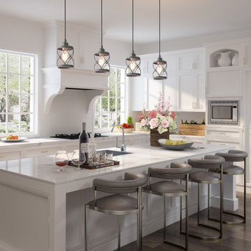
This one-light mini pendant brings versatile style to your luminary arrangement. Its open iron-made shade adds a breezy touch to any space while its antique silver pairs perfectly with the adjustable rod and wall decor. With traditional X-shaped accents, this on-trend one-light mini pendant is an updated classic.
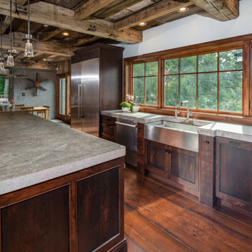
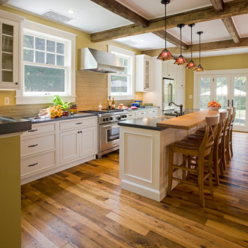
2014 Fall Parade Cascade Springs I Chad Gould Architect I BDR Custom Homes I Rock Kauffman Design I M-Buck Studios
Une belle et grande maison de l’Île Saint Denis, en bord de Seine. Ce qui aura constitué l’un de mes plus gros défis ! Madame aime le pop, le rose, le batik, les 50’s-60’s-70’s, elle est tendre, romantique et tient à quelques références qui ont construit ses souvenirs de maman et d’amoureuse. Monsieur lui, aime le minimalisme, le minéral, l’art déco et les couleurs froides (et le rose aussi quand même!). Tous deux aiment les chats, les plantes, le rock, rire et voyager. Ils sont drôles, accueillants, généreux, (très) patients mais (super) perfectionnistes et parfois difficiles à mettre d’accord ?
Et voilà le résultat : un mix and match de folie, loin de mes codes habituels et du Wabi-sabi pur et dur, mais dans lequel on retrouve l’essence absolue de cette démarche esthétique japonaise : donner leur chance aux objets du passé, respecter les vibrations, les émotions et l’intime conviction, ne pas chercher à copier ou à être « tendance » mais au contraire, ne jamais oublier que nous sommes des êtres uniques qui avons le droit de vivre dans un lieu unique. Que ce lieu est rare et inédit parce que nous l’avons façonné pièce par pièce, objet par objet, motif par motif, accord après accord, à notre image et selon notre cœur. Cette maison de bord de Seine peuplée de trouvailles vintage et d’icônes du design respire la bonne humeur et la complémentarité de ce couple de clients merveilleux qui resteront des amis. Des clients capables de franchir l’Atlantique pour aller chercher des miroirs que je leur ai proposés mais qui, le temps de passer de la conception à la réalisation, sont sold out en France. Des clients capables de passer la journée avec nous sur le chantier, mètre et niveau à la main, pour nous aider à traquer la perfection dans les finitions. Des clients avec qui refaire le monde, dans la quiétude du jardin, un verre à la main, est un pur moment de bonheur. Merci pour votre confiance, votre ténacité et votre ouverture d’esprit. ????

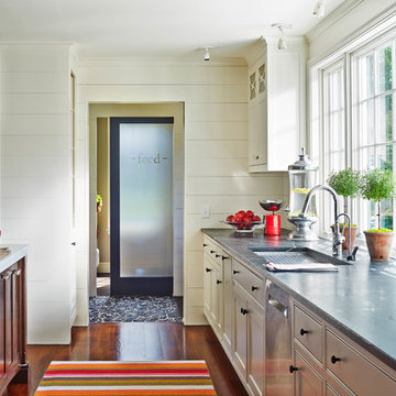
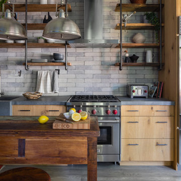
The Deetjen residence's kitchen. The window faces the backyard garden.
603 Billeder af køkken med rillede låger og betonbordplade
1