48.966 Billeder af retro køkken
Find den rigtige lokale ekspert til dit projekt
The primary intent of the project was to bring the property up to a modern standard of living, with additional space at the rear to provide kitchen, dining and living space for a couple who would become a family over the course of the build, with the arrival of twins in a very Grand Designs manner.
The project was relatively cost effective, and it was decided early on to draw upon the existing 1930’s design aesthetic of the existing house. A white painted render finish to the extension was combined with the curved corner which drew influence from the beautiful curved bay window at the front of the house. Green glazed ceramic tile details were a response to the painted tile window cills, each a different colour on the development of 6 houses located just outside the Wandsworth Common Conservation Area. The tiles came to define planting zones as part of the landscaping at the rear of the extension.
Further up the house, a new softwood staircase with circular balusters lead to the new loft conversion, where the master bedroom and en-suite are located. The playful design aesthetic continues, with vintage inspired elements such as a T&G timber clad headboard ledge and the mid-century sideboard vanity unit that the clients sourced for the bathroom.
Internally, the spaces were designed to incorporate a large self-contained study at the front of the house, which could be opened to the rest of the space with salvaged pocket doors. Interior designer Sarah Ashworth put together a 1930’s inspired colour scheme, which is at it’s boldest in this study space, with a golden yellow paint offsetting the clients vast collection of vintage furniture.
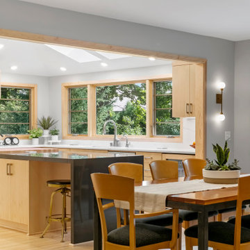
A utility and downstairs loo are incorporated in the original small kitchen space, with a free flowing sequence of spaces for living opening up to the garden at the rear. A slot rooflight provides light for the kitchen set in the centre of the plan.
The Roger Lee designed house from 1962 was purchased by the current homeowners in almost original condition, as the previous owners elected to defer most maintenance projects over the years. The clients were able to see beyond the dated materials and finishes, single-paned glass and uninsulated walls and they approached Klopf Architecture to help them expand and update the entire home, one the family could settle into and enjoy for years to come. It was important that the new designs were aligned with Lee's original intent not only because of the client's appreciation for mid-century modern architecture, but also because the house was deemed historical. The Stanford Real Estate Office requires a stringent design review which safeguards the integrity of the community, which Klopf Architecture was happy to oblige going into their updated designs.
As with many original mid-century modern homes, the house was scaled to the 1960s lifestyle where rooms were smaller and openings to views were limited and tightly framed. The original conditions defined the direction the family of four would take in updating the house and making it comfortable for their modern lifestyle. Klopf designed a full gut remodel and major addition to bring the house into the 21st century and provide the living area needed for the client's family. The newly expanded house added just about 1,100 sf to create an airy, comfortable and family friendly house, taking full advantage of the beautiful southwestern views that extend out to the hills beyond. The enclosed garage created an additional 240 sf of covered space for long-term storage.
A cracked swimming pool created an eyesore taking up a majority of the backyard landscape, so it was one of the first elements to go during the transformation. Working with Outer Space Landscape Architects, the family asked for a mix of relaxing outdoor patio spaces that eventually blend into the native landscaping, extending their views outward toward the natural greenery of the trees beyond their property. Filling in the old pool was a smart way to expand the living spaces outward. The orientation of the house was designed to enjoy the views, but the original architecture provided the first homeowners with mere glimpses of the landscape outside.
Klopf was able to broaden those views, continuing and extending on the original architecture to take full advantage of the unobstructed natural views across the rear facade of the house. Small horizontal openings in the primary bedroom and office were replaced with much taller windows that now follow the angled roof line upward, extending across almost all of the facade. We worked with Western Windows, whose designs included an oblique-shaped, operable casement that allowed our design to rise with the slope. A new corner office added to the primary suite, offers a bright and functional work-from-home solution that looks out at the distant views and added natural light from the expanded window configuration that now wraps around the corner.
The existing lower level was designed by Lee as a utilitarian space, serving as a wet pool room with a drain in the center of the floor, bathroom, laundry and storage areas. Without the need for a pool room, Klopf was able to convert the area into a much more comfortable and functional living space with a new family room and guest suite. The new spaces enjoy easy access to a new outdoor patio through floor to ceiling, full-width glass sliders.
Continuing along the rear facade, a previously exposed deck extending from the living room and hallway provided access to the backyard through a single set of stairs leading toward the side of the house which made sense when the pool was in place. The new deck was re-envisioned as an extension of the main living room and now serves as a second outdoor living room. A new slatted pergola above provides the homeowners welcome relief from the hot afternoon sun. A second set of stairs now creates a better connection to the redesigned lower level. Klopf was able to reconfigure the spaces, extending the living room outward toward the views, where the family now claims it as the heart of the home, spending a large majority of their time outdoors.
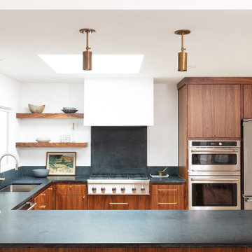
Back inside, the original wood-burning Malm fireplace was beautifully restored and a gas burner installed to comply with California's strict air standards. It now rests in front of a wall of Heath accent tiles where a dated red brick wall used to stand. A new taller window brings more light and views into the refreshed interior living room. The original glass doors opposite the fireplace were replaced by larger sliders that when fully opened, create a seamless transition to the new outdoor living area so the two spaces feel like one connected space. The original utilitarian kitchen was needlessly tucked into the far back corner and closed-off, out of sight from the living room, so the clients asked Klopf to open it up and expand the kitchen forward so it felt more connected. Today the much larger kitchen is connected to the living area where a short wall with a cutout offers a visual glimpse into the kitchen and a handy pass-through counter for serving guests. A new breakfast nook was also added to create another spot where the family can gather for casual meals. Just outside, a new built-in outdoor grill and prep area extends the kitchen outside and connects to a new outdoor dining spot nestled amongst the trees, taking advantage of the views out back.
Klopf was able to expand the other two bedrooms, add a new laundry room and half-bath and convert the carport to an enclosed garage to add more storage areas which was lost when the pool house was converted to the family and guest room.
To maintain a historical connection to the original designs, the exterior siding was repeated on all exterior walls, a full-height stained glass window at the front entryway restored, and an interior slatted screen element repeated outside at the exterior entry courtyard and over the new outdoor living room to create a shade trellis. The new house stands proudly and shines against it's new landscaping features, while respecting and expanding on the original intent of Roger Lee's designs epitomizing the comforts of indoor-outdoor living in Northern California.
Completion year: 2020
Klopf Architecture project team: John Klopf, Klara Kevane, Noel Andrade
Contractor: ORB Construction, Brendan O'Reilly
Structural engineer: Sezen and Moon
Landscape architect: Outer space
Furnishings and decoration: Urbanism Designs
Photographer: Mariko Reed
Nearly two decades ago now, Susan and her husband put a letter in the mailbox of this eastside home: "If you have any interest in selling, please reach out." But really, who would give up a Flansburgh House?
Fast forward to 2020, when the house went on the market! By then it was clear that three children and a busy home design studio couldn't be crammed into this efficient footprint. But what's second best to moving into your dream home? Being asked to redesign the functional core for the family that was.
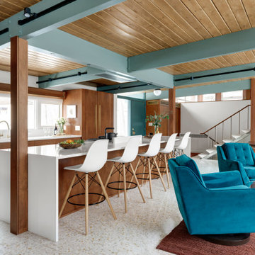
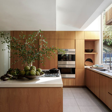
In this classic Flansburgh layout, all the rooms align tidily in a square around a central hall and open air atrium. As such, all the spaces are both connected to one another and also private; and all allow for visual access to the outdoors in two directions—toward the atrium and toward the exterior. All except, in this case, the utilitarian galley kitchen. That space, oft-relegated to second class in midcentury architecture, got the shaft, with narrow doorways on two ends and no good visual access to the atrium or the outside. Who spends time in the kitchen anyway?
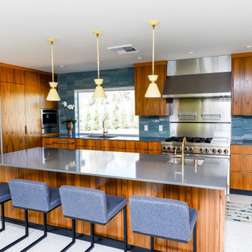
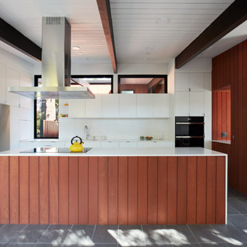
As is often the case with even the very best midcentury architecture, the kitchen at the Flansburgh House needed to be modernized; appliances and cabinetry have come a long way since 1970, but our culture has evolved too, becoming more casual and open in ways we at SYH believe are here to stay. People (gasp!) do spend time—lots of time!—in their kitchens! Nonetheless, our goal was to make this kitchen look as if it had been designed this way by Earl Flansburgh himself.
The house came to us full of bold, bright color. We edited out some of it (along with the walls it was on) but kept and built upon the stunning red, orange and yellow closet doors in the family room adjacent to the kitchen. That pop was balanced by a few colorful midcentury pieces that our clients already owned, and the stunning light and verdant green coming in from both the atrium and the perimeter of the house, not to mention the many skylights. Thus, the rest of the space just needed to quiet down and be a beautiful, if neutral, foil. White terrazzo tile grounds custom plywood and black cabinetry, offset by a half wall that offers both camouflage for the cooking mess and also storage below, hidden behind seamless oak tambour.
Contractor: Rusty Peterson
Cabinetry: Stoll's Woodworking
Photographer: Sarah Shields
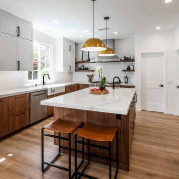
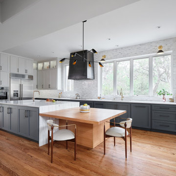
We completely transformed the original small Kitchen into a space twice as large. The homeowner's love to cook and this new Kitchen is designed with both beauty and high function in mind with plenty of well designed storage, generous amount of counterspace and unique design features such as the quartersawn white oak table end of the island which intersects the beautiful white macabus quartzite waterfall edge. The two tone perimeter cabinets bring subtle interest to the space.
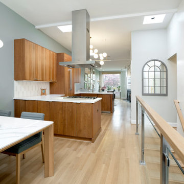
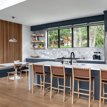
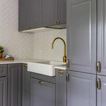
A two-bed, two-bath condo located in the Historic Capitol Hill neighborhood of Washington, DC was reimagined with the clean lined sensibilities and celebration of beautiful materials found in Mid-Century Modern designs. A soothing gray-green color palette sets the backdrop for cherry cabinetry and white oak floors. Specialty lighting, handmade tile, and a slate clad corner fireplace further elevate the space. A new Trex deck with cable railing system connects the home to the outdoors.
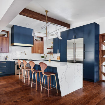
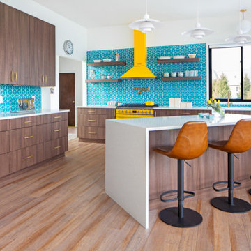
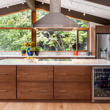
The kitchen in this Mid Century Modern home is a true showstopper. The designer expanded the original kitchen footprint and doubled the kitchen in size. The walnut dividing wall and walnut cabinets are hallmarks of the original mid century design, while a mix of deep blue cabinets provide a more modern punch. The triangle shape is repeated throughout the kitchen in the backs of the counter stools, the ends of the waterfall island, the light fixtures, the clerestory windows, and the walnut dividing wall.
48.966 Billeder af retro køkken
4