
65.295 Billeder af spisestue
Sorteret efter:
Budget
Sorter efter:Populær i dag
1 - 20 af 65.295 billeder
Item 1 ud af 2



 LORRAINE G VALE, Allied ASID
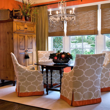
This lovely breakfast room, overlooking the garden, is an inviting place to start your day lingering over Sunday morning coffee. I had the walls painted in a soft coral, contrasting with various wood tones in the armoire, table and shades. It is all tied together by keeping the chair covers and rug light in color. The crystal chandelier is an unexpected element in a breakfast room, yet, your not compelled to pull out the china and silver.
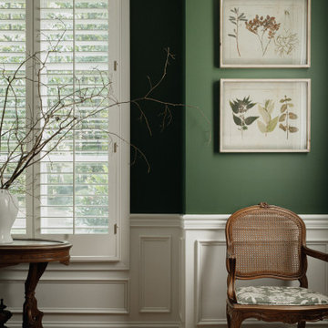
 The Green Room Interiors
This dining room update was part of an ongoing project with the main goal of updating the 1990's spaces while creating a comfortable, sophisticated design aesthetic. New pieces were incorporated with existing family heirlooms.
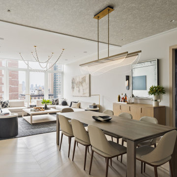
 Darci Hether New York
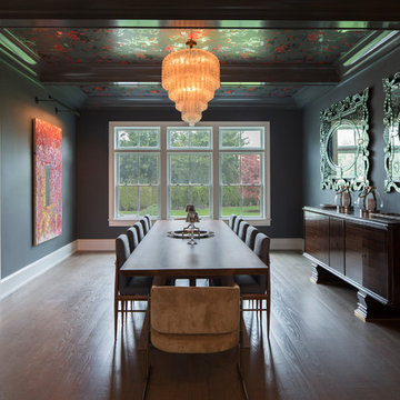
In this NYC pied-à-terre new build for empty nesters, architectural details, strategic lighting, dramatic wallpapers, and bespoke furnishings converge to offer an exquisite space for entertaining and relaxation.
This open-concept living/dining space features a soothing neutral palette that sets the tone, complemented by statement lighting and thoughtfully selected comfortable furniture. This harmonious design creates an inviting atmosphere for both relaxation and stylish entertaining.
---
Our interior design service area is all of New York City including the Upper East Side and Upper West Side, as well as the Hamptons, Scarsdale, Mamaroneck, Rye, Rye City, Edgemont, Harrison, Bronxville, and Greenwich CT.
For more about Darci Hether, see here: https://darcihether.com/
To learn more about this project, see here: https://darcihether.com/portfolio/bespoke-nyc-pied-à-terre-interior-design
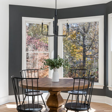

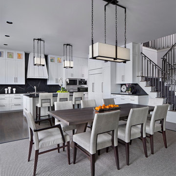


 ZeroEnergy Design
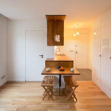
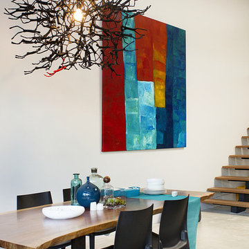
Modern family loft includes an open dining area with a custom walnut table and unique lighting fixture.
Photos by Eric Roth.
Construction by Ralph S. Osmond Company.
Green architecture by ZeroEnergy Design. http://www.zeroenergy.com

 First Lamp
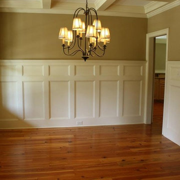
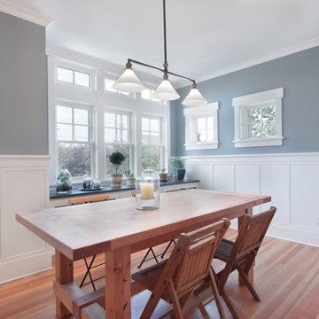
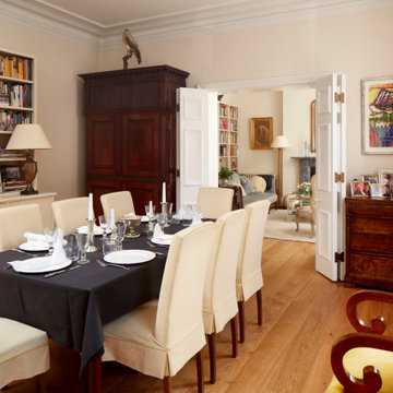
This Greenlake area home is the result of an extensive collaboration with the owners to recapture the architectural character of the 1920’s and 30’s era craftsman homes built in the neighborhood. Deep overhangs, notched rafter tails, and timber brackets are among the architectural elements that communicate this goal.
Given its modest 2800 sf size, the home sits comfortably on its corner lot and leaves enough room for an ample back patio and yard. An open floor plan on the main level and a centrally located stair maximize space efficiency, something that is key for a construction budget that values intimate detailing and character over size.

 Boxwood Avenue
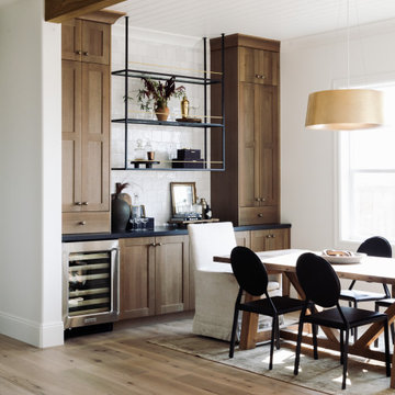
This beautiful custom home built by Bowlin Built and designed by Boxwood Avenue in the Reno Tahoe area features creamy walls painted with Benjamin Moore's Swiss Coffee and white oak custom cabinetry. This dining room design is complete with a custom floating brass bistro bar and gorgeous brass light fixture.
 MuralSources
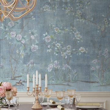
Design: "Chanteur Antiqued". Installed above a chair rail in this traditional dining room.

 Meadowlark Design+Build
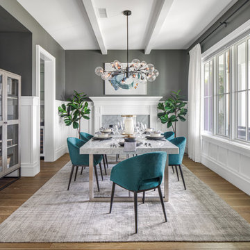
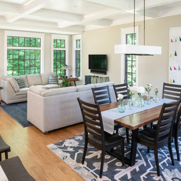
This great room was designed so everyone can be together for both day-to-day living and when entertaining. This custom home was designed and built by Meadowlark Design+Build in Ann Arbor, Michigan. Photography by Joshua Caldwell.
 Dual Concept Design
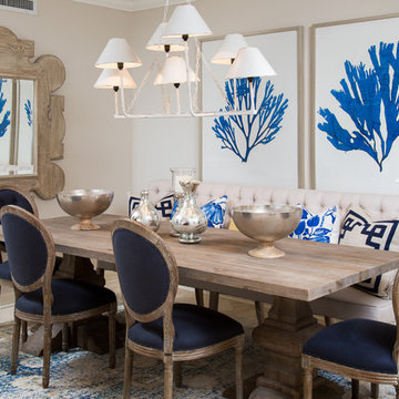
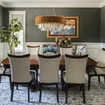
A transitional dining room, where we incorporated the clients' antique dining table and paired it up with chairs that are a mix of upholstery and wooden accents. A traditional navy and cream rug anchors the furniture, and dark gray walls with accents of brass, mirror and some color in the artwork and accessories pull the space together.

 Curated Nest
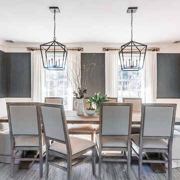
Formal dining room: This light-drenched dining room in suburban New Jersery was transformed into a serene and comfortable space, with both luxurious elements and livability for families. Moody grasscloth wallpaper lines the entire room above the wainscoting and two aged brass lantern pendants line up with the tall windows. We added linen drapery for softness with stylish wood cube finials to coordinate with the wood of the farmhouse table and chairs. We chose a distressed wood dining table with a soft texture to will hide blemishes over time, as this is a family-family space. We kept the space neutral in tone to both allow for vibrant tablescapes during large family gatherings, and to let the many textures create visual depth.
Photo Credit: Erin Coren, Curated Nest Interiors
65.295 Billeder af spisestue
1