11.825 Billeder af spisestue med blå vægge
Sorteret efter:
Budget
Sorter efter:Populær i dag
1 - 20 af 11.825 billeder
Item 1 ud af 2
New Yorkers are always on the prowl for innovative ways to make the most of the space they have. An upper east side couple, challenged with a slightly narrow L shaped apartment sought out Decor Aid’s help to make the most of their Manhattan condo. Paired with one of our senior designer, Kimberly P., we learned that the clients wanted a space that looked beautiful, comfortable and also packed with functionality for everyday living.
“Immediately upon seeing the space, I knew that we needed to create a narrative that allowed the design to control how you moved through the space,” reports Kimberly, senior interior designer.
After surveying each room and learning a bit more about their personal style, we started with the living room remodel. It was clear that the couple wanted to infuse mid-century modern into the design plan. Sourcing the Room & Board Jasper Sofa with its narrow arms and tapered legs, it offered the mid-century look, with the modern comfort the clients are used to. Velvet accent pillows from West Elm and Crate & Barrel add pops of colors but also a subtle touch of luxury, while framed pictures from the couple’s honeymoon personalize the space.
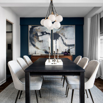
Moving to the dining room next, Kimberly decided to add a blue accent wall to emphasize the Horchow two piece Percussion framed art that was to be the focal point of the dining area. The Seno sideboard from Article perfectly accentuated the mid-century style the clients loved while providing much-needed storage space. The palette used throughout both rooms were very New York style, grays, blues, beiges, and whites, to add depth, Kimberly sourced decorative pieces in a mixture of different metals.
“The artwork above their bureau in the bedroom is photographs that her father took,”
Moving into the bedroom renovation, our designer made sure to continue to stick to the client’s style preference while once again creating a personalized, warm and comforting space by including the photographs taken by the client’s father. The Avery bed added texture and complimented the other colors in the room, while a hidden drawer at the foot pulls out for attached storage, which thrilled the clients. A deco-inspired Faceted mirror from West Elm was a perfect addition to the bedroom due to the illusion of space it provides. The result was a bedroom that was full of mid-century design, personality, and area so they can freely move around.
The project resulted in the form of a layered mid-century modern design with touches of luxury but a space that can not only be lived in but serves as an extension of the people who live there. Our designer was able to take a very narrowly shaped Manhattan apartment and revamp it into a spacious home that is great for sophisticated entertaining or comfortably lazy nights in.
Design: "Chanteur Antiqued". Installed above a chair rail in this traditional dining room.
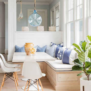
Coastal breakfast nook in organic hues and blue fabrics to create a laid back beach vibe.
This adorable beach cottage is in the heart of the village of La Jolla in San Diego. The goals were to brighten up the space and be the perfect beach get-away for the client whose permanent residence is in Arizona. Some of the ways we achieved the goals was to place an extra high custom board and batten in the great room and by refinishing the kitchen cabinets (which were in excellent shape) white. We created interest through extreme proportions and contrast. Though there are a lot of white elements, they are all offset by a smaller portion of very dark elements. We also played with texture and pattern through wallpaper, natural reclaimed wood elements and rugs. This was all kept in balance by using a simplified color palate minimal layering.
I am so grateful for this client as they were extremely trusting and open to ideas. To see what the space looked like before the remodel you can go to the gallery page of the website www.cmnaturaldesigns.com
Photography by: Chipper Hatter
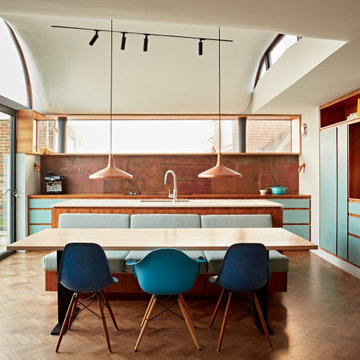
We created a light fixture (based on Lindsay Adelman's You Make It) and had it plated copper to coordinate with the lovely copper chairs. Both metal pieces were not sealed and allow the natural patina and fingerprints to add interesting texture and warmth. The shades were of a natural material and allow light to pass through for an airy feel but diffuse it enough to avoid a harsh glare.
© scott benedict | practical(ly) studios
Download our free ebook, Creating the Ideal Kitchen. DOWNLOAD NOW
The homeowner and his wife had lived in this beautiful townhome in Oak Brook overlooking a small lake for over 13 years. The home is open and airy with vaulted ceilings and full of mementos from world adventures through the years, including to Cambodia, home of their much-adored sponsored daughter. The home, full of love and memories was host to a growing extended family of children and grandchildren. This was THE place. When the homeowner’s wife passed away suddenly and unexpectedly, he became determined to create a space that would continue to welcome and host his family and the many wonderful family memories that lay ahead but with an eye towards functionality.
We started out by evaluating how the space would be used. Cooking and watching sports were key factors. So, we shuffled the current dining table into a rarely used living room whereby enlarging the kitchen. The kitchen now houses two large islands – one for prep and the other for seating and buffet space. We removed the wall between kitchen and family room to encourage interaction during family gatherings and of course a clear view to the game on TV. We also removed a dropped ceiling in the kitchen, and wow, what a difference.
Next, we added some drama with a large arch between kitchen and dining room creating a stunning architectural feature between those two spaces. This arch echoes the shape of the large arch at the front door of the townhome, providing drama and significance to the space. The kitchen itself is large but does not have much wall space, which is a common challenge when removing walls. We added a bit more by resizing the double French doors to a balcony at the side of the house which is now just a single door. This gave more breathing room to the range wall and large stone hood but still provides access and light.
We chose a neutral pallet of black, white, and white oak, with punches of blue at the counter stools in the kitchen. The cabinetry features a white shaker door at the perimeter for a crisp outline. Countertops and custom hood are black Caesarstone, and the islands are a soft white oak adding contrast and warmth. Two large built ins between the kitchen and dining room function as pantry space as well as area to display flowers or seasonal decorations.
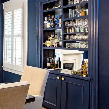
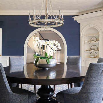
We repeated the blue in the dining room where we added a fresh coat of paint to the existing built ins, along with painted wainscot paneling. Above the wainscot is a neutral grass cloth wallpaper which provides a lovely backdrop for a wall of important mementos and artifacts. The dining room table and chairs were refinished and re-upholstered, and a new rug and window treatments complete the space. The room now feels ready to host more formal gatherings or can function as a quiet spot to enjoy a cup of morning coffee.

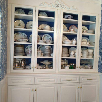
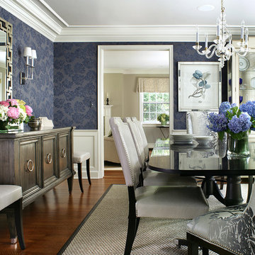
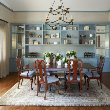
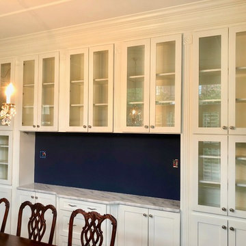
This client wanted to update her traditional dining room. We built this lovely white floor to ceiling china cabinet with glass doors and painted the interior blue. We then wallpapered the upper part of her dining room walls with a lovely blue and white wallpaper and painted the lower part of her dining room walls white... I wish she would have let me reorganize the inside of her china cabinet and remove some of the china so that it didn't look so crowded bu I think the cabinet and the walls look fabulous.. What do you think?
Youthful tradition for a bustling young family. Refined and elegant, deliberate and thoughtful — with outdoor living fun.
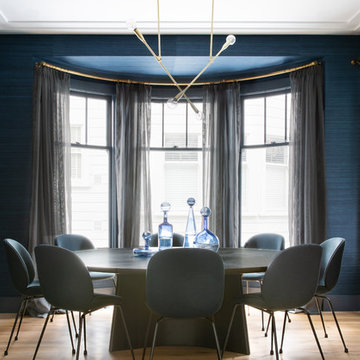
Intentional. Elevated. Artisanal.
With three children under the age of 5, our clients were starting to feel the confines of their Pacific Heights home when the expansive 1902 Italianate across the street went on the market. After learning the home had been recently remodeled, they jumped at the chance to purchase a move-in ready property. We worked with them to infuse the already refined, elegant living areas with subtle edginess and handcrafted details, and also helped them reimagine unused space to delight their little ones.
Elevated furnishings on the main floor complement the home’s existing high ceilings, modern brass bannisters and extensive walnut cabinetry. In the living room, sumptuous emerald upholstery on a velvet side chair balances the deep wood tones of the existing baby grand. Minimally and intentionally accessorized, the room feels formal but still retains a sharp edge—on the walls moody portraiture gets irreverent with a bold paint stroke, and on the the etagere, jagged crystals and metallic sculpture feel rugged and unapologetic. Throughout the main floor handcrafted, textured notes are everywhere—a nubby jute rug underlies inviting sofas in the family room and a half-moon mirror in the living room mixes geometric lines with flax-colored fringe.
On the home’s lower level, we repurposed an unused wine cellar into a well-stocked craft room, with a custom chalkboard, art-display area and thoughtful storage. In the adjoining space, we installed a custom climbing wall and filled the balance of the room with low sofas, plush area rugs, poufs and storage baskets, creating the perfect space for active play or a quiet reading session. The bold colors and playful attitudes apparent in these spaces are echoed upstairs in each of the children’s imaginative bedrooms.
Architect + Developer: McMahon Architects + Studio, Photographer: Suzanna Scott Photography
11.825 Billeder af spisestue med blå vægge
1