


Nylig aktivitet
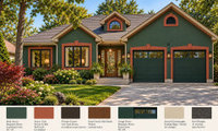
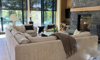

I would not feel obliged to fill that space: the dark, textured stone is already a strong feature, while the TV occupies the quieter recess to the left. If the wall still feels bare when you sit on the sofa, I would try one wide, softly colored artwork centered over the mantel—something with an ivory or warm taupe ground and a little charcoal to connect it to the stone. I would skip a grid of small frames or a mirror, which could compete with the stone pattern and reflect the windows or TV.
Before buying or drilling, tape up a paper rectangle to judge the scale from your usual seats. If this is a working fireplace, check the unit’s heat-clearance guidance and the mounting method for that stone first. Leaving the stone bare and styling the mantel simply is also a good option.


Moving the fridge to the bar area puts them so far out of the work zone.
id hate to cook in that space
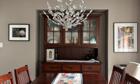
Here’s an idea to consider if only wanting to do minor changes. I would definitely go with a round or arched mirror due to the squareness of the alcove.
If you want to keep your prints add a second one below the one on the right so it balances the wall.
If it’s in the budget I would hire an electrician to change the location of the light fixture rather than having the chain. It’s a relatively inexpensive job and will give your room a polished look. And if you change out the fixture it would be a good time to do it.


I feel the garage is not really attractive, therefore I would paint it blackish so the garage does not stand out.

I like the brick.
I would paint the trim above the garage door to match the house's trim and leave the garage door the color of the light-colored siding.
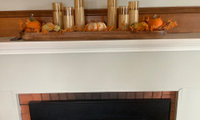
I don't decorate for the seasons. It looks nice, sure, but I don't want to be bothered with taking it all down.
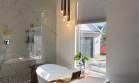
I like what you’ve chosen as it gives a nice accent light. I also like the whimsical look of this sphere fixture.

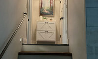

Thank you so much Emily! The stair lights automatically come on when you come close to the stairs, so no problem there. I only use that ceiling light if I need to get in the closet on the right. I agree with your decor selection. Will look for something similar
The painter should have to repaint on his own dollar, since you requested premium from the beginning, and he is the one that changed it.
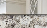

Kay P.. Yes the installer did a really nice job.. the crown moulding at the ceiling was a little tough for him as the ceiling wasnt exactly level.. but you wouldnt know it when he finished.. We had a lot of issues with the company itself.. but the installer made up for all the mistakes.. (there were a number of measurement issues..) .
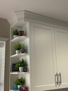

My 1 st thought charcoal but Norwood could be right so check that. IMO charcoal allows a change in siding color in the future a bit easier to decide. I sure would like to actually see the house so removing some of that overgrowth would be on my list


Will suggest either a ceiling mounted light or a couple of can downlights. That should give you more than adequate lighting. The bar fixture above the vanity will be additional lighting for faces looking into the mirror.


I would dress all the windows with drapery panels. Your hutch is really too large for the space you have it in. Is there a place it can be relocated to? It's coming past the casing on both sides. Can you flip it and place it near the chair and is that chest smaller and perhaps a beter fit where the hutch is? I would use French Rods so finials are not impeding on the kitchen cabinet side.
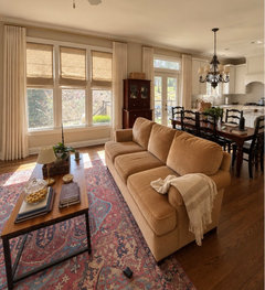
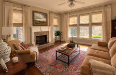
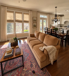
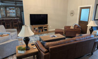
You could do something like this.

My TV built-in is not symmetrical with two shelf units on the left, then the TV and then one shelf unit to the right. The TV is in front of the seating area.
Not everything in a house has to be perfectly symmetrical!
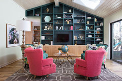
I had forgotten about the fireplace idea.
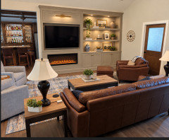
“We will probably live here until one of us gets carried out”. How old are you ? Not that I think that matters. Remodel to suit your tastes & needs & disregard any consideration of ”future buyer expectations”. Who cares what they are? You would have to be psychic.
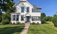
For sure no octogon and as for trim what color were you thinking? I like your home the way it is but I grre the landscaping is where I would spend 2K best ROI
I would lighten your trim color and include it on the trim on the roofline. I hae used Ben Moore Boothsbay Gray in the rendering. Keep your door color as a nice contrast to the siding and new trim color. Move the eagle to your portico front. Doing cursive house numbers would fall in the line with the eagle as well. For some wow I would use some thin brick on your porch and steps and if you can continue it down your entire walkway. Plant some spiral topiaries on either side of the railing and plant your beds with the intention of them being mature and larger at year 3-4.
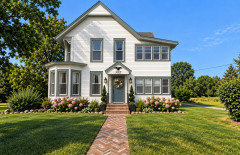
Consider going just a bit darker on the trim around the windows and then adding that color to the other trim on the house and posts. Home looks nice.


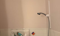
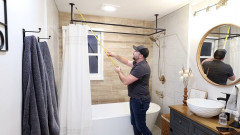
Install a ceiling mounted curtain rod meant for claw foot tubs.


Melfairm, I understand your original question and your concern about the TONE of subsequent comments. I too have had situations with contractors where there were concerns and they try to make you think there’s either no issue or want to push a quick, but not best fix to save themselves time and money. So asking experts for advice prior to the conversation makes sense to me. It also seems folks on this forum routinely respond with a condescending and rude tone under the guise of honesty. Honesty does not require rudeness.
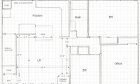

You could get a simply folding stool like this to keep in the laundry room.


@katinparadise no laundry room in this home, it's a stackable in the hall, but that folding stool would be perfect and I can just store it in the office closet. Thank you :)
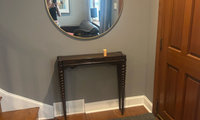
The mirror dwarfs the table, so I would probably either look for a wider table (wider than the mirror), or skip it entirely.
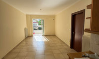
This color would be my vote. Even if you select a color and then it’s not quite perfect, furnishings can help pull it all together.
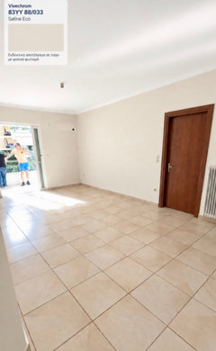
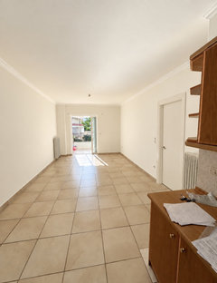
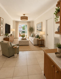

When you can't stand looking at what you've got?
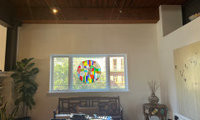
I’d install shades close to ceiling to make the window appear larger and frame with draperies.
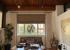

Square, no hinges, or no windows, no hinges. The less busy the better, as your house already has enough visual elements.
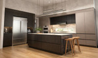

Doesn't feel glam, doesn't feel modern, and just feels somber and heavy.........and both feel cold versus......breezy and welcoming. Let's see the rest of the house, please? Along with the current kitchen condition?
I don’t mind your layout but the finishes are very stark and make the kitchen very sterile looking. Whereas your current home looks very bright and warm. So consider changing finishes and style of the cabinets to give that sleeker appearance but keep the warmth of the space.
The second pic shows that you could even have a mix of shaker style doors with some modern fronts , and still have a nice sleek look. It appears you have crown moulding throughout your home so consider what works with that verses removing it.
The actual finishes and layout would be determined later. This is just for a visual ideas.
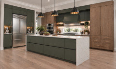
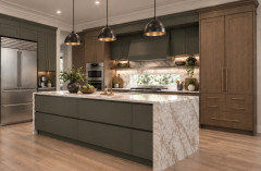
I really like Emily's option very well done. Do you mind sharing what colors those are etc. What you produced is probably a 150,000 kitchen which is more than I want to spend. I am upset about having to spend close to 100,000 for the kitchen. So yes looks fantastic. Show me how to do it for 50k less and you are a rockstar!!!!
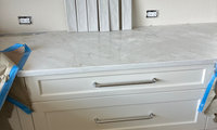

Just wanted to show my backsplash. Turned out perfect.
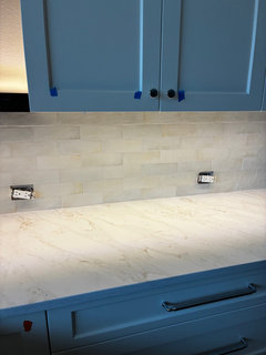
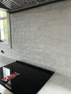
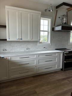
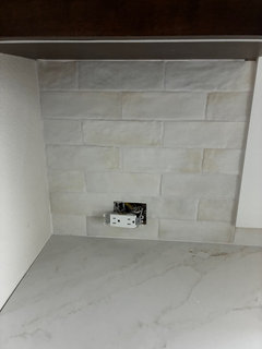

Back the heck up and take another picture. We cannot get a feel for what you are asking with what you gave us.
Coray, looks like the house has lots of positives, but if I had bought it and planned to be there long term, I would definitely plan on taking down all those coffered ceilings. What someone paid in the past for a feature in a house, shouldn't be a reason for me to keep it if I didn't love it! I think both OP's and your house would feel more airy/open and less top heavy without the coffered ceilings.
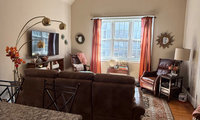
This is how I would arrange your space. If you use swivel chairs then you could have conversations with those in the kitchen too.
Install draperies that are off the window to create a larger looking window and help frame the sofa.
A round table in the center could be pulled away from the sofa enough to not interfere with the reclining sofa.
Add additional lighting to soften the look when you don’t need that much light from an overhead fixture.
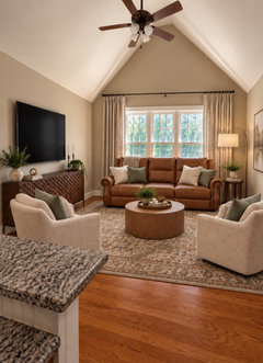
I usually try to position furniture so you can take advantage of the view out a window, but in your space I like the sofa under the window because it really opens up the room.
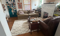
MY LR is small too and no TV I got these pieces from Wayfair they are comfy but not huge
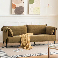
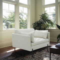
The chairs are a bit wide but fit okay even with a table between them I like sleek and minimal so worked for me .
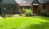
I too like the awnings, nice home.

Unless I have a very good memory for previous posters' dilemmas, I take the current ones at face value. I didn't realize that this was an ongoing dilemma.
But after seeing the before I still think the new color looks great!
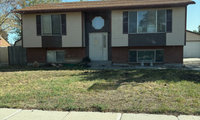
Paint the wood under the windows to match the siding, imo that is what needs the most attention. Also remove the shutters.
Take off the shutters, paint everything that light beige color. Paint the front door navy blue or sage green.
Or light trim and wood (or wood color) door?
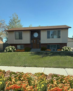
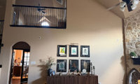
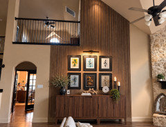
You prints get a little lost on that large wall. Consider doing a slatted wood treatment behind the console and extend it to the ceiling. It helps “lose” the opening on second floor and makes the openings and furnishings cohesive.
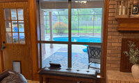
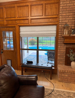
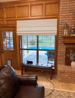
You could do an inside mount cordless Roman shade to add a bit of cream. You could also do an outside mount cordless shade which would allow you to cover more paneling above the window plus you could extend it so it covers the fact that the little trim moulding doesn’t match up above door and window. Note that the pic of the outside mount doesn’t have the shade all the way to the fireplace which it should be placed.
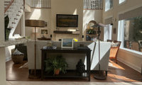

The console table would be better served with a table top light instead.
You can place the tall lights elsewhere such as a corner placement or against a wall to prevent a tripping hazard.
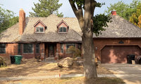
Am thinking that the change to asphalt shingles will have a dramatic impact on your home - so much so that maybe will suggest that you change the roof first and then decide which direction to go from there. Will say though that new landscaping will be very important in improving the overall look of your home.

I'm confused--didn't the OP ask for advice on whether she should keep the chandelier? In the most recent post?
"Here’s the update on my dining room can I get some advice for chandeliers or if I should keep it."
I think it's a nice chandelier, but it's hung too high. I'd lower it--ideally it should be 30" above the top of the table. But I also think simplynatural's idea of a more modern chandelier looks nice too. There's no right or wrong, just personal taste.
Again, I'm confused. this is the original photo of the dining room:
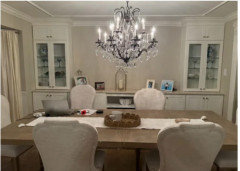
This is the most recent one, where the OP states that it is the "update":
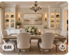
the chandelier appears bigger in the original photo, and hung at a good height. The updated photo shows a much smaller one hung too high. So which is it? Hard to give good advice with conflicting information.
Art and its placement is very subjective. There are no rules.
Art doesn't have to coordinate ... what does that mean and who would decide that rule? Based on what? Color, style, technique, subject, artist, vintage, etc?
Also whether "art pieces compete with each other", would very much depend on your personal taste and ability, or tolerance, to mix/match patterns and colors.
Some people have a few larger pieces of art scattered around the house and others have all types of art, on every wall, from floor to ceiling.
No one is going to be able to answer this for you, as you are just going to get responses with people's individual tastes and preferences.
Buy art that you love and it will work in any house that you will live in.
Modern style house with an eclectic art collection and placement.

Art is a personal expression of the people who live in the house.


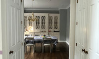

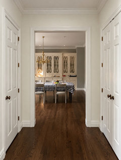
The millwork profile, continuous 2 part crown, door panels, cabinets, etc all point to a cased opening (right now it is not cased, it is drywalled) that should be bespoke around the entire house. It is a no brainer, add the return on the other side and case the opening.
It has nothing to do with what appears expensive or personal taste, it has to do with consistency in design.
I like the idea of making the opening centered on the wall by building the left side out a little, and then adding moulding around it. Gives it a finished look.
Now the red does what I want it to- a nice focus on the front door.