380 Billeder af entré med blå vægge
Sorteret efter:
Budget
Sorter efter:Populær i dag
1 - 20 af 380 billeder
Item 1 ud af 3
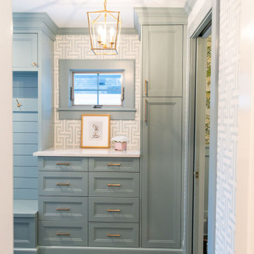
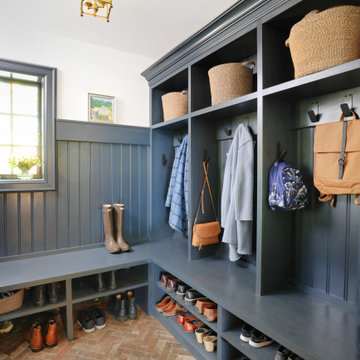
This entryway is all about function, storage, and style. The vibrant cabinet color coupled with the fun wallpaper creates a "wow factor" when friends and family enter the space. The custom built cabinets - from Heard Woodworking - creates ample storage for the entire family throughout the changing seasons.
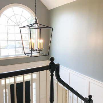
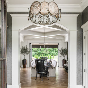
This two story entry needed a grand statement of a chandelier. We chose this lovely Circa Lighting cage chandelier for its grand scale, yet light mass. The black iron compliments the black handrail on the staircase.
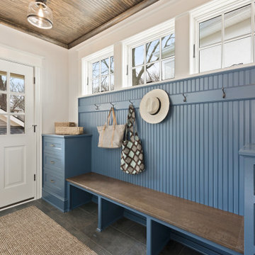
This home underwent significant floorplan changes to create spaces that are better aligned with modern living. For example, removing the back staircase allows for a spacious mudroom with a rustic floor.
This Naples home was the typical Florida Tuscan Home design, our goal was to modernize the design with cleaner lines but keeping the Traditional Moulding elements throughout the home. This is a great example of how to de-tuscanize your home.
Le projet :
Une maison de ville en région parisienne, meulière typique des années 30 restée dans son jus et nécessitant des travaux de rénovation pour une mise aux normes tant en matière de confort que d’aménagement afin d’accueillir une jeune famille.
Notre solution :
Nous avons remis aux normes l’électricité et la plomberie sur l’ensemble de la maison, repensé les volumes dès le rez-de-chaussée.
Ainsi nous avons ouvert la cloison entre l’ancienne cuisine et le séjour, permettant ainsi d’obtenir une cuisine fonctionnelle et ouverte sur le séjour avec un îlot repas.
Les plafonds de l’espace cuisine et de l’entrée bénéficient d’un faux-plafond qui permet d’optimiser l’éclairage mais aussi d’intégrer une hotte située au dessus de l’îlot central.
Nous avons supprimés les anciens carrelages au sol disparates de l’entrée et de la cuisine que nous avons remplacé par des dalles grises mixées avec un carrelage à motifs posé en tapis dans l’entrée et autour de l’îlot.
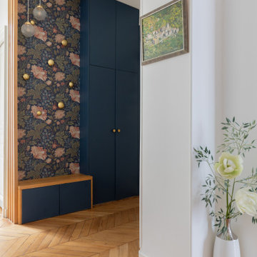
Dans l’entrée, nous avons créé un ensemble menuisé sur mesure qui permet d’intégrer un dressing, des étagères de rangements avec des tiroirs fermés pour les chaussures et une petite banquette. En clin d’oeil aux créations de Charlotte Perriand, nous avons dessiné une bibliothèque suspendue sur mesure dans le salon, à gauche de la cheminée et au dessus des moulures en partie basse.
La cage d’escalier autrefois recouverte de liège a retrouvé son éclat et gagné en luminosité grâce à un jeu de peintures en blanc et bleu.
A l’étage, nous avons rénové les 3 chambres et la salle de bains sous pente qui bénéficient désormais de la climatisation et d’une isolation sous les rampants. La chambre parentale qui était coupée en deux par un dressing placé entre deux poutres porteuses a bénéficié aussi d’une transformation importante : la petite fenêtre qui était murée dans l’ancien dressing a été remise en service et la chambre a gagné en luminosité et rangements avec une tête de lit et un dressing.
Nous avons redonné un bon coup de jeune à la petite salle de bains avec des carrelages blancs à motifs graphiques aux murs et un carrelage au sol en noir et blanc. Le plafond et les rampants isolés et rénovés ont permis l’ajout de spots. Un miroir sur mesure rétro éclairé a trouvé sa place au dessus du meuble double vasque.
Enfin, une des deux chambres enfants par laquelle passe le conduit de la cheminée a elle aussi bénéficié d’une menuiserie sur mesure afin d’habiller le conduit tout en y intégrant des rangements ouverts et fermés.
Le style :
Afin de gagner en luminosité, nous avons privilégié les blancs sur l’ensemble des boiseries et joué avec un camaïeu de bleus et verts présents par petites touches sur l’ensemble des pièces de la maison, ce qui donne une unité au projet. Les murs du séjour sont gris clairs afin de mettre en valeur les différentes boiseries et moulures. Le mobilier et les luminaires sont contemporains et s’intègrent parfaitement à l’architecture ancienne.
Photo : © Julien Fernandez / Amandine et Jules – Hotel particulier a Angers par l’architecte Laurent Dray.
Небольшая прихожая со всем необходимым не занимает в квартире слишком много места.
Architecture: Noble Johnson Architects
Interior Design: Rachel Hughes - Ye Peddler
Photography: Garett + Carrie Buell of Studiobuell/ studiobuell.com
Download our free ebook, Creating the Ideal Kitchen. DOWNLOAD NOW
Lakefront property in the northwest suburbs of Chicago is hard to come by, so when we were hired by this young family with exactly that, we were immediately inspired by not just the unusually large footprint of this 1950’s colonial revival but also the lovely views of the manmade lake it was sited on. The large 5-bedroom home was solidly stuck in the 1980’s, but we saw tons of potential. We started out by updating the existing staircase with a fresh coat of paint and adding new herringbone slate to the entry hall.
The powder room off the entryway also got a refresh - new flooring, new cabinets and fixtures. We ran the new slate right through into this space for some consistency. A fun wallpaper and shiplap trim add a welcoming feel and set the tone for the home.
Next, we tackled the kitchen. Located away from the rest of the first floor, the kitchen felt a little isolated, so we immediately began planning for how to better connect it to the rest of the first floor. We landed on removing the wall between the kitchen and dining room and designed a modified galley style space with separate cooking and clean up zones. The cooking zone consists of the refrigerator, prep sink and cooktop, along with a nice long run of prep space at the island. The cleanup side of the kitchen consists of the main sink and dishwasher. Both areas are situated so that the user can view the lake during prep work and cleanup!
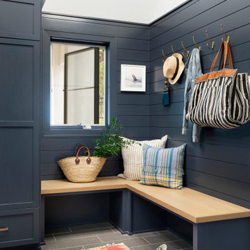
One of the home’s main puzzles was how to incorporate the mudroom and area in front of the patio doors at the back of the house. We already had a breakfast table area, so the space by the patio doors was a bit of a no man’s land. We decided to separate the kitchen proper from what became the new mudroom with a large set of barn doors. That way you can quickly hide any mudroom messes but have easy access to the light coming in through the patio doors as well as the outdoor grilling station. We also love the impact the barn doors add to the overall space.
The homeowners’ first words to us were “it’s time to ditch the brown,” so we did! We chose a lovely blue pallet that reflects the home’s location on the lake which is also vibrant yet easy on the eye. Countertops are white quartz, and the natural oak floor works well with the other honey accents. The breakfast table was given a refresh with new chairs, chandelier and window treatments that frame the gorgeous views of the lake out the back.
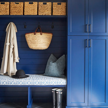
We coordinated the slate mudroom flooring with that used in the home’s main entrance for a consistent feel. The storage area consists of open and closed storage to allow for some clutter control as needed.
Next on our “to do” list was revamping the dated brown bar area in the neighboring dining room. We eliminated the clutter by adding some closed cabinets and did some easy updates to help the space feel more current. One snag we ran into here was the discovery of a beam above the existing open shelving that had to be modified with a smaller structural beam to allow for our new design to work. This was an unexpected surprise, but in the end we think it was well worth it!
We kept the colors here a bit more muted to blend with the homeowner’s existing furnishings. Open shelving and polished nickel hardware add some simple detail to the new entertainment zone which also looks out onto the lake!
Next we tackled the upstairs starting with the homeowner’s son’s bath. The bath originally had both a tub shower and a separate shower, so we decided to swap out the shower for a new laundry area. This freed up some space downstairs in what used to be the mudroom/laundry room and is much more convenient for daily laundry needs.
We continued the blue palette here with navy cabinetry and the navy tile in the shower. Porcelain floor tile and chrome fixtures keep maintenance to a minimum while matte black mirrors and lighting add some depth the design. A low maintenance runner adds some warmth underfoot and ties the whole space together.
We added a pocket door to the bathroom to minimize interference with the door swings. The left door of the laundry closet is on a 180 degree hinge to allow for easy full access to the machines. Next we tackled the master bath which is an en suite arrangement. The original was typical of the 1980’s with the vanity outside of the bathroom, situated near the master closet. And the brown theme continued here with multiple shades of brown.
Our first move was to segment off the bath and the closet from the master bedroom. We created a short hall from the bedroom to the bathroom with his and hers walk-in closets on the left and right as well as a separate toilet closet outside of the main bathroom for privacy and flexibility.
The original bathroom had a giant soaking tub with steps (dangerous!) as well as a small shower that did not work well for our homeowner who is 6’3”. With other bathtubs in the home, they decided to eliminate the tub and create an oversized shower which takes up the space where the old tub was located. The double vanity is on the opposite wall and a bench is located under the window for morning conversations and a place to set a couple of towels.
The pallet in here is light and airy with a mix of blond wood, creamy porcelain and marble tile, and brass accents. A simple roman shade adds some texture and it’s top-down mechanism allows for light and privacy.
This large whole house remodel gave our homeowners not only the ability to maximize the potential of their home but also created a lovely new frame from which to view their fabulous lake views.
Designed by: Susan Klimala, CKD, CBD
Photography by: Michael Kaskel
For more information on kitchen and bath design ideas go to: www.kitchenstudio-ge.com
380 Billeder af entré med blå vægge
1