How to Pick the Perfect Paint Colours for Light-starved Spaces
Make the most of cloudy days and dimly lit areas at home with tones that complement soft, diffused light

Colour is an important part of design and it can have a powerful effect on how our home makes us feel. But choosing colour is something with which many people struggle – there’s so much choice, it’s easy to get bamboozled. Often, the images we use for inspiration are from places with completely different climates to our own and, while bright and vibrant shades look fantastic in sunny locations, they’re not so good in areas that have weaker light.
Ireland gets a large number of cloudy days throughout the year, which makes the light soft and diffused. Equally, many UK homes have darker, north-facing rooms or are light-starved at certain times of the year. Some colours work every time in this context, but others just don’t, and it’s not always obvious why. So here are a few rules that will help you to choose the perfect shade to work with soft light and dimly lit rooms alike.
Ireland gets a large number of cloudy days throughout the year, which makes the light soft and diffused. Equally, many UK homes have darker, north-facing rooms or are light-starved at certain times of the year. Some colours work every time in this context, but others just don’t, and it’s not always obvious why. So here are a few rules that will help you to choose the perfect shade to work with soft light and dimly lit rooms alike.
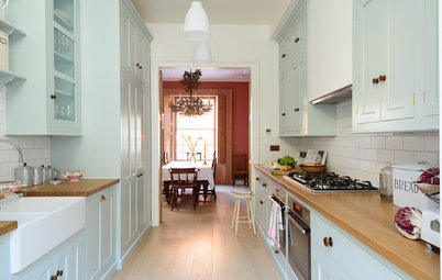
…but get to know your shades of white
If a darker hue doesn’t appeal, you can still give the impression of white without going brilliant. In this beautifully simple room, the walls have been painted in a slightly softer shade of white than the ceiling. You’ll see that there’s a slight hint of green in the wall colour, which makes it feel less stark (see the next point for more on this).
White and even some off-whites can feel quite clinical, but by slightly contrasting the walls and ceiling, this room is anything but.
Use a hint of green in your neutrals
When trying to select a neutral colour for a room with dim natural light, I’d steer clear of any shade with a hint of pink or peach in it. These tones appear to be warm, which can be tempting in cooler climes, but, in fact, they’re very difficult to live with. This is particularly true with neutral shades – magnolia is a classic example – as their warmer tones tend to clash with everything.
Hot and warm colours work in sunnier climates, because the light there is strong. Weaker light needs cooler shades, at least where neutrals are concerned.
So when picking a neutral or off-white, I’d suggest going for one with a slight hint of green in it, as this has a neutralising effect, meaning that most colours will combine really well with it. The green also means it will react really well in the light that comes with the Irish climate, which tends to be very soft, as well as in other rooms with limited natural light.
More: How to Prevent Your Neutral Scheme From Falling Flat
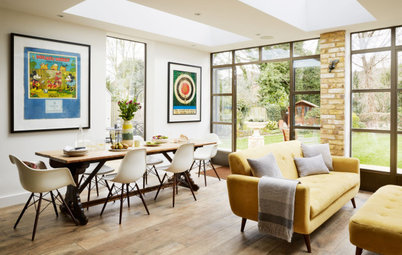
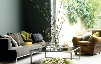
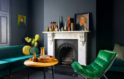
Create a focal point
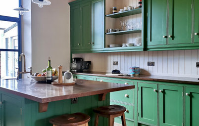
Using a bold colour is a great way to create a point of focus in a room with changeable light, plus it helps to define different zones within an open-plan space. Really dark shades, like the grey in this living room, actually work as a neutral tone, contrasting beautifully with the brighter shades and providing a fantastic backdrop for artwork.
When selecting dark shades, do opt for the more earthy end of the spectrum. For example, this is a warm grey with sandy undertones, which is much softer and warmer than a cooler grey with blue or purple undertones.
Keep your palette simple
While rooms in sunnier climes with more direct sunlight can handle a rainbow of shades, in climates where there’s frequent cloud cover, a simple colour palette works best. So if you’re planning to paint a dark or north-facing space in a bold shade, keep the rest of the scheme simple for a clean contrast. What you don’t want is too many strong colours in a room, as they will start to compete. Here, a monochrome palette creates a relaxed and elegant atmosphere.
While rooms in sunnier climes with more direct sunlight can handle a rainbow of shades, in climates where there’s frequent cloud cover, a simple colour palette works best. So if you’re planning to paint a dark or north-facing space in a bold shade, keep the rest of the scheme simple for a clean contrast. What you don’t want is too many strong colours in a room, as they will start to compete. Here, a monochrome palette creates a relaxed and elegant atmosphere.
Paint a dark window wall
Where you have large windows, a deep shade can be very dramatic. The wall with the windows is actually the darkest in the room, as it gets no direct light, so it’s the ideal surface to paint a dark colour.
In this kitchen, the grey picks up the veining in the striking marble island, showing that contemporary colours can work wonderfully in a period setting. This gorgeous shade of grey has a slightly earthy undertone, making it work really well with the subdued light.
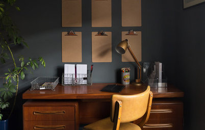
Be uniform with woodwork and ceiling…
When selecting your colour palette, paint the woodwork and ceiling in the same shade, but go for a contrast on the walls. This will give a unified look to your scheme. Steer clear of whites with pink or yellow undertones in muted light, as the base pigment is strong and can dominate the colour scheme, making it very difficult to find complementary tones for your walls.
When selecting your colour palette, paint the woodwork and ceiling in the same shade, but go for a contrast on the walls. This will give a unified look to your scheme. Steer clear of whites with pink or yellow undertones in muted light, as the base pigment is strong and can dominate the colour scheme, making it very difficult to find complementary tones for your walls.
…or try a darker shade for the woodwork
Don’t be afraid to go dark on the woodwork and lighter on the walls instead. This works really well where the woodwork is not in great condition, as the darker colour is more forgiving.
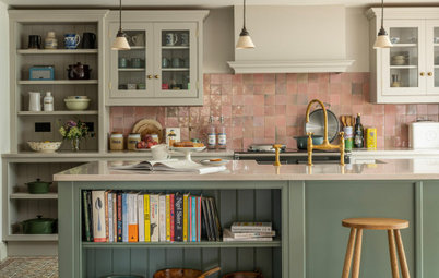
An earthy shade like this one is a great choice; colours with sandy, green or beige undertones all work really well with muted light. This is because they’re soft, too, and so don’t tend to dominate your colour scheme, making them ideal for woodwork, which will frame every room in the house.
Don’t be afraid to go dark on the woodwork and lighter on the walls instead. This works really well where the woodwork is not in great condition, as the darker colour is more forgiving.
An earthy shade like this one is a great choice; colours with sandy, green or beige undertones all work really well with muted light. This is because they’re soft, too, and so don’t tend to dominate your colour scheme, making them ideal for woodwork, which will frame every room in the house.
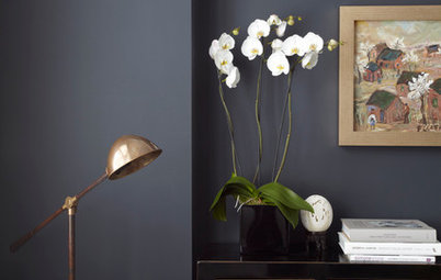
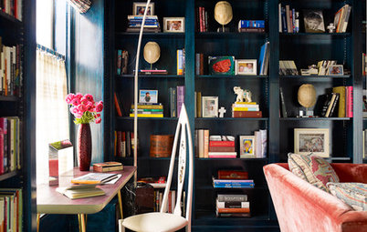
Create a backdrop for displaying accessories
One place you can really play with colour and darker tones despite the light you’re working with is on smaller panels, behind art and accessories, where the wall or shelves themselves aren’t the focal point, but rather what’s on them.
Dark colours are great for showcasing art: the contrast makes whatever you place in front stand out. Painting the wall behind this shelving unit in a dark grey has created the perfect backdrop for displaying these colourful accessories and brings this otherwise neutral scheme to life.
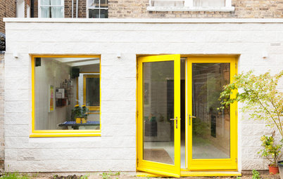
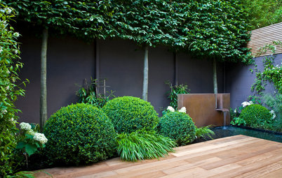
Explore earthy tones externally, too
When selecting external paint colours, tones with a slightly earth hue tend to work best, as they’re warm. Here, there’s a slight green tint to the grey colour used on the exterior cladding, making the grey feel warm and inviting. If your skies are grey or white for much of the year, choosing a warm shade for your exterior will mean your home will look its best whatever the weather.
Tell us…
Do you have a dark room? What colour have you painted it – and are you happy with the result? Share your experiences in the Comments.


Sponsored
Reload the page to not see this specific ad anymore
A very common mistake for a north-facing or dark room is to paint it white to try to make it feel brighter. This doesn’t work and can actually make the room seem cold. Instead, what you should try to do is make the room feel cosy.
We have no control over orientation, so pulling more sunlight into a north-facing room is generally not an option. However, by going for a darker, softer shade on the walls and improving artificial lighting, a north-facing room can be a very snug, pleasant place to spend time, regardless of the climate conditions outside.