Room Tour: Clever Design Creates Two Bathrooms From One
The bathroom in this Grade II listed home didn’t make good use of its generous floorspace – so it was split in two

The couple who own this house had a dilemma perhaps unusual in the average urban home: the bathroom was too big. “It was a huge room,” says architect and interior designer Kate Clare of LOUD Architecture & Interior Design, who redesigned the space.
The couple wanted the main bathroom to be practical for when family come to stay, but also loved the idea of having their own en suite. Kate gave them both by chopping the existing bathroom in two, changing access, and rejigging the layout in the adjacent bedroom to allow it.
The couple wanted the main bathroom to be practical for when family come to stay, but also loved the idea of having their own en suite. Kate gave them both by chopping the existing bathroom in two, changing access, and rejigging the layout in the adjacent bedroom to allow it.
Here, you’re looking at the L-shaped en suite from its new entrance – a sliding pocket door that gives onto the main bedroom. There are new double basins with shelving beneath, a walk-in shower straight ahead and, out of shot opposite the shower, a freestanding bath.
“My ‘slogan’ is to have pops of colour, but we made this quite white to keep it looking traditional, so it would fit in with the Grade II listing,” she says. The owners also collect art, lots of it very colourful – such as the Damien Hirst print in the bedroom – and Kate wanted to offset this, too, with plain walls.
“I did want to put black grout between the floor tiles,” she admits, but the owners weren’t keen. Instead, she introduced black elements in the form of the taps and shower to add interest.
This ‘before’ plan shows the original bathroom, with its curved corner shower, freestanding bath, double basins and loo. The drawing also shows the door as it was, opening onto the landing. This door has not moved, but now opens into the other bathroom only (photos of which are lower down in the story).
Make the challenge of finding the right people for your project easier by searching the Houzz Professionals Directory.
Make the challenge of finding the right people for your project easier by searching the Houzz Professionals Directory.
This plan shows the layout Kate designed.
The rooms are on the first floor of the house. Originally, the large family bathroom was adjacent to the bedroom, but accessed from the landing only. Kate’s redesign put a sliding pocket door in the bedroom wall (bottom left on the plan) to allow access to the new, L-shaped en suite. The landing entrance now opens onto the smaller, family bathroom.
Read more: Everything You Need to Know About Pocket Doors.
To retain a freestanding bath, Kate sourced a short design, chosen to fit perfectly into the newly reconfigured space. “This was the only wall the tub could go against in order for us to fit a bath in both rooms and a standalone shower in this one,” Kate says.
Here you can also see a custom-made mirror surrounded by artificial foliage, which softens the white walls and helps to magnify the light from the window. The bespoke oak shelf has a similar softening effect and also provides a surface for shampoos and bath oils.
The position of the loo (just in shot here) also influenced the overall layout. Kate moved it across the room, but the pipework had to run to an external wall, so it had to stay fairly close to the back to allow for a sufficient slope on the pipe (the longer the pipe, the higher up it needs to be at its starting point, and the Grade II listed status prevented alterations to the original floor, which might have allowed for more options). The pipe runs around the corner, behind the bath.
The shower screen is an easy-maintenance design. “I love it because, unlike the usual steel or aluminium versions, where water could sit in the profiles, this has two sheets of glass that sit either side of the metal, so it’s easy to clean,” Kate says.
The controls are on the side wall, so you don’t have to reach under the shower head to turn on the water.
Shower screen, Drench.
The controls are on the side wall, so you don’t have to reach under the shower head to turn on the water.
Shower screen, Drench.
Kate chose open shelving, made from Durastone, rather than a vanity unit to make the most of the space. “The shelf supporting the basins, and the one below, cut into the chimney a little and cantilever out,” she says. She had to gain Planning Permission for this detail because of the listed status of the building.
“The beautiful floor tiles – tiny diamond-shapes – had a 10-week lead time,” Kate explains, “but they were worth the wait. The biggest nightmare, though, was that they arrived one box short and the company in Italy had shut down for August [when the work was underway]. The contractor had begun tiling at the door, rather than the shower, so the shower wasn’t useable in all that time.”
Basins, Lusso Stone. Taps, Crosswater. Floor tiles, Rombini range at Domus.
There is additional storage in a row of slim cupboards behind the mirrors; the door on the far right also conceals charging points for electric toothbrushes and a shaver.
Kate designed this unit so the doors didn’t open in such a way that the joins would run down the middle of each basin – essentially cutting your face in half.
The joinery inside the cupboards is oak.
Kate designed this unit so the doors didn’t open in such a way that the joins would run down the middle of each basin – essentially cutting your face in half.
The joinery inside the cupboards is oak.
This is the new entrance to the en suite from the bedroom. The bed was originally against this wall, so the fitted storage was removed and Kate repositioned the electrics to allow the bed to be moved to the chimney breast wall instead.
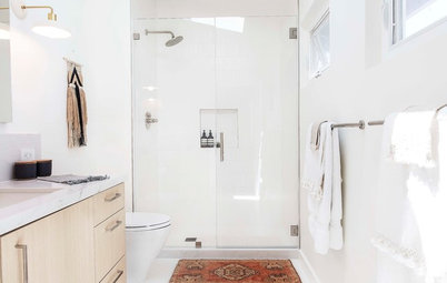
This is the smaller of the two bathrooms, accessed from the landing.
As the room has no window, a vent runs in the ceiling void to comply with Building Regulations. Kate installed a large mirror, which helps to keep the room feeling bright and open.
As the room has no window, a vent runs in the ceiling void to comply with Building Regulations. Kate installed a large mirror, which helps to keep the room feeling bright and open.
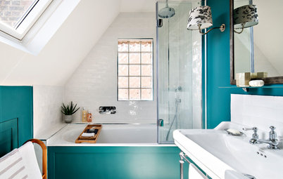
In here, Kate was more daring with colour. Along with the strong blue elements, she used the same floor tiles as the ones next door, but this time with dark blue grout to highlight their shape.
The unusual tiles that make up the bath panel are 3D, adding interesting texture to the room.
Basin, Kast. Floor tiles; bath panel tiles; pale blue wall tiles, all Rombini range at Domus.
The unusual tiles that make up the bath panel are 3D, adding interesting texture to the room.
Basin, Kast. Floor tiles; bath panel tiles; pale blue wall tiles, all Rombini range at Domus.
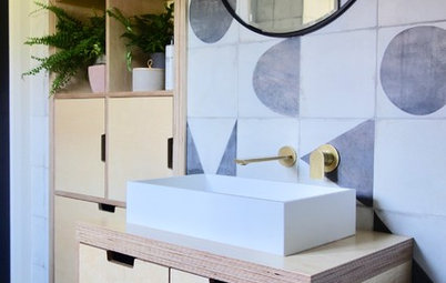
“We had to get a really slim basin to allow for the door swing and create enough room between it and the loo,” Kate says. It was wall-hung to further boost the sense of space.
“The taps are from a tiny local shop that imports from Italy,” Kate says.
Brassware, Hintons Bathrooms.
Tell us…
What do you think of Kate’s clever reconfiguration of this space? Let us know in the Comments.
Brassware, Hintons Bathrooms.
Tell us…
What do you think of Kate’s clever reconfiguration of this space? Let us know in the Comments.

Sponsored
Reload the page to not see this specific ad anymore
Who lives here? A couple and their young daughter
Location East London
Property A Grade II listed period townhouse
Room dimensions Whole space approx 3.2m x 3.6m
Designer Kate Clare of LOUD Architecture & Interior Design
To turn the large bathroom into two smaller ones, Kate carved out an L shape for the en suite and fitted the guest bathroom into the remainder of the rectangle (scroll down to see the floorplan). This also allowed her to give each room the space for a bath and, in the en suite, a walk-in shower, too.
Here, you’re looking at the bathroom and main bedroom before Kate’s reconfiguration. “The ‘before’ bathroom was OK,” she says, “but it had two basins in not very good condition and a curved shower [cubicle]. It did have a large, freestanding tub, though, which the owners liked, so we decided to keep that theme rather than boxing in a new bath to the back.”
The main opportunity, however, was to make the space work much harder.