5.670 Billeder af turkis spisestue
Sorteret efter:
Budget
Sorter efter:Populær i dag
1 - 20 af 5.670 billeder
Item 1 ud af 2
Clean and bright for a space where you can clear your mind and relax. Unique knots bring life and intrigue to this tranquil maple design. With the Modin Collection, we have raised the bar on luxury vinyl plank. The result is a new standard in resilient flooring. Modin offers true embossed in register texture, a low sheen level, a rigid SPC core, an industry-leading wear layer, and so much more.
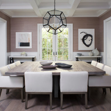
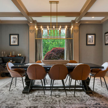
Mocha grass cloth lines the walls, oversized bronze pendant with brass center hangs over custom 7.5 foot square x base dining table, custom faux leather dining chairs.
Meghan Beierle
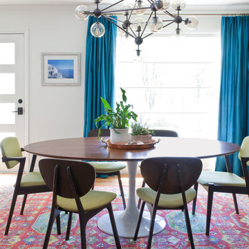
Wallpaper is de Gournay Earlham pattern, wall color is Sherwin-Williams Rookwood Sash Green, Ceiling is Sherwin-Williams Wallflower. Table is Plexi-Craft, chairs are client's existing, chandelier is Oly, lamps are Shine, Rug is Davis & Davis, draperies are custom. Door color is Sherwin-Williams Urbane Bronze
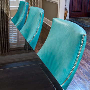
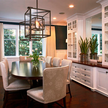
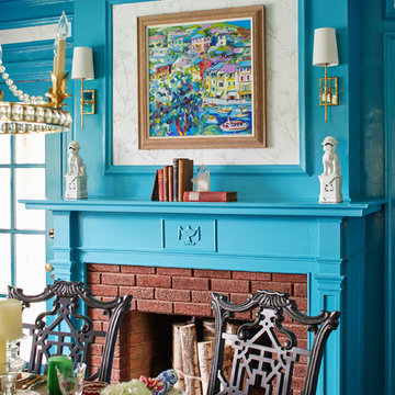
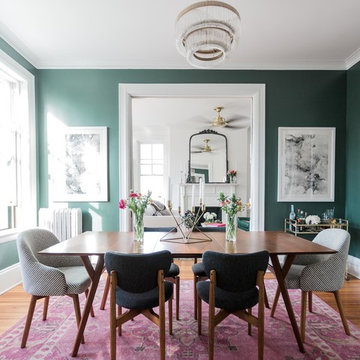
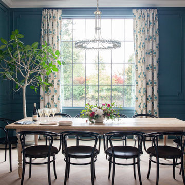
This client came to us wanting to enhance their existing space by using some creative finishes for walls. They hoped to make the home feel more modern with an urban rustic vibe as opposed to the traditional architectural style of the structure but did not know how to accomplish this transition. Upon our arrival it was noted that all walls had been painted white which was determined too harsh and did not achieve the modern feel the homeowner had hoped to evoke. The space was softened by using a subtle and fresh color palette with one accent color for impact. Teal was the color selected to create a continuous thread of pop in varying degrees in each room which included the Entry Hall, Dining Room and Living Room. Touches of black were injected into each space due to the client’s previous purchases of a drum fixture for the living room and black dining table; both gave direction on scale and style.
The Entry Hall was given powerful impact as someone enters the home by taking its cue from the abstract art selected for the Dining Room. A faux concrete wall was created with the use of artistically combined colors. In the Dining Room, the use of classic chairs are successfully made modern by upholstering in teal leather which added both continuity and unexpected interest next to the velvet Greek Key pattern found on host chairs. In the Living Room custom upholstered sofa and chairs are grounded by a rug that brings all colors together. A unique copper rivet finish was applied in the niches that flank the fireplace as a contrast to whimsical amber crystal mini chandeliers hung over modern consoles that display simple yet exciting teal bowls. The final furnishings, art and accessories ultimately brought the entire home together in a rustic, modern way that is warm and inviting reflecting the unique personality of the people who live there.
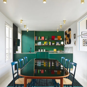
Une belle et grande maison de l’Île Saint Denis, en bord de Seine. Ce qui aura constitué l’un de mes plus gros défis ! Madame aime le pop, le rose, le batik, les 50’s-60’s-70’s, elle est tendre, romantique et tient à quelques références qui ont construit ses souvenirs de maman et d’amoureuse. Monsieur lui, aime le minimalisme, le minéral, l’art déco et les couleurs froides (et le rose aussi quand même!). Tous deux aiment les chats, les plantes, le rock, rire et voyager. Ils sont drôles, accueillants, généreux, (très) patients mais (super) perfectionnistes et parfois difficiles à mettre d’accord ?
Et voilà le résultat : un mix and match de folie, loin de mes codes habituels et du Wabi-sabi pur et dur, mais dans lequel on retrouve l’essence absolue de cette démarche esthétique japonaise : donner leur chance aux objets du passé, respecter les vibrations, les émotions et l’intime conviction, ne pas chercher à copier ou à être « tendance » mais au contraire, ne jamais oublier que nous sommes des êtres uniques qui avons le droit de vivre dans un lieu unique. Que ce lieu est rare et inédit parce que nous l’avons façonné pièce par pièce, objet par objet, motif par motif, accord après accord, à notre image et selon notre cœur. Cette maison de bord de Seine peuplée de trouvailles vintage et d’icônes du design respire la bonne humeur et la complémentarité de ce couple de clients merveilleux qui resteront des amis. Des clients capables de franchir l’Atlantique pour aller chercher des miroirs que je leur ai proposés mais qui, le temps de passer de la conception à la réalisation, sont sold out en France. Des clients capables de passer la journée avec nous sur le chantier, mètre et niveau à la main, pour nous aider à traquer la perfection dans les finitions. Des clients avec qui refaire le monde, dans la quiétude du jardin, un verre à la main, est un pur moment de bonheur. Merci pour votre confiance, votre ténacité et votre ouverture d’esprit. ????
C’est à quelque pas de l’église St-Roch, que la créatrice de Maison Sarah Lavoine, Sarah Poniatowski a enfin réalisé son rêve depuis 18 ans : vivre sous les toits parisiens.
C’est une boîte en verre accrochée en haut d’un immeuble entièrement peinte en Ressource. Dans son duplex, une belle verrière trône en maître dans le salon. Un appartement gai, lumineux et coloré à l’image de la créatrice dont le décor change régulièrement au gré de ses nouvelles collections, des visites de ses amis et des objets et meubles chinés rapportés de ses voyages.
Une visite vivante et inspirante où l’on retrouve de nombreuses teintes issues de notre collaboration.
Les teintes utilisées pour cette réalisation : Craie - SL03, Orange Bleue - SL31, Archipel - SL29, Red Hook - SL39, Huddlestone – SL40, Radis Noir - SL11, Tournesol - SL13.
Créateur : Maison Sarah Lavoine.
Site : https://www.maisonsarahlavoine.com.
Photographe : © Francis Amiand.
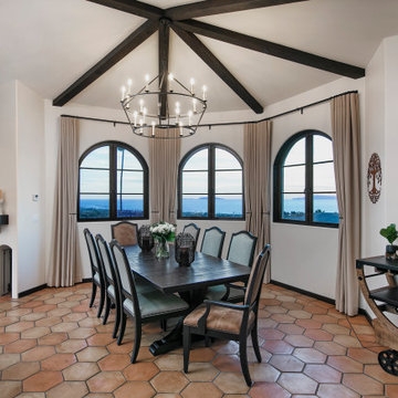
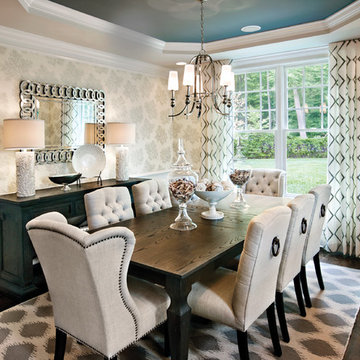
Beautiful Spanish tile details are present in almost
every room of the home creating a unifying theme
and warm atmosphere. Wood beamed ceilings
converge between the living room, dining room,
and kitchen to create an open great room. Arched
windows and large sliding doors frame the amazing
views of the ocean.
Architect: Beving Architecture
Photographs: Jim Bartsch Photographer
5.670 Billeder af turkis spisestue
1