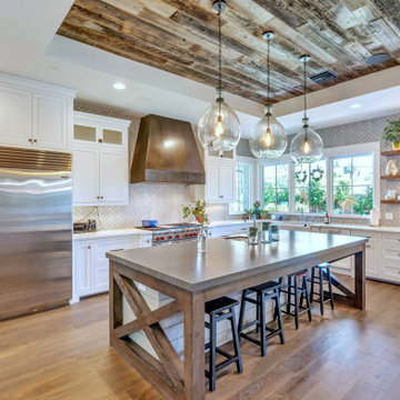
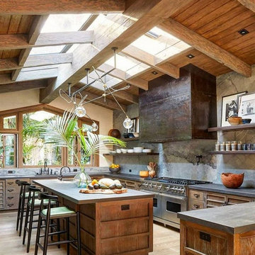
41.790 Billeder af brunt køkken med grå stænkplade
Sorteret efter:
Budget
Sorter efter:Populær i dag
201 - 220 af 41.790 billeder
Item 1 ud af 3
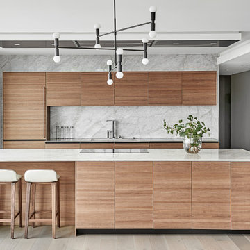
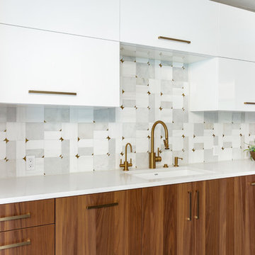
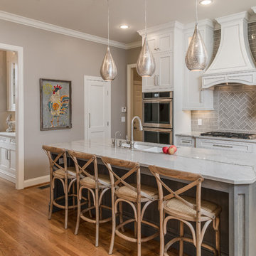
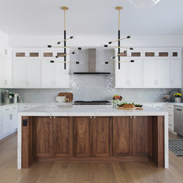
In our world of kitchen design, it’s lovely to see all the varieties of styles come to life. From traditional to modern, and everything in between, we love to design a broad spectrum. Here, we present a two-tone modern kitchen that has used materials in a fresh and eye-catching way. With a mix of finishes, it blends perfectly together to create a space that flows and is the pulsating heart of the home.
With the main cooking island and gorgeous prep wall, the cook has plenty of space to work. The second island is perfect for seating – the three materials interacting seamlessly, we have the main white material covering the cabinets, a short grey table for the kids, and a taller walnut top for adults to sit and stand while sipping some wine! I mean, who wouldn’t want to spend time in this kitchen?!
Cabinetry
With a tuxedo trend look, we used Cabico Elmwood New Haven door style, walnut vertical grain in a natural matte finish. The white cabinets over the sink are the Ventura MDF door in a White Diamond Gloss finish.
Countertops
The white counters on the perimeter and on both islands are from Caesarstone in a Frosty Carrina finish, and the added bar on the second countertop is a custom walnut top (made by the homeowner!) with a shorter seated table made from Caesarstone’s Raw Concrete.
Backsplash
The stone is from Marble Systems from the Mod Glam Collection, Blocks – Glacier honed, in Snow White polished finish, and added Brass.
Fixtures
A Blanco Precis Silgranit Cascade Super Single Bowl Kitchen Sink in White works perfect with the counters. A Waterstone transitional pulldown faucet in New Bronze is complemented by matching water dispenser, soap dispenser, and air switch. The cabinet hardware is from Emtek – their Trinity pulls in brass.
Appliances
The cooktop, oven, steam oven and dishwasher are all from Miele. The dishwashers are paneled with cabinetry material (left/right of the sink) and integrate seamlessly Refrigerator and Freezer columns are from SubZero and we kept the stainless look to break up the walnut some. The microwave is a counter sitting Panasonic with a custom wood trim (made by Cabico) and the vent hood is from Zephyr.
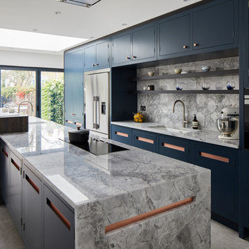
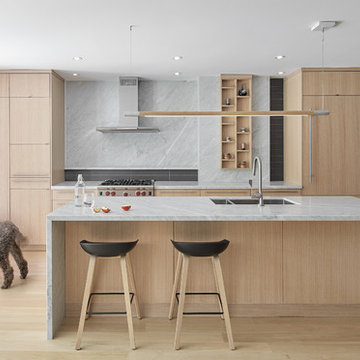
The island cooking zone with ovens, induction hob and ceiling mounted extractor is designed to keep the business end of preparing a meal away from the more communal breakfast bar.
The original enclosed kitchen was opened up, giving the homeowner a better layout, an island for entertaining, a hidden desk/message center, and maximum storage.
Interiors: Marcia Leach Design
Cabinetry: Barber Cabinet Company
Contractor: Andrew Thompson Construction
Photography: Garett + Carrie Buell of Studiobuell/ studiobuell.com
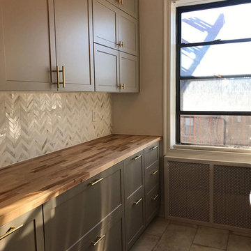
Jenny was open to using IKEA cabinetry throughout, but ultimately decided on Semihandmade’s Light Gray Shaker door style. “I wanted to maximize storage, maintain affordability, and spice up visual interest by mixing up shelving and closed cabinets,” she says. “And I wanted to display nice looking things and hide uglier things, like Tupperware pieces.” This was key as her original kitchen was dark, cramped and had inefficient storage, such as wire racks pressed up against her refrigerator and limited counter space. To remedy this, the upper cabinetry is mixed asymmetrically throughout, over the long run of countertops along the wall by the refrigerator and above the food prep area and above the stove. “Stylistically, these cabinets blended well with the butcher block countertops and the large Moroccan/Spanish tile design on the floor,” she notes.
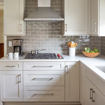
The cabinets featured in the kitchen are a part of Wellborn’s Premier cabinetry line (Inset, Henlow Square door style featured in Maple). The cabinetry is showcased in Repose Gray (Sherwin Williams 7015).
Free ebook, Creating the Ideal Kitchen. DOWNLOAD NOW
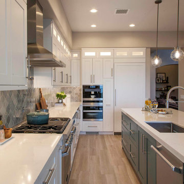
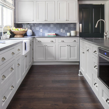
Our clients had been in their home since the early 1980’s and decided it was time for some updates. We took on the kitchen, two bathrooms and a powder room.
The layout in the kitchen was functional for them, so we kept that pretty much as is. Our client wanted a contemporary-leaning transitional look — nice clean lines with a gray and white palette. Light gray cabinets with a slightly darker gray subway tile keep the northern exposure light and airy. They also purchased some new furniture for their breakfast room and adjoining family room, so the whole space looks completely styled and new. The light fixtures are staggered and give a nice rhythm to the otherwise serene feel.
The homeowners were not 100% sold on the flooring choice for little powder room off the kitchen when I first showed it, but now they think it is one of the most interesting features of the design. I always try to “push” my clients a little bit because that’s when things can get really fun and this is what you are paying for after all, ideas that you may not come up with on your own.
We also worked on the two upstairs bathrooms. We started first on the hall bath which was basically just in need of a face lift. The floor is porcelain tile made to look like carrera marble. The vanity is white Shaker doors fitted with a white quartz top. We re-glazed the cast iron tub.
The master bath was a tub to shower conversion. We used a wood look porcelain plank on the main floor along with a Kohler Tailored vanity. The custom shower has a barn door shower door, and vinyl wallpaper in the sink area gives a rich textured look to the space. Overall, it’s a pretty sophisticated look for its smaller fooprint.
Designed by: Susan Klimala, CKD, CBD
Photography by: Michael Alan Kaskel
For more information on kitchen and bath design ideas go to: www.kitchenstudio-ge.com
41.790 Billeder af brunt køkken med grå stænkplade
11