122.206 Billeder af køkken med beige skabe og skabe i lyst træ
Sorteret efter:
Budget
Sorter efter:Populær i dag
21 - 40 af 122.206 billeder
Item 1 ud af 3
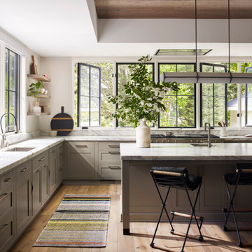
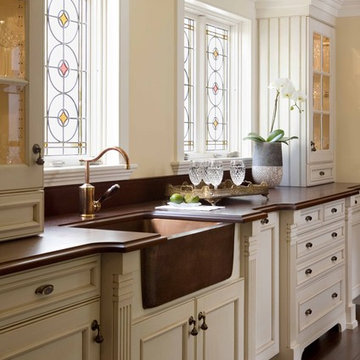
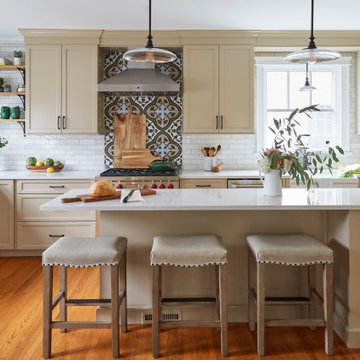
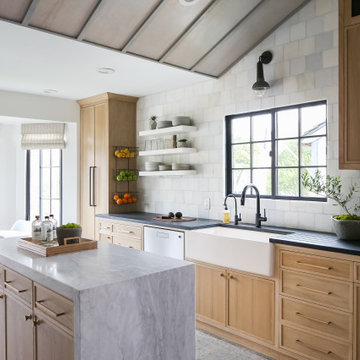
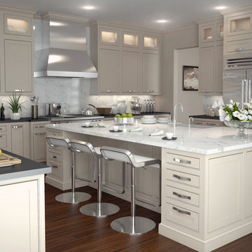
This expansive Victorian had tremendous historic charm but hadn’t seen a kitchen renovation since the 1950s. The homeowners wanted to take advantage of their views of the backyard and raised the roof and pushed the kitchen into the back of the house, where expansive windows could allow southern light into the kitchen all day. A warm historic gray/beige was chosen for the cabinetry, which was contrasted with character oak cabinetry on the appliance wall and bar in a modern chevron detail. Kitchen Design: Sarah Robertson, Studio Dearborn Architect: Ned Stoll, Interior finishes Tami Wassong Interiors
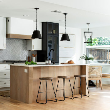
Coastal contemporary finishes and furniture designed by Interior Designer and Realtor Jessica Koltun in Dallas, TX. #designingdreams
This renovated brick rowhome in Boston’s South End offers a modern aesthetic within a historic structure, creative use of space, exceptional thermal comfort, a reduced carbon footprint, and a passive stream of income.
DESIGN PRIORITIES. The goals for the project were clear - design the primary unit to accommodate the family’s modern lifestyle, rework the layout to create a desirable rental unit, improve thermal comfort and introduce a modern aesthetic. We designed the street-level entry as a shared entrance for both the primary and rental unit. The family uses it as their everyday entrance - we planned for bike storage and an open mudroom with bench and shoe storage to facilitate the change from shoes to slippers or bare feet as they enter their home. On the main level, we expanded the kitchen into the dining room to create an eat-in space with generous counter space and storage, as well as a comfortable connection to the living space. The second floor serves as master suite for the couple - a bedroom with a walk-in-closet and ensuite bathroom, and an adjacent study, with refinished original pumpkin pine floors. The upper floor, aside from a guest bedroom, is the child's domain with interconnected spaces for sleeping, work and play. In the play space, which can be separated from the work space with new translucent sliding doors, we incorporated recreational features inspired by adventurous and competitive television shows, at their son’s request.
MODERN MEETS TRADITIONAL. We left the historic front facade of the building largely unchanged - the security bars were removed from the windows and the single pane windows were replaced with higher performing historic replicas. We designed the interior and rear facade with a vision of warm modernism, weaving in the notable period features. Each element was either restored or reinterpreted to blend with the modern aesthetic. The detailed ceiling in the living space, for example, has a new matte monochromatic finish, and the wood stairs are covered in a dark grey floor paint, whereas the mahogany doors were simply refinished. New wide plank wood flooring with a neutral finish, floor-to-ceiling casework, and bold splashes of color in wall paint and tile, and oversized high-performance windows (on the rear facade) round out the modern aesthetic.
RENTAL INCOME. The existing rowhome was zoned for a 2-family dwelling but included an undesirable, single-floor studio apartment at the garden level with low ceiling heights and questionable emergency egress. In order to increase the quality and quantity of space in the rental unit, we reimagined it as a two-floor, 1 or 2 bedroom, 2 bathroom apartment with a modern aesthetic, increased ceiling height on the lowest level and provided an in-unit washer/dryer. The apartment was listed with Jackie O'Connor Real Estate and rented immediately, providing the owners with a source of passive income.
ENCLOSURE WITH BENEFITS. The homeowners sought a minimal carbon footprint, enabled by their urban location and lifestyle decisions, paired with the benefits of a high-performance home. The extent of the renovation allowed us to implement a deep energy retrofit (DER) to address air tightness, insulation, and high-performance windows. The historic front facade is insulated from the interior, while the rear facade is insulated on the exterior. Together with these building enclosure improvements, we designed an HVAC system comprised of continuous fresh air ventilation, and an efficient, all-electric heating and cooling system to decouple the house from natural gas. This strategy provides optimal thermal comfort and indoor air quality, improved acoustic isolation from street noise and neighbors, as well as a further reduced carbon footprint. We also took measures to prepare the roof for future solar panels, for when the South End neighborhood’s aging electrical infrastructure is upgraded to allow them.
URBAN LIVING. The desirable neighborhood location allows the both the homeowners and tenant to walk, bike, and use public transportation to access the city, while each charging their respective plug-in electric cars behind the building to travel greater distances.
OVERALL. The understated rowhouse is now ready for another century of urban living, offering the owners comfort and convenience as they live life as an expression of their values.
Photography: Eric Roth Photo
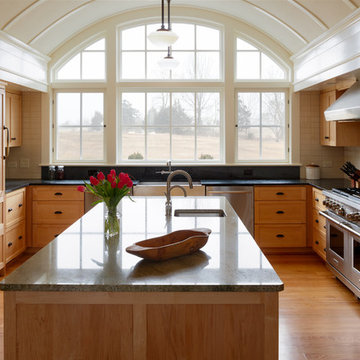
Tiled kitchen with birch cabinetry opens to outdoor dining beyond windows. Entry with stair to second floor and dining room.
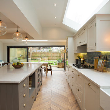
Download our free ebook, Creating the Ideal Kitchen. DOWNLOAD NOW
The homeowners came to us looking to update the kitchen in their historic 1897 home. The home had gone through an extensive renovation several years earlier that added a master bedroom suite and updates to the front façade. The kitchen however was not part of that update and a prior 1990’s update had left much to be desired. The client is an avid cook, and it was just not very functional for the family.
The original kitchen was very choppy and included a large eat in area that took up more than its fair share of the space. On the wish list was a place where the family could comfortably congregate, that was easy and to cook in, that feels lived in and in check with the rest of the home’s décor. They also wanted a space that was not cluttered and dark – a happy, light and airy room. A small powder room off the space also needed some attention so we set out to include that in the remodel as well.
See that arch in the neighboring dining room? The homeowner really wanted to make the opening to the dining room an arch to match, so we incorporated that into the design.
Another unfortunate eyesore was the state of the ceiling and soffits. Turns out it was just a series of shortcuts from the prior renovation, and we were surprised and delighted that we were easily able to flatten out almost the entire ceiling with a couple of little reworks.
Other changes we made were to add new windows that were appropriate to the new design, which included moving the sink window over slightly to give the work zone more breathing room. We also adjusted the height of the windows in what was previously the eat-in area that were too low for a countertop to work. We tried to keep an old island in the plan since it was a well-loved vintage find, but the tradeoff for the function of the new island was not worth it in the end. We hope the old found a new home, perhaps as a potting table.
Designed by: Susan Klimala, CKD, CBD
Photography by: Michael Kaskel
For more information on kitchen and bath design ideas go to: www.kitchenstudio-ge.com
Winner of the 2018 Tour of Homes Best Remodel, this whole house re-design of a 1963 Bennet & Johnson mid-century raised ranch home is a beautiful example of the magic we can weave through the application of more sustainable modern design principles to existing spaces.
We worked closely with our client on extensive updates to create a modernized MCM gem.
Extensive alterations include:
- a completely redesigned floor plan to promote a more intuitive flow throughout
- vaulted the ceilings over the great room to create an amazing entrance and feeling of inspired openness
- redesigned entry and driveway to be more inviting and welcoming as well as to experientially set the mid-century modern stage
- the removal of a visually disruptive load bearing central wall and chimney system that formerly partitioned the homes’ entry, dining, kitchen and living rooms from each other
- added clerestory windows above the new kitchen to accentuate the new vaulted ceiling line and create a greater visual continuation of indoor to outdoor space
- drastically increased the access to natural light by increasing window sizes and opening up the floor plan
- placed natural wood elements throughout to provide a calming palette and cohesive Pacific Northwest feel
- incorporated Universal Design principles to make the home Aging In Place ready with wide hallways and accessible spaces, including single-floor living if needed
- moved and completely redesigned the stairway to work for the home’s occupants and be a part of the cohesive design aesthetic
- mixed custom tile layouts with more traditional tiling to create fun and playful visual experiences
- custom designed and sourced MCM specific elements such as the entry screen, cabinetry and lighting
- development of the downstairs for potential future use by an assisted living caretaker
- energy efficiency upgrades seamlessly woven in with much improved insulation, ductless mini splits and solar gain
This expansive Victorian had tremendous historic charm but hadn’t seen a kitchen renovation since the 1950s. The homeowners wanted to take advantage of their views of the backyard and raised the roof and pushed the kitchen into the back of the house, where expansive windows could allow southern light into the kitchen all day. A warm historic gray/beige was chosen for the cabinetry, which was contrasted with character oak cabinetry on the appliance wall and bar in a modern chevron detail. Kitchen Design: Sarah Robertson, Studio Dearborn Architect: Ned Stoll, Interior finishes Tami Wassong Interiors
DeWils Cabintery,
Out dated laminate cabinets and not enough storage were the driver for the kitchen intervention. Natural quarter sawn oak cabinets and a furniture style island made an incredible difference in the use and feel of this kitchen.
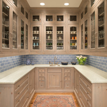
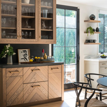
Large butler's pantry approximately 8 ft wide. This space features a ton of storage from both recessed and glass panel cabinets. The cabinets have a lightwood finish and is accented very well with a blue tile backsplash.
122.206 Billeder af køkken med beige skabe og skabe i lyst træ
2