19.951 Billeder af køkken med en planlimet vask og hvid bordplade
Sorteret efter:
Budget
Sorter efter:Populær i dag
101 - 120 af 19.951 billeder
Item 1 ud af 3
Атмосферная сталинка в Москве
Трёхкомнатная квартира в доме 1958 года постройки. Молодая семейная пара, ребята работают в геймдеве, занимаются маркетингом игр.
Проект интересен:
- организованной и согласованной перепланировкой, в которой уместилось большое количество встроенного хранения корпусами икеа(сецчас их можно заменить серией из хоф) .
- Разместили колонну стиральной и сушильной машин в санузле. Сделали душевую зону из стеклоблоков.
- Сохранили газовое обеспечение, при этом на кухне почти все его следы закрыли.
- Одну комнату оформили под кабинет с перспективой, что там будет актуальна и детская.
- В спальне разместили гардеробную и ещё одно рабочее место, тк ребята периодически работают удалённо.
- Бюджет берегли, применялись правила разумной экономии. В интерьере использованы отреставрированная советская мебель и люстры , сохранена родная резная розетка на потолке.
- Ну и главное: результат перепланировки- избавились от длинного коридора и получили развернутое и воздушное пространство и прекрасный вид при входе. Распашные двери на балкон открывают вид на двор с пышной березой.
– в интерьере много винтажа, собственно и интерьер собирали с купленных хозяйкой винтажных люстр еще до проекта
Bâtiment des années 30, cet ancien hôpital de jour transformé en habitation avait besoin d'être remis au goût de ses nouveaux propriétaires.
Les couleurs passent d'une pièce à une autre, et nous accompagnent dans la maison. L'artiste Resco à su mélanger ces différentes couleurs pour les rassembler dans ce grand escalier en chêne illuminé par une verrière.
Les sérigraphies, source d'inspiration dès le départ de la conception, se marient avec les couleurs choisies.
Des meubles sur-mesure structurent et renforcent l'originalité de chaque espace, en mélangeant couleur, bois clair et carrelage carré.
Avec les rendus 3D, le but du projet était de pouvoir visualiser les différentes solutions envisageable pour rendre plus chaleureux le salon, qui était tout blanc. De plus, il fallait ici réfléchir sur une restructuration de la bibliothèque / meuble TV.
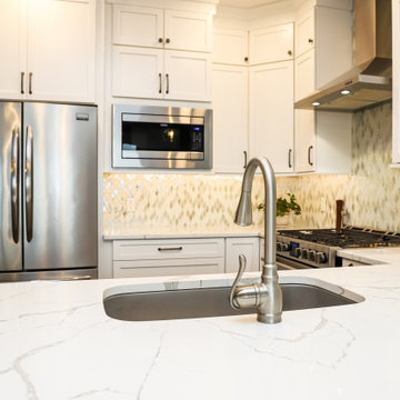
“With the open-concept floor plan, this kitchen needed to have a galley layout,” Ellison says. A large island helps delineate the kitchen from the other rooms around it. These include a dining area directly behind the kitchen and a living room to the right of the dining room. This main floor also includes a small TV lounge, a powder room and a mudroom. The house sits on a slope, so this main level enjoys treehouse-like canopy views out the back. The bedrooms are on the walk-out lower level.“These homeowners liked grays and neutrals, and their style leaned contemporary,” Ellison says. “They also had a very nice art collection.” The artwork is bright and colorful, and a neutral scheme provided the perfect backdrop for it.
They also liked the idea of using durable laminate finishes on the cabinetry. The laminates have the look of white oak with vertical graining. The galley cabinets are lighter and warmer, while the island has the look of white oak with a gray wash for contrast. The countertops and backsplash are polished quartzite. The quartzite adds beautiful natural veining patterns and warm tones to the room.
Our Austin studio decided to go bold with this project by ensuring that each space had a unique identity in the Mid-Century Modern style bathroom, butler's pantry, and mudroom. We covered the bathroom walls and flooring with stylish beige and yellow tile that was cleverly installed to look like two different patterns. The mint cabinet and pink vanity reflect the mid-century color palette. The stylish knobs and fittings add an extra splash of fun to the bathroom.
The butler's pantry is located right behind the kitchen and serves multiple functions like storage, a study area, and a bar. We went with a moody blue color for the cabinets and included a raw wood open shelf to give depth and warmth to the space. We went with some gorgeous artistic tiles that create a bold, intriguing look in the space.
In the mudroom, we used siding materials to create a shiplap effect to create warmth and texture – a homage to the classic Mid-Century Modern design. We used the same blue from the butler's pantry to create a cohesive effect. The large mint cabinets add a lighter touch to the space.
---
Project designed by the Atomic Ranch featured modern designers at Breathe Design Studio. From their Austin design studio, they serve an eclectic and accomplished nationwide clientele including in Palm Springs, LA, and the San Francisco Bay Area.
For more about Breathe Design Studio, see here: https://www.breathedesignstudio.com/
To learn more about this project, see here: https://www.breathedesignstudio.com/atomic-ranch
A large island with Valor White quartz countertops allows for counter seating. The three pendants above the island keep the space simple and balanced. The matt black fixture with clear water glass add interest.
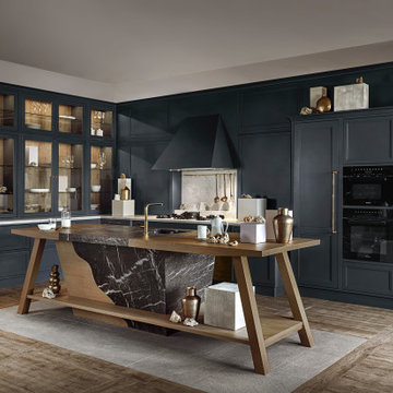
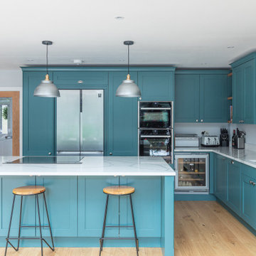
A meeting... Of materials: stainless steel, glass, white Carrara marble, wood, black Marquinia stone. Of styles, Farmhouse Shaker style contemporary and classic yet gives of the warm feeling of a rustic vibe interior design, creating a third, which transcends time. Match of finishes: hammering, antique brass finish, trowel, natural finish, matte, shiny reflective glass. An encounter between optimal functionality and pure aesthetics, which coexist in perfect balance. Blue avio, a color blue kitchen, played down by the large contemporary island and Shaker Style Cabinets, which aesthetically create a clever play of depth. The workhorse is undoubtedly his island, a dialogue of styles between classic and contemporary, a combination of materials in which honey-colored wood meets Nero Marquinia stone in a brushed finish and marble. The visual contrast alone, but also the Italian excellence of the material quality, make it a true work of art.
The mixture of black accents with light woods give this Julia Zettler Design kitchen the ultimate modern look.
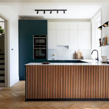
Darkest green base cabinets were paired with off white wall units and walnut cladding to create a beautiful modern kitchen. Details include a slim profile ceramic worktop and splashback, oak block herringbone floor, wrap around kitchen shelf and black and brass wall lights.
Amos Goldreich Architecture has completed an asymmetric brick extension that celebrates light and modern life for a young family in North London. The new layout gives the family distinct kitchen, dining and relaxation zones, and views to the large rear garden from numerous angles within the home.
The owners wanted to update the property in a way that would maximise the available space and reconnect different areas while leaving them clearly defined. Rather than building the common, open box extension, Amos Goldreich Architecture created distinctly separate yet connected spaces both externally and internally using an asymmetric form united by pale white bricks.
Previously the rear plan of the house was divided into a kitchen, dining room and conservatory. The kitchen and dining room were very dark; the kitchen was incredibly narrow and the late 90’s UPVC conservatory was thermally inefficient. Bringing in natural light and creating views into the garden where the clients’ children often spend time playing were both important elements of the brief. Amos Goldreich Architecture designed a large X by X metre box window in the centre of the sitting room that offers views from both the sitting area and dining table, meaning the clients can keep an eye on the children while working or relaxing.
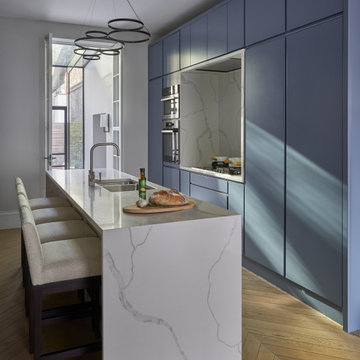
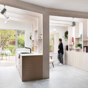
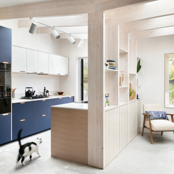
Amos Goldreich Architecture enlivened and lightened the home by working with materials that encourage the diffusion of light throughout the spaces. Exposed timber rafters create a clever shelving screen, functioning both as open storage and a permeable room divider to maintain the connection between the sitting area and kitchen. A deep blue kitchen with plywood handle detailing creates balance and contrast against the light tones of the pale timber and white walls.
The new extension is clad in white bricks which help to bounce light around the new interiors, emphasise the freshness and newness, and create a clear, distinct separation from the existing part of the late Victorian semi-detached London home. Brick continues to make an impact in the patio area where Amos Goldreich Architecture chose to use Stone Grey brick pavers for their muted tones and durability. A sedum roof spans the entire extension giving a beautiful view from the first floor bedrooms. The sedum roof also acts to encourage biodiversity and collect rainwater.
Continues
Amos Goldreich, Director of Amos Goldreich Architecture says:
“The Framework House was a fantastic project to work on with our clients. We thought carefully about the space planning to ensure we met the brief for distinct zones, while also keeping a connection to the outdoors and others in the space.
“The materials of the project also had to marry with the new plan. We chose to keep the interiors fresh, calm, and clean so our clients could adapt their future interior design choices easily without the need to renovate the space again.”
Clients, Tom and Jennifer Allen say:
“I couldn’t have envisioned having a space like this. It has completely changed the way we live as a family for the better. We are more connected, yet also have our own spaces to work, eat, play, learn and relax.”
“The extension has had an impact on the entire house. When our son looks out of his window on the first floor, he sees a beautiful planted roof that merges with the garden.”
Amos Goldreich Architecture has completed an asymmetric brick extension that celebrates light and modern life for a young family in North London. The new layout gives the family distinct kitchen, dining and relaxation zones, and views to the large rear garden from numerous angles within the home.
The owners wanted to update the property in a way that would maximise the available space and reconnect different areas while leaving them clearly defined. Rather than building the common, open box extension, Amos Goldreich Architecture created distinctly separate yet connected spaces both externally and internally using an asymmetric form united by pale white bricks.
Previously the rear plan of the house was divided into a kitchen, dining room and conservatory. The kitchen and dining room were very dark; the kitchen was incredibly narrow and the late 90’s UPVC conservatory was thermally inefficient. Bringing in natural light and creating views into the garden where the clients’ children often spend time playing were both important elements of the brief. Amos Goldreich Architecture designed a large X by X metre box window in the centre of the sitting room that offers views from both the sitting area and dining table, meaning the clients can keep an eye on the children while working or relaxing.
Amos Goldreich Architecture enlivened and lightened the home by working with materials that encourage the diffusion of light throughout the spaces. Exposed timber rafters create a clever shelving screen, functioning both as open storage and a permeable room divider to maintain the connection between the sitting area and kitchen. A deep blue kitchen with plywood handle detailing creates balance and contrast against the light tones of the pale timber and white walls.
The new extension is clad in white bricks which help to bounce light around the new interiors, emphasise the freshness and newness, and create a clear, distinct separation from the existing part of the late Victorian semi-detached London home. Brick continues to make an impact in the patio area where Amos Goldreich Architecture chose to use Stone Grey brick pavers for their muted tones and durability. A sedum roof spans the entire extension giving a beautiful view from the first floor bedrooms. The sedum roof also acts to encourage biodiversity and collect rainwater.
Continues
Amos Goldreich, Director of Amos Goldreich Architecture says:
“The Framework House was a fantastic project to work on with our clients. We thought carefully about the space planning to ensure we met the brief for distinct zones, while also keeping a connection to the outdoors and others in the space.
“The materials of the project also had to marry with the new plan. We chose to keep the interiors fresh, calm, and clean so our clients could adapt their future interior design choices easily without the need to renovate the space again.”
Clients, Tom and Jennifer Allen say:
“I couldn’t have envisioned having a space like this. It has completely changed the way we live as a family for the better. We are more connected, yet also have our own spaces to work, eat, play, learn and relax.”
“The extension has had an impact on the entire house. When our son looks out of his window on the first floor, he sees a beautiful planted roof that merges with the garden.”
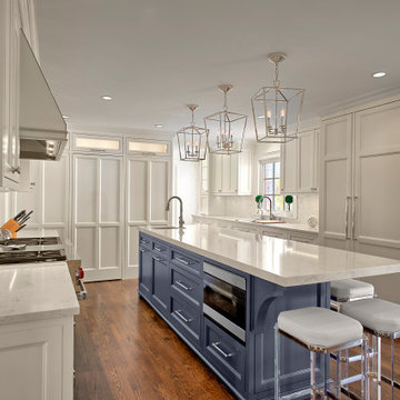
Transitional yet classic, this elegant white kitchen has accents of deep blue at the base of the island, the bar cabinetry and the paneled wine refrigerator. Stainless steel bands on the range hood complement the lantern pendants above the island. A spacious walk-in pantry with touch latch door and glass upper panels frames the kitchen with a touch of elegance.
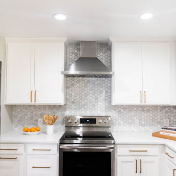
Vertical shot of the kitchen hood and appliances. Featuring white shaker cabinets, wood floors, gold hardware, and a gray backsplash.
How’s this for brightening up your day? This is our latest project hot off the press – a beautiful family kitchen in Letchworth, Herts. hand painted in Goblin by the Little Greene Paint Company.
The large, open plan space lends itself, perfectly, to the rich colour of the bespoke Shaker cabinets, creating a kitchen zone where the vibrancy of the blue/green pops in the otherwise neutral colour scheme of the wider space. We’re excited to see how much green is taking off in kitchen trends and this particular shade is bang on trend!
Providing ample space for sitting as well as prepping and storage, the large kitchen island with its CRL Calacatta Quartz worktop is as functional as it is beautiful. The sharp white marble finish is durable enough for family living and pairs beautifully with the integrated Neff hob and downdraft extractor.
The shelving above the sink run looks fab with the integrated lighting and adds the touch of personality that comes with a totally bespoke design, whilst the Quooker Flex Tap in Stainless Steel looks elegant against the Quartz worktop. Finally, check out the tall cupboard with its spice rack (or bottle holder) built into the door. All of our cabinetry is built to your specification so that no space, no matter how small is wasted. Genius!
La cucina studiata in modo da essere funzionale e dialogare con l'ambiente del living annesso. le mensole a lato del forno infatti sono dello stesso legno di recupero dei primi gradini della scala. I toni sono neutri e le linee pulite per dare maggiore evidenza all'isola realizzata in pietra ardesia.
19.951 Billeder af køkken med en planlimet vask og hvid bordplade
6