137 Billeder af køkken med ikke-porøs bordplade og terrazzogulv
Sorteret efter:
Budget
Sorter efter:Populær i dag
81 - 100 af 137 billeder
Item 1 ud af 3
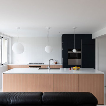
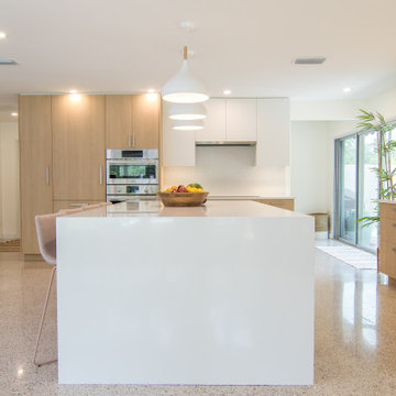
Un et un ne font qu’un. Né de la réunion de deux appartements modernistes, ce duplex tout en volumes se caractérise par son allure épuré. On y entre au second par la pièce de vie ; un plan libre offrant la meilleure vue sur la Marne. Un escalier central descend dans le prolongement de l’îlot pour distribuer les pièces de nuit tout en intimité. Grâce à cette transformation, Marie et Luc gardent leur adresse idyllique sur les bords de Marne et savourent tout le confort d’un appartement résolument contemporain à la pointe de la technologie.
On continue la visite de l'appartement (Voir la réalisation "Comme une maison sur les toits"), par la cuisine qui a subi un sérieux lifting.
Auparavant, elle était séparée de la salle à manger, par un office, pièces désuète.
Le souhait initial de mon client aurait été de tout ouvrir sur la salle à manger, mais le mur porteur compliquait les choses : outre le budget qui allait monter, il aurait fallu attendre l'accord de la copropriété, ce qui aurait retardé le chantier total. Je lui ai donc proposé de faire disparaître l'office, et d'agrandir la cuisine: le nouveau plan propose un îlot central qui permet de manger à huit personnes, cette pièce devient donc une vraie cuisine dînatoire.
Le choix du vrai terrazzo s'est imposé à mes yeux, car j'ai voulu à tout prix replacer la magnifique suspension vertigo cuivrée, le terrazzo fait écho à sa belle couleur.
Un mur d'armoire vient dissimuler tout l'électroménager, et permet de cacher également l'un des poteaux porteurs d'une colonne de l'immeuble, le phénix, matériau mat par excellence, finalise cette nouvelle cuisine.
Nearly two decades ago now, Susan and her husband put a letter in the mailbox of this eastside home: "If you have any interest in selling, please reach out." But really, who would give up a Flansburgh House?
Fast forward to 2020, when the house went on the market! By then it was clear that three children and a busy home design studio couldn't be crammed into this efficient footprint. But what's second best to moving into your dream home? Being asked to redesign the functional core for the family that was.
In this classic Flansburgh layout, all the rooms align tidily in a square around a central hall and open air atrium. As such, all the spaces are both connected to one another and also private; and all allow for visual access to the outdoors in two directions—toward the atrium and toward the exterior. All except, in this case, the utilitarian galley kitchen. That space, oft-relegated to second class in midcentury architecture, got the shaft, with narrow doorways on two ends and no good visual access to the atrium or the outside. Who spends time in the kitchen anyway?
As is often the case with even the very best midcentury architecture, the kitchen at the Flansburgh House needed to be modernized; appliances and cabinetry have come a long way since 1970, but our culture has evolved too, becoming more casual and open in ways we at SYH believe are here to stay. People (gasp!) do spend time—lots of time!—in their kitchens! Nonetheless, our goal was to make this kitchen look as if it had been designed this way by Earl Flansburgh himself.
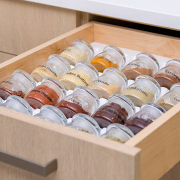
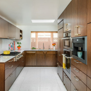
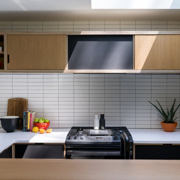
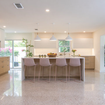
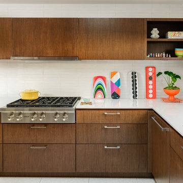
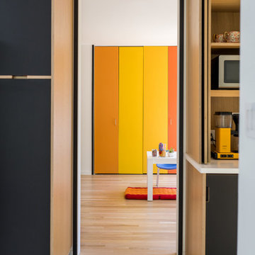
The house came to us full of bold, bright color. We edited out some of it (along with the walls it was on) but kept and built upon the stunning red, orange and yellow closet doors in the family room adjacent to the kitchen. That pop was balanced by a few colorful midcentury pieces that our clients already owned, and the stunning light and verdant green coming in from both the atrium and the perimeter of the house, not to mention the many skylights. Thus, the rest of the space just needed to quiet down and be a beautiful, if neutral, foil. White terrazzo tile grounds custom plywood and black cabinetry, offset by a half wall that offers both camouflage for the cooking mess and also storage below, hidden behind seamless oak tambour.
Contractor: Rusty Peterson
Cabinetry: Stoll's Woodworking
Photographer: Sarah Shields
Nearly two decades ago now, Susan and her husband put a letter in the mailbox of this eastside home: "If you have any interest in selling, please reach out." But really, who would give up a Flansburgh House?
Fast forward to 2020, when the house went on the market! By then it was clear that three children and a busy home design studio couldn't be crammed into this efficient footprint. But what's second best to moving into your dream home? Being asked to redesign the functional core for the family that was.
In this classic Flansburgh layout, all the rooms align tidily in a square around a central hall and open air atrium. As such, all the spaces are both connected to one another and also private; and all allow for visual access to the outdoors in two directions—toward the atrium and toward the exterior. All except, in this case, the utilitarian galley kitchen. That space, oft-relegated to second class in midcentury architecture, got the shaft, with narrow doorways on two ends and no good visual access to the atrium or the outside. Who spends time in the kitchen anyway?
As is often the case with even the very best midcentury architecture, the kitchen at the Flansburgh House needed to be modernized; appliances and cabinetry have come a long way since 1970, but our culture has evolved too, becoming more casual and open in ways we at SYH believe are here to stay. People (gasp!) do spend time—lots of time!—in their kitchens! Nonetheless, our goal was to make this kitchen look as if it had been designed this way by Earl Flansburgh himself.
The house came to us full of bold, bright color. We edited out some of it (along with the walls it was on) but kept and built upon the stunning red, orange and yellow closet doors in the family room adjacent to the kitchen. That pop was balanced by a few colorful midcentury pieces that our clients already owned, and the stunning light and verdant green coming in from both the atrium and the perimeter of the house, not to mention the many skylights. Thus, the rest of the space just needed to quiet down and be a beautiful, if neutral, foil. White terrazzo tile grounds custom plywood and black cabinetry, offset by a half wall that offers both camouflage for the cooking mess and also storage below, hidden behind seamless oak tambour.
Contractor: Rusty Peterson
Cabinetry: Stoll's Woodworking
Photographer: Sarah Shields
• Full Kitchen Renovation
• General Contractor - Area Construction
• Custom casework - Natural American Walnut Veneer
• Decorative Accessory Styling
• Cooktop - Wolf
• Exhaust Hood - Zephyr
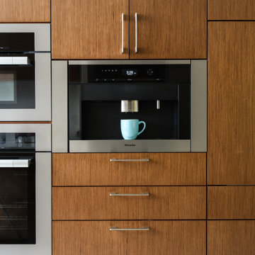
• Dishwasher - Miele
• Refridgerator - Sub-zero
• Ovens - Miele
• Coffee System - Miele
• Backsplash tile - Heath Tile
• Countertop - Diresco
• Custom under-mount sink - Berlin
• Pull-down + Filtration Faucets - Waterstone
• Decorative Hardware - Sugatsune
• Terrazzo floor tile - Waterworks
Alex Maguire Photography
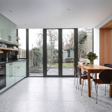
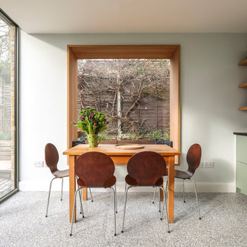
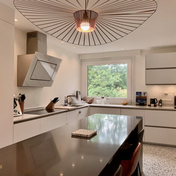
One of the nicest thing that can happen as an architect is that a client returns to you because they enjoyed working with us so much the first time round. Having worked on the bathroom in 2016 we were recently asked to look at the kitchen and to advice as to how we could extend into the garden without completely invading the space. We wanted to be able to "sit in the kitchen and still be sitting in the garden".
Alex Maguire Photography
One of the nicest thing that can happen as an architect is that a client returns to you because they enjoyed working with us so much the first time round. Having worked on the bathroom in 2016 we were recently asked to look at the kitchen and to advice as to how we could extend into the garden without completely invading the space. We wanted to be able to "sit in the kitchen and still be sitting in the garden".
Nearly two decades ago now, Susan and her husband put a letter in the mailbox of this eastside home: "If you have any interest in selling, please reach out." But really, who would give up a Flansburgh House?
Fast forward to 2020, when the house went on the market! By then it was clear that three children and a busy home design studio couldn't be crammed into this efficient footprint. But what's second best to moving into your dream home? Being asked to redesign the functional core for the family that was.
In this classic Flansburgh layout, all the rooms align tidily in a square around a central hall and open air atrium. As such, all the spaces are both connected to one another and also private; and all allow for visual access to the outdoors in two directions—toward the atrium and toward the exterior. All except, in this case, the utilitarian galley kitchen. That space, oft-relegated to second class in midcentury architecture, got the shaft, with narrow doorways on two ends and no good visual access to the atrium or the outside. Who spends time in the kitchen anyway?
As is often the case with even the very best midcentury architecture, the kitchen at the Flansburgh House needed to be modernized; appliances and cabinetry have come a long way since 1970, but our culture has evolved too, becoming more casual and open in ways we at SYH believe are here to stay. People (gasp!) do spend time—lots of time!—in their kitchens! Nonetheless, our goal was to make this kitchen look as if it had been designed this way by Earl Flansburgh himself.
The house came to us full of bold, bright color. We edited out some of it (along with the walls it was on) but kept and built upon the stunning red, orange and yellow closet doors in the family room adjacent to the kitchen. That pop was balanced by a few colorful midcentury pieces that our clients already owned, and the stunning light and verdant green coming in from both the atrium and the perimeter of the house, not to mention the many skylights. Thus, the rest of the space just needed to quiet down and be a beautiful, if neutral, foil. White terrazzo tile grounds custom plywood and black cabinetry, offset by a half wall that offers both camouflage for the cooking mess and also storage below, hidden behind seamless oak tambour.
Contractor: Rusty Peterson
Cabinetry: Stoll's Woodworking
Photographer: Sarah Shields
• Full Kitchen Renovation
• General Contractor: Area Construction
• Custom casework - Natural American Walnut Veneer
• Decorative Accessory Styling
• Decorative Hardware - Sugatsune
• Ovens - Miele
• Coffee System - Miele
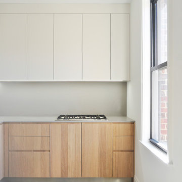
• Full Kitchen Renovation
• General Contractor: Area Construction
• Custom casework: Natural American Walnut Veneer
• Decorative Accessory Styling
• Backsplash tile - Heath Tile
• Cooktop - Wolf
• Exhaust Hood - Zephyr
• Countertop - Diresco
• Decorative Hardware - Sugatsune
• Terrazzo tile - Waterworks
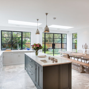
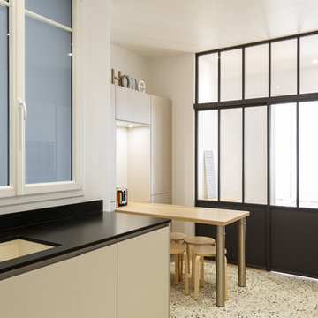
The bright open kitchen dining room provides and elegant space full of light to either cook, dine or simply hang out in.
On continue la visite de l'appartement (Voir la réalisation "Comme une maison sur les toits"), par la cuisine qui a subi un sérieux lifting.
Auparavant, elle était séparée de la salle à manger, par un office, pièces désuète.
Le souhait initial de mon client aurait été de tout ouvrir sur la salle à manger, mais le mur porteur compliquait les choses : outre le budget qui allait monter, il aurait fallu attendre l'accord de la copropriété, ce qui aurait retardé le chantier total. Je lui ai donc proposé de faire disparaître l'office, et d'agrandir la cuisine: le nouveau plan propose un îlot central qui permet de manger à huit personnes, cette pièce devient donc une vraie cuisine dînatoire.
Le choix du vrai terrazzo s'est imposé à mes yeux, car j'ai voulu à tout prix replacer la magnifique suspension vertigo cuivrée, le terrazzo fait écho à sa belle couleur.
Un mur d'armoire vient dissimuler tout l'électroménager, et permet de cacher également l'un des poteaux porteurs d'une colonne de l'immeuble, le phénix, matériau mat par excellence, finalise cette nouvelle cuisine.
Nearly two decades ago now, Susan and her husband put a letter in the mailbox of this eastside home: "If you have any interest in selling, please reach out." But really, who would give up a Flansburgh House?
Fast forward to 2020, when the house went on the market! By then it was clear that three children and a busy home design studio couldn't be crammed into this efficient footprint. But what's second best to moving into your dream home? Being asked to redesign the functional core for the family that was.
In this classic Flansburgh layout, all the rooms align tidily in a square around a central hall and open air atrium. As such, all the spaces are both connected to one another and also private; and all allow for visual access to the outdoors in two directions—toward the atrium and toward the exterior. All except, in this case, the utilitarian galley kitchen. That space, oft-relegated to second class in midcentury architecture, got the shaft, with narrow doorways on two ends and no good visual access to the atrium or the outside. Who spends time in the kitchen anyway?
As is often the case with even the very best midcentury architecture, the kitchen at the Flansburgh House needed to be modernized; appliances and cabinetry have come a long way since 1970, but our culture has evolved too, becoming more casual and open in ways we at SYH believe are here to stay. People (gasp!) do spend time—lots of time!—in their kitchens! Nonetheless, our goal was to make this kitchen look as if it had been designed this way by Earl Flansburgh himself.
The house came to us full of bold, bright color. We edited out some of it (along with the walls it was on) but kept and built upon the stunning red, orange and yellow closet doors in the family room adjacent to the kitchen. That pop was balanced by a few colorful midcentury pieces that our clients already owned, and the stunning light and verdant green coming in from both the atrium and the perimeter of the house, not to mention the many skylights. Thus, the rest of the space just needed to quiet down and be a beautiful, if neutral, foil. White terrazzo tile grounds custom plywood and black cabinetry, offset by a half wall that offers both camouflage for the cooking mess and also storage below, hidden behind seamless oak tambour.
Contractor: Rusty Peterson
Cabinetry: Stoll's Woodworking
Photographer: Sarah Shields
137 Billeder af køkken med ikke-porøs bordplade og terrazzogulv
5