26.475 Billeder af køkken med sorte hvidevarer og hvid bordplade
Sorteret efter:
Budget
Sorter efter:Populær i dag
41 - 60 af 26.475 billeder
Item 1 ud af 3
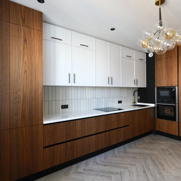
Кухня, безупречно сочетающая в себе настроение американской классики и эстетики стиля арт-деко. Шпонированные фасады EGO в цвете американский орех и белоснежные фасады VITO, придающие лёгкость и воздушность всему интерьеру.
Довершает дизайн современная бытовая техника и утончённые ручки.
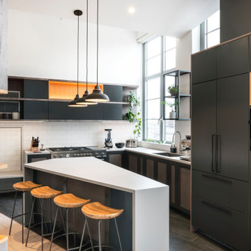
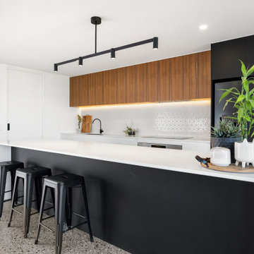
A daring combination of forms and finishes yielded an exciting contemporary/industrial hybrid. In a converted wedge-shaped factory building, this loft’s quirky shape was celebrated, not disguised. Contrasting flooring demarcates what is, in fact, a literal work triangle. The island’s unusual five-sided shape proudly reiterates the room’s footprint; the three waterfall ends accentuate its one-of-a-kind geometry. Four different materials were chosen to establish a playful dialogue between light, dark, and texture: caramel-stained rift cut oak on open cabinets; matte charcoal gray paint on tall and wall cabinets; brushed bronze oil-rubbed wire mesh inserts for bases; and panels in a laminate resembling knotty weathered wood. White quartz countertops provide a unifying feature. Open cabinets are singular for their asymmetrical placement and, in some spots, open-ended configuration within the tall units.
The breathtaking dining table was fashioned from two free-form live edge planks, joined by a ribbon of clear epoxy resin, thus creating the illusion of a stream meandering through fallen trees. Black elements contribute an industrial edge: an open-framed metal wall shelf over the sink; iron table legs; a mix of dining chairs in mid-century wire mesh, molded plastic, and retro aluminum; and machinery castors on the low-slung coffee table.
This project was designed by Bilotta Designer Daniel Popescu in collaboration with MeldNYC. Photography is by Nico Arellano.
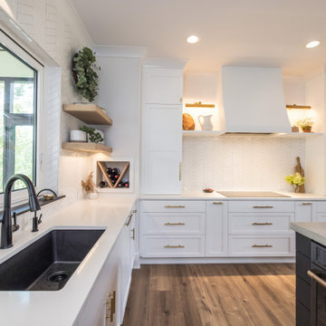
This modern farmhouse kitchen by Glover Design LLC and Isabella Grace Refined Homes features an ActivWall Gas Strut Window connecting the kitchen to the adjacent screened dining area.
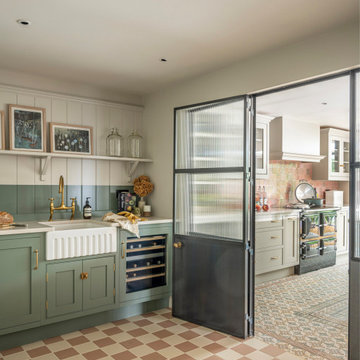
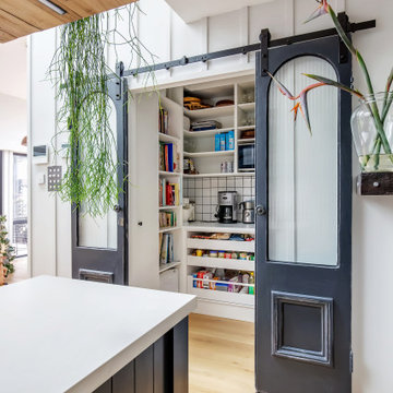
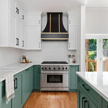
A colouful kitchen in a victorian house renovation. The view here is from the pantry through to main kitchen which features two tone kitchen cabinets in soft green and off-white. The areas are separated with crittall doors with reeded glass
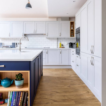
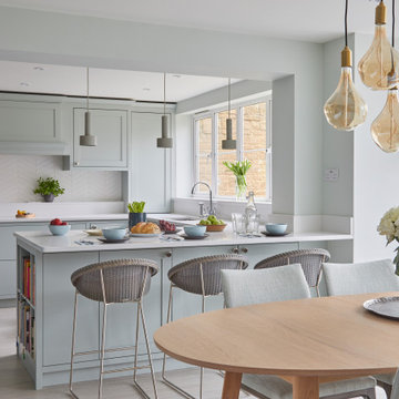
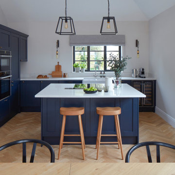
SOMETIMES, A CLASSIC DESIGN IS ALL YOU NEED FOR AN OPEN-PLAN SPACE THAT WORKS FOR THE WHOLE FAMILY.
This client wanted to extend their existing space to create an open plan kitchen where the whole family could spend time together.
To meet this brief, we used the beautiful Shelford from our British kitchen range, with shaker doors in Inkwell Blue and Light Grey.
The stunning kitchen island added the wow factor to this design, where the sink was located and also some beautiful oak shelving to house books and accessories.
We used quartz composite worktops in Ice Branco throughout, Blanco sink and taps, and completed the space with AEG built-in and integrated appliances.
We also created a functional utility room, which complemented the main kitchen design.
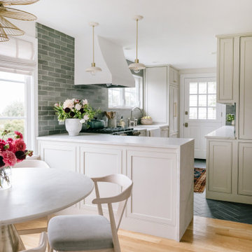
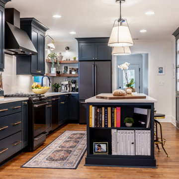
Lovely kitchen remodel featuring inset cabinetry, herringbone patterned tile, Cedar & Moss lighting, and freshened up surfaces throughout. Design: Cohesively Curated. Photos: Carina Skrobecki. Build: Blue Sound Construction, Inc.
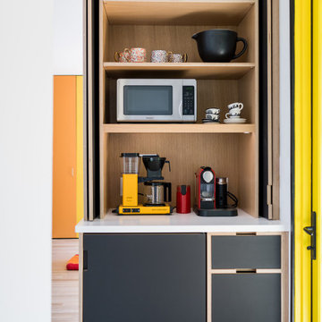
Nearly two decades ago now, Susan and her husband put a letter in the mailbox of this eastside home: "If you have any interest in selling, please reach out." But really, who would give up a Flansburgh House?
Fast forward to 2020, when the house went on the market! By then it was clear that three children and a busy home design studio couldn't be crammed into this efficient footprint. But what's second best to moving into your dream home? Being asked to redesign the functional core for the family that was.
In this classic Flansburgh layout, all the rooms align tidily in a square around a central hall and open air atrium. As such, all the spaces are both connected to one another and also private; and all allow for visual access to the outdoors in two directions—toward the atrium and toward the exterior. All except, in this case, the utilitarian galley kitchen. That space, oft-relegated to second class in midcentury architecture, got the shaft, with narrow doorways on two ends and no good visual access to the atrium or the outside. Who spends time in the kitchen anyway?
As is often the case with even the very best midcentury architecture, the kitchen at the Flansburgh House needed to be modernized; appliances and cabinetry have come a long way since 1970, but our culture has evolved too, becoming more casual and open in ways we at SYH believe are here to stay. People (gasp!) do spend time—lots of time!—in their kitchens! Nonetheless, our goal was to make this kitchen look as if it had been designed this way by Earl Flansburgh himself.
The house came to us full of bold, bright color. We edited out some of it (along with the walls it was on) but kept and built upon the stunning red, orange and yellow closet doors in the family room adjacent to the kitchen. That pop was balanced by a few colorful midcentury pieces that our clients already owned, and the stunning light and verdant green coming in from both the atrium and the perimeter of the house, not to mention the many skylights. Thus, the rest of the space just needed to quiet down and be a beautiful, if neutral, foil. White terrazzo tile grounds custom plywood and black cabinetry, offset by a half wall that offers both camouflage for the cooking mess and also storage below, hidden behind seamless oak tambour.
Contractor: Rusty Peterson
Cabinetry: Stoll's Woodworking
Photographer: Sarah Shields
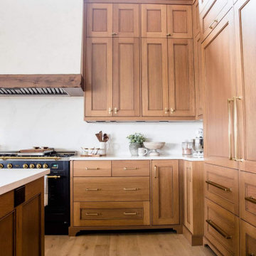
Furniture toe details throughout kitchen. Fridge/freezer Sub-Zero units. All switches and outlets are underneath upper cabinetry to keep a clean backsplash.
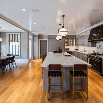
This kitchen was designed for a family who decided to leave life in the big city and move up to Westchester for more room. The large space exuberates a calm, clean and classic feeling. “I love being brought in as a collaborative partner with both the architect and homeowner. It becomes my job as the kitchen designer to deliver on the vision of which the architect and homeowner are dreaming” says Bilotta Designer Randy O’Kane. The details become the focus, such as in this case, using just the right fluted Bendheim low iron Pyramid textured glass with just the correct proportions. Understanding the appliances (a mix of SubZero, Wolf and Miele) and their exterior panel and space requirements is critical. Framing out each doorway while lining up all the reveals can only happen when the architect has an eye for detail. Ira of Ira Grandberg Architects focuses on how all the surrounding rooms center on the kitchen so that from every angle you see one cohesive space, interfacing with the adjacent rooms. The client had specific "asks" as it related to the door style and color as well as the range and hood (a La Canche French Range by Art Culinaire in Matte Black with Brass Trim with a Custom Hood by Rangecraft.) Kismet is when there are "just the right" number of cooks creating this amazing kitchen. The challenge for the architect was designing a larger eat-in kitchen that did not feel overpowering. With all the light coming in from the many windows they wanted to keep the space bright but not use the typical white paint and so opted for a soft grey for the custom cabinetry. They decided to forgo the cabinet and countertop surfaces on the exterior wall so that they could have a large table for the family to eat meals at together. This also brought an enormous amount of light into the space – very inviting.
Bilotta Designer: Randy O’Kane
Photographer: Kirt Washington
Architect: Ira Grandberg Architects
Builder: ABC Construction
26.475 Billeder af køkken med sorte hvidevarer og hvid bordplade
3
