15.481 Billeder af køkken med spejl som stænkplade og stænkplade i granit
Sorteret efter:
Budget
Sorter efter:Populær i dag
41 - 60 af 15.481 billeder
Item 1 ud af 3
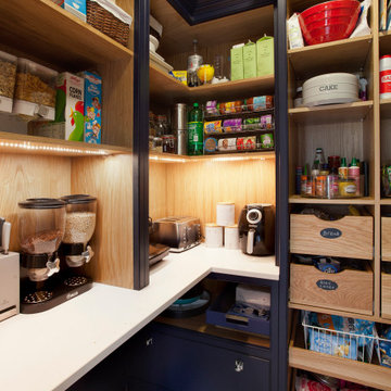
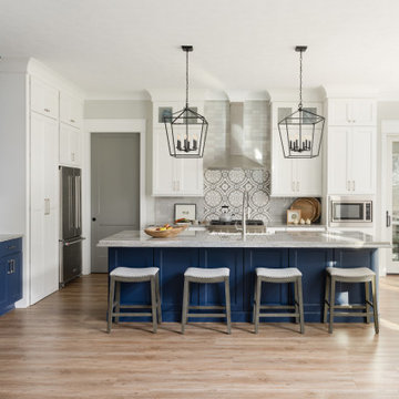
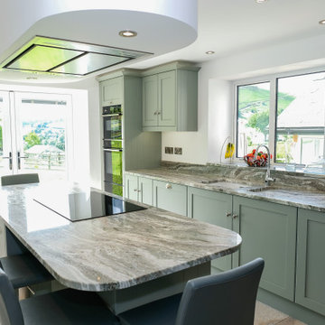
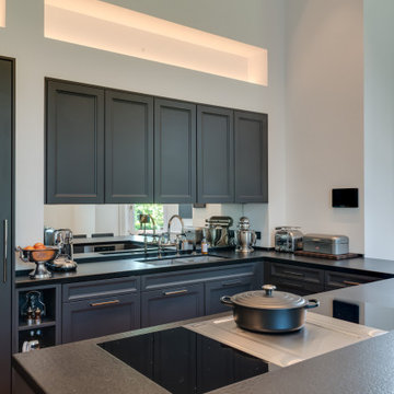
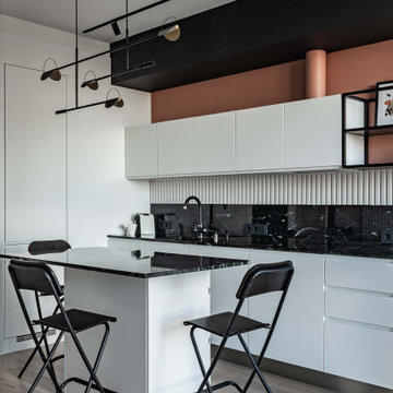
Classical kitchen with Navy hand painted finish with Silestone quartz work surfaces & mirror splash back.
The new kitchen extension provided a foot print of approx 8.6m by 5.6m. We took a small space out of this footage by elongating the hallway to provide a utility room opposite a full height, double coat cupboard before entering the new kitchen.
As this is a new part of the house we embraced the modernity and choose sleek, handleless blue cabintery. The bronzed mirrored splashback adds warmth as well as maximising the sense of space.
Photography by @paullcraig
This sky home with stunning views over Brisbane's CBD, the river and Kangaroo Point Cliffs captures the maturity now
found in inner city living in Brisbane. Originally from Melbourne and with his experience gain from extensive business
travel abroad, the owner of the apartment decided to transform his home to match the cosmopolitan lifestyle he has
enjoyed whilst living in these locations.
The original layout of the kitchen was typical for apartments built over 20 years ago. The space was restricted by a
collection of small rooms, two dining areas plus kitchen that did not take advantage of the views or the need for a strong
connection between living areas and the outdoors.
The new design has managed to still give definition to activities performed in the kitchen, dining and living but through
minimal detail the kitchen does not dominate the space which can often happen in an open plan.
A typical galley kitchen design was selected as it best catered for how the space relates to the rest of the apartment and
adjoining living space. An effortless workflow is created from the start point of the pantry, housing food stores as well as
small appliances, and refrigerator. These are within easy reach of the preparation zones and cooking on the island. Then
delivery to the dining area is seamless.
There are a number of key features used in the design to create the feeling of spaces whilst maximising functionality. The
mirrored kickboards reflect light (aided by the use of LED strip lighting to the underside of the cabinets) creating the illusion
that the cabinets are floating thus reducing the footprint in the design.
The simple design philosophy is continued with the use of Laminam, 3mm porcelain sheets to the vertical and horizontal
surfaces. This material is then mitred on the edges of all drawers and doors extenuate the seamless, minimalist, cube look.
A cantilevered bespoke silky oak timber benchtop placed on the island creates a small breakfast/coffee area whilst
increasing bench space and creating the illusion of more space. The stain and other features of this unique piece of timber
compliments the tones found in the porcelain skin of the kitchen.
The half wall built behind the sinks hides the entry point of the services into the apartment. This has been clad in a
complimentary laminate for the timber benchtop . Mirror splashbacks help reflect more light into the space. The cabinets
above the cleaning zone also appear floating due to the mirrored surface behind and the placement of LED strip lighting
used to highlight the perimeter.
A fully imported FALMAC Stainless Rangehood and flyer over compliments the plasterboard bulkhead that houses the air
conditioning whilst providing task lighting to the island.
Lighting has been used throughout the space to highlight and frame the design elements whist creating illumination for all
tasks completed in the kitchen.
Achieving "fluid motion" has been a major influence in the choice of hardware used in the design. Blum servo drive
electronic drawer opening systems have been used to counter act any issues that may be encounter by the added weight
of the porcelain used on the drawer fronts. These are then married with Blum Intivo soft close drawer systems.
The devil is in the detail with a design and space that is so low profile yet complicated in it's simplicity.
Steve Ryan - Rix Ryan Photography
The kitchen diner of our Fulham Family Home was painted in Paint & Paper Library Capuchin which felt light & elegant, and we added contrast & texture with a granite worktop, pale green & inky blue Shaker kitchen & an oak herringbone parquet floor. A semi sheer curtain helped to prevent glare and added privacy, while the jute rug, upholstered dining chairs & bronze hardware added warmth.
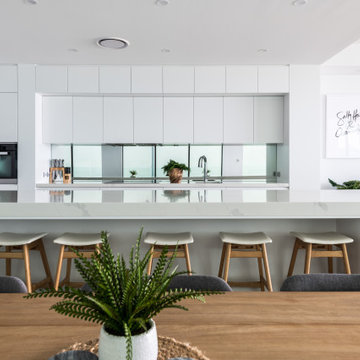
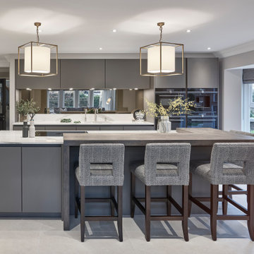
Our Carmel design-build studio planned a beautiful open-concept layout for this home with a lovely kitchen, adjoining dining area, and a spacious and comfortable living space. We chose a classic blue and white palette in the kitchen, used high-quality appliances, and added plenty of storage spaces to make it a functional, hardworking kitchen. In the adjoining dining area, we added a round table with elegant chairs. The spacious living room comes alive with comfortable furniture and furnishings with fun patterns and textures. A stunning fireplace clad in a natural stone finish creates visual interest. In the powder room, we chose a lovely gray printed wallpaper, which adds a hint of elegance in an otherwise neutral but charming space.
---
Project completed by Wendy Langston's Everything Home interior design firm, which serves Carmel, Zionsville, Fishers, Westfield, Noblesville, and Indianapolis.
For more about Everything Home, see here: https://everythinghomedesigns.com/
To learn more about this project, see here:
https://everythinghomedesigns.com/portfolio/modern-home-at-holliday-farms
Amos Goldreich Architecture has completed an asymmetric brick extension that celebrates light and modern life for a young family in North London. The new layout gives the family distinct kitchen, dining and relaxation zones, and views to the large rear garden from numerous angles within the home.
The owners wanted to update the property in a way that would maximise the available space and reconnect different areas while leaving them clearly defined. Rather than building the common, open box extension, Amos Goldreich Architecture created distinctly separate yet connected spaces both externally and internally using an asymmetric form united by pale white bricks.
Previously the rear plan of the house was divided into a kitchen, dining room and conservatory. The kitchen and dining room were very dark; the kitchen was incredibly narrow and the late 90’s UPVC conservatory was thermally inefficient. Bringing in natural light and creating views into the garden where the clients’ children often spend time playing were both important elements of the brief. Amos Goldreich Architecture designed a large X by X metre box window in the centre of the sitting room that offers views from both the sitting area and dining table, meaning the clients can keep an eye on the children while working or relaxing.
Amos Goldreich Architecture enlivened and lightened the home by working with materials that encourage the diffusion of light throughout the spaces. Exposed timber rafters create a clever shelving screen, functioning both as open storage and a permeable room divider to maintain the connection between the sitting area and kitchen. A deep blue kitchen with plywood handle detailing creates balance and contrast against the light tones of the pale timber and white walls.
The new extension is clad in white bricks which help to bounce light around the new interiors, emphasise the freshness and newness, and create a clear, distinct separation from the existing part of the late Victorian semi-detached London home. Brick continues to make an impact in the patio area where Amos Goldreich Architecture chose to use Stone Grey brick pavers for their muted tones and durability. A sedum roof spans the entire extension giving a beautiful view from the first floor bedrooms. The sedum roof also acts to encourage biodiversity and collect rainwater.
Continues
Amos Goldreich, Director of Amos Goldreich Architecture says:
“The Framework House was a fantastic project to work on with our clients. We thought carefully about the space planning to ensure we met the brief for distinct zones, while also keeping a connection to the outdoors and others in the space.
“The materials of the project also had to marry with the new plan. We chose to keep the interiors fresh, calm, and clean so our clients could adapt their future interior design choices easily without the need to renovate the space again.”
Clients, Tom and Jennifer Allen say:
“I couldn’t have envisioned having a space like this. It has completely changed the way we live as a family for the better. We are more connected, yet also have our own spaces to work, eat, play, learn and relax.”
“The extension has had an impact on the entire house. When our son looks out of his window on the first floor, he sees a beautiful planted roof that merges with the garden.”
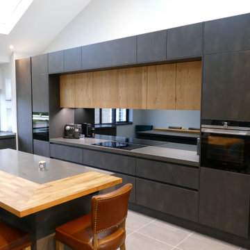
Um auch der Stilwand besondere Offenheit zu verleihen wurde unter den Oberschränken und hinter dem Spülbereich auf einen klassischen Fliesenspiegel verzichtet. Stattdessen gibt eine Spiegel-Verkleidung auch dem wandseitigen Küchenbereich eine offene und großzügige Wirkung.
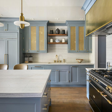
New Custom Kitchen with Brass Accents and Quartzite Counters. Walnut Floating Shelves and Integrated Appliances.
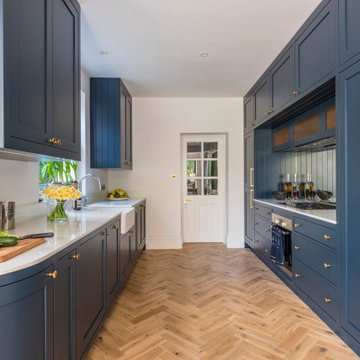
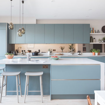
Open-plan living made simple with a deep blue colour scheme running throughout this rear extension in Crouch End, London. Traditionally styled with contemporary features, this handmade kitchen is hand painted with our specialist finish and boasts curved ends on both sides, dovetailed oak drawers and a mirrored splashback.
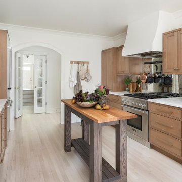
This small kitchen space needed to have every inch function well for this young family. By adding the banquette seating we were able to get the table out of the walkway and allow for easier flow between the rooms. Wall cabinets to the counter on either side of the custom plaster hood gave room for food storage as well as the microwave to get tucked away. The clean lines of the slab drawer fronts and beaded inset make the space feel visually larger.
15.481 Billeder af køkken med spejl som stænkplade og stænkplade i granit
3