1.487 Billeder af moderne entré med en grå dør
Sorteret efter:
Budget
Sorter efter:Populær i dag
141 - 160 af 1.487 billeder
Item 1 ud af 3
This Infill home is in one of Regina’s oldest neighbourhoods. It was extremely important to both the client and ourselves to respect the character of the neighbourhood. We came up with a design that both respected the heritage as well as provide a much needed upgrade and modernization for the homeowner. The interior is inspired by a mixture of modern farmhouse and South African. The barn-style doors in the kitchen leading to the mudroom, as well as the doors in the master suite leading into the ensuite, were repurposed from the home that was previously on the lot.
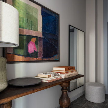
L’entrée sans rangement de cet appartement neuf donnait directement dans la grande pièce à vivre. Nous avons donc créé un placard sur mesure dissimulé derrière un claustra en chêne massif et peint le plafond comme le mur pour créer une boîte et isoler l’entrée du séjour.
Photos Lucie Thomas
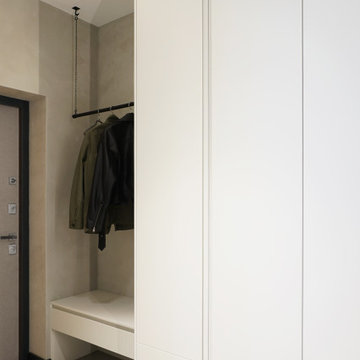
Push to open flap down compartments provide safe storage and easy access for keys and other items, leaving the surface clutter free.
Interior and furniture design - despina design
White Oak never looked so good! These wide planks and color variations will steal the show in any interior.
Квартира 118квм в ЖК Vavilove на Юго-Западе Москвы. Заказчики поставили задачу сделать планировку квартиры с тремя спальнями: родительская и 2 детские, гостиная и обязательно изолированная кухня. Но тк изначально квартира была трехкомнатная, то окон в квартире было всего 4 и одно из помещений должно было оказаться без окна. Выбор пал на гостиную. Именно ее разместили в глубине квартиры без окон. Несмотря на современную планировку по сути эта квартира-распашонка. И нам повезло, что в ней удалось выкроить просторное помещение холла, которое и превратилось в полноценную гостиную. Общая планировка такова, что помимо того, что гостиная без окон, в неё ещё выходят двери всех помещений - и кухни, и спальни, и 2х детских, и 2х су, и коридора - 7 дверей выходят в одно помещение без окон. Задача оказалась нетривиальная. Но я считаю, мы успешно справились и смогли достичь не только функциональной планировки, но и стилистически привлекательного интерьера. В интерьере превалирует зелёная цветовая гамма. Этот природный цвет прекрасно сочетается со всеми остальными природными оттенками, а кто как не природа щедра на интересные приемы и сочетания. Практически все пространства за исключением мастер-спальни выдержаны в светлых тонах.
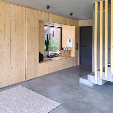
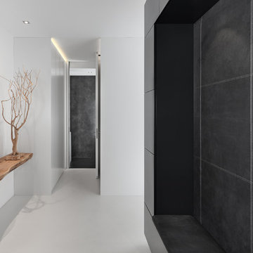
Eingangsbereich mit Einbaugarderobe und Sitzfenster. Flügelgeglätteter Sichtbetonboden mit Betonkernaktivierung und Sichtbetontreppe mit Holzgeländer
Объект находится в Москве, ЖК Vander Park (метро Молодёжная).
Дизайн интерьера разрабатывался для молодой пары. Сложностей особенно не было, квартира маленькая, всего 55м2. Заказчики с большим вкусом и быстро принимали решения, как во время проекта так и во время ремонта, так что всё прошло гладко, если не считать пары моментов с изменением планировки (перенос стиральной машинки из ванной комнаты в скрытую нишу в коридоре, а также смена местами плиты и раковины в зоне кухни). Также ремонт пришелся на весенний Lock down из-за COVID-19, это сильно повлияло на финальные закупки, все пришлось заново выбрать из наличия (шторы, предметы отдельно стоящей мебели).
Концепция пространства довольно проста, нужно было создать интерьер, где всё было бы функционально и эстетично, также нужно было использовать тёмные цвета чтобы "глаз отдыхал". Дело в том, что хозяин квартиры врач и постоянно находится в больнице, где светло и не уютно, нужно было сделать полный антипод.
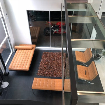
View from a modern day hanging glass and stainless steel bridge to the entrance downstairs. The vertical window structure soars all the way up to the 15 foot ceiling, together with the impressive 15 foot entrance door. The entrance has a sitting area with stylish modern furniture and the eye catcher: A Garage with a Glass wall, showcasing a gorgeous red Ducati. If you love your cars and bikes, this is the garage for you! You can enjoy your vehicles even from inside your home!
Download our free ebook, Creating the Ideal Kitchen. DOWNLOAD NOW
The homeowners built their traditional Colonial style home 17 years’ ago. It was in great shape but needed some updating. Over the years, their taste had drifted into a more contemporary realm, and they wanted our help to bridge the gap between traditional and modern.
We decided the layout of the kitchen worked well in the space and the cabinets were in good shape, so we opted to do a refresh with the kitchen. The original kitchen had blond maple cabinets and granite countertops. This was also a great opportunity to make some updates to the functionality that they were hoping to accomplish.
After re-finishing all the first floor wood floors with a gray stain, which helped to remove some of the red tones from the red oak, we painted the cabinetry Benjamin Moore “Repose Gray” a very soft light gray. The new countertops are hardworking quartz, and the waterfall countertop to the left of the sink gives a bit of the contemporary flavor.
We reworked the refrigerator wall to create more pantry storage and eliminated the double oven in favor of a single oven and a steam oven. The existing cooktop was replaced with a new range paired with a Venetian plaster hood above. The glossy finish from the hood is echoed in the pendant lights. A touch of gold in the lighting and hardware adds some contrast to the gray and white. A theme we repeated down to the smallest detail illustrated by the Jason Wu faucet by Brizo with its similar touches of white and gold (the arrival of which we eagerly awaited for months due to ripples in the supply chain – but worth it!).
The original breakfast room was pleasant enough with its windows looking into the backyard. Now with its colorful window treatments, new blue chairs and sculptural light fixture, this space flows seamlessly into the kitchen and gives more of a punch to the space.
The original butler’s pantry was functional but was also starting to show its age. The new space was inspired by a wallpaper selection that our client had set aside as a possibility for a future project. It worked perfectly with our pallet and gave a fun eclectic vibe to this functional space. We eliminated some upper cabinets in favor of open shelving and painted the cabinetry in a high gloss finish, added a beautiful quartzite countertop and some statement lighting. The new room is anything but cookie cutter.
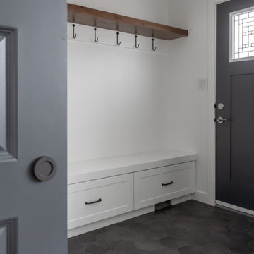
Next the mudroom. You can see a peek of the mudroom across the way from the butler’s pantry which got a facelift with new paint, tile floor, lighting and hardware. Simple updates but a dramatic change! The first floor powder room got the glam treatment with its own update of wainscoting, wallpaper, console sink, fixtures and artwork. A great little introduction to what’s to come in the rest of the home.
The whole first floor now flows together in a cohesive pallet of green and blue, reflects the homeowner’s desire for a more modern aesthetic, and feels like a thoughtful and intentional evolution. Our clients were wonderful to work with! Their style meshed perfectly with our brand aesthetic which created the opportunity for wonderful things to happen. We know they will enjoy their remodel for many years to come!
Photography by Margaret Rajic Photography
Key to the design solution was the client’s extensive brief and the desire to form a layout based on maximising natural light, views and the ‘feeling of space’. The brief seemingly split into three sections this included an open plan living and entertaining wing, a more private living and working wing and a recreational wing with a pool and gym to suit the client’s athletic lifestyle.
The form was derived from traditional vernacular architecture whilst the ‘three wing’ layout and the use of single storey elements and flat roofs helped to break down the massing of the overall building composition.
The material palette was carefully chosen to reflect the rural setting with the use of render, natural stone, slate and untreated vertical larch cladding. Contemporary detailing, large format glazing and zinc cladding have been used to give the house a modern edge.
1.487 Billeder af moderne entré med en grå dør
8