
105 Billeder af beige u-formet køkken med skabe i slidt træ og skabe i mørkt træ
Sorteret efter:
Budget
Sorter efter:Populær i dag
1 - 20 af 105 billeder
Item 1 ud af 5
 Holme Tree Bespoke Furniture
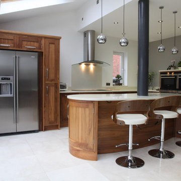
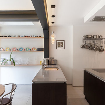
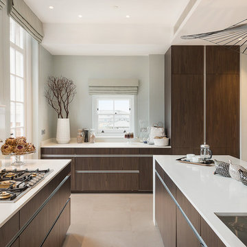
Holme Tree created a stunning open plan walnut kitchen in this Staffordshire home that has it all - style, quality and functionality.
With its walnut in-frame cabinetry contrasting with the light surfaces and flooring.
The design incorporated the structural steel post making it look amazing as part of the iconic kidney-bean island.
Holme Tree designs for each individual client, we pay careful attention to the unusual design features of your home. Let us create a stunning design for your home.

 Creative Wood Kitchens
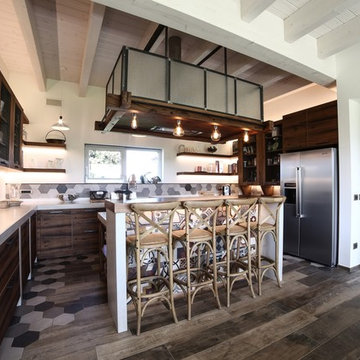
A contemporary kitchen distinguished by its soft pastel tones and luxurious walnut accents and, crafted to excite and delight family and guests alike.
In-frame cabinetry with beaded-shaker doors is finished in pastel grey and natural walnut, hung on exposed butt hinges and paired with brushed brass knobs for a timeless yet stylish look. Crisp white stone worktops, upstand, and a full-height backsplash provide a clean foundation, while glazed upper cabinets and statement pendant lighting introduce brightness and contrast against the richness of the walnut.
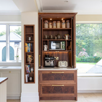
The kitchen is thoughtfully zoned for efficiency: food storage is consolidated between a large LG American-style fridge/freezer and tall pantry; cooking is centred around the substantial cream AGA beneath an oversized contemporary hood; and cleanup is streamlined with an undermounted sink flanked by an integrated dishwasher and generous pullout bins. The island provides expansive prep space alongside seating for casual dining, while a dedicated breakfast station houses tea, coffee, and small appliances, ensuring main worktops remain clear and uncluttered.
The walnut breakfast station and pantry unit are striking centrepieces, showcasing dramatic bookmatched burl veneers with swirling, eye-like patterns—nature’s artistry framed within cabinet doors. Walnut is also found carefully layered throughout the design: the integrated bookshelf, bespoke wine rack, drawers, carcassing, and the island’s substantial countertop, creating warmth and texture while highlighting key features.
The completed space seamlessly combines contemporary design with the artistry of natural materials. It is a kitchen of character and comfort, a luxurious yet liveable centrepiece to be the heart of the home.



 Kitchens by Emanuel
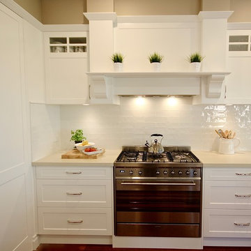
When your kitchen is situated in the middle of your home, generally there are multiple door ways and structural walls you need to design around. You can't always knock every wall down, you just need to design smart and think outside the box!
- Quantum Quartz 'Crema Quartz' bench top
- Tiled splash back (Subway tiles)
- 'Shaker' profile polyurethane doors
- Custom mantle
- Chrome handles
Sheree Bounassif, Kitchens by Emanuel
 The Kitchen Lady UK
The Project
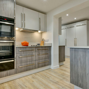
Una and Pat bought this house with their young family and spent many happy years bringing up their children in this home. Now their children have grown up and moved away, it was time to update the house to fit their new lives and refresh their style.
Awkward Space
They had already undertaken some large projects years beforehand, adding a wrap around extension that linked their kitchen and garage together, whilst providing a dining room and utility space. However, by keeping the original kitchen, guests were squeezed passed the chef by the door, shown through the utility room before sitting down for their meal in a room that felt quite isolated from the rest of the house. It was clear that the flow just wasnt working.
By taking the rather radical step of knocking through an old window that had been blocked up during the extension, we could move the doorway towards the centre of the house and create a much better flow between the rooms.
Zoning
At first Una was worried that she would be getting a much smaller kitchen as it was now fitting into the utility room. However, she didn't worry long as we carefully zoned each area, putting the sink and hob in the brightest areas of the room and the storage in the darker, higher traffic areas that had been in the old kitchen.
To make sure that this space worked efficiently, we acted out everyday tasks to make sure that everything was going to be in the right space for THEM.
Colours & Materials
Because we used a local cabinetmaker to turn plans into reality, Una had an almost unlimited choice of doors to choose from. As a keen amature artist, she had a great eye for colour but she was even braver than I had expected. I love the smoked woodgrain door that she chose for the base units. To keep the bright and calm feel, we paired it with a soft grey door on the wall and tall units and also used it on the plinth to create a floating feel.
Una and Pat used a new worktop material called Compact Laminate which is only 12mm thick and is a brilliant new affordable solid worktop. We also used it as a splashback behind the sink and hob for a practical and striking finish.
Supporting Local
Because we used a local cabinetmaker, they could add some great twists that we couldn't have had from buying off the shelf. There is actually a hidden cupboard in the area going through the arch, a handle would have been a hip bruiser so we used a secret push to open mechanism instead.
They also took that extra care when making the units, if you look carefully on the drawers, you will see the same grain runs down all three drawers which is beautiful.

 Impala Kitchens and Bathrooms
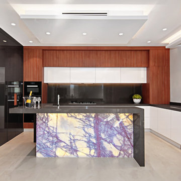
The kitchen is in a beautifully newly constructed multi-level luxury home
The clients brief was a design where spaces have an architectural design flow to maintain a stylistic integrity
Glossy and luxurious surfaces with Minimalist, sleek, modern appearance defines the kitchen
All state of art appliances are used here
All drawers and Inner drawers purposely designed to provide maximum convenience as well as a striking visual appeal.
Recessed led down lights under all wall cabinets to add dramatic indirect lighting and ambience
Optimum use of space has led to cabinets till ceiling height with 2 level access all by electronic servo drive opening
Integrated fridges and freezer along with matching doors leading to scullery form part of a minimalistic wall complementing the symmetry and clean lines of the kitchen
All components in the design from the beginning were desired to be elements of modernity that infused a touch of natural feel by lavish use of Marble and neutral colour tones contrasted with rich timber grain provides to create Interest.
The complete kitchen is in flush doors with no handles and all push to open servo opening for wall cabinets
The cleverly concealed pantry has ample space with a second sink and dishwasher along with a large area for small appliances storage on benchtop
The center island piece is intended to reflect a strong style making it an architectural sculpture in the middle of this large room, thus perfectly zoning the kitchen from the formal spaces.
The 2 level Island is perfect for entertaining and adds to the dramatic transition between spaces. Simple lines often lead to surprising visual patterns, which gradually build rhythm.
New York marble backlit makes it a stunning Centre piece offset by led lighting throughout.
 User
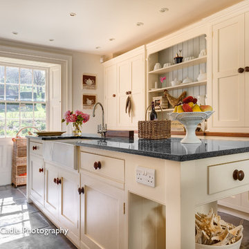
UserBeautiful bespoke kitchen completes this restored Georgian House, Salcombe, South Devon. Photo Styling Jan Cadle, Colin Cadle Photography

 Studio Black Interiors
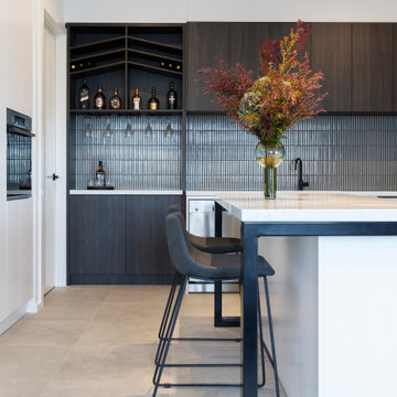
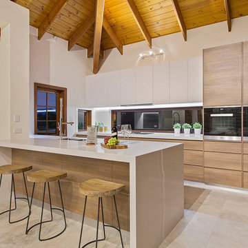
For this development, in the established suburb of Redhill, Canberra, the interior design aesthetic was modern and sophisticated. The layering of black, white and grey finishes married with soft timber accents and pops of brass allows for an elegant sense of drama.
Finishes of Quantum Quartz, Polytec woodmatt cabintery black steel island legs and finger kit kat tiles.
Interior design and styling by Studio Black Interiors. Built by Homes by Howe. Photography by Hcreations.
 User
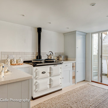
UserA bespoke kitchen leading onto a garden terrace at the rear and with river views to the front. Restored cottage, South Devon. Photo Styling Jan Cadle, Colin Cadle Photography
 WL Kitchen & Home
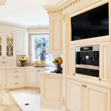
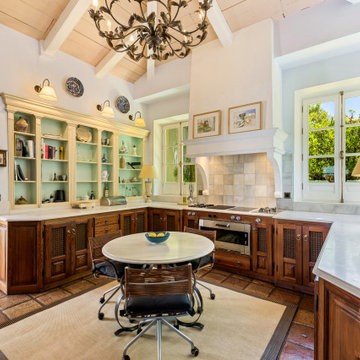
This traditional kitchen balances decorative details with elegance, to create a timeless design that feels luxurious and highly functional.
 The Kitchen Lady UK
The Project
Una and Pat bought this house with their young family and spent many happy years bringing up their children in this home. Now their children have grown up and moved away, it was time to update the house to fit their new lives and refresh their style.
Awkward Space
They had already undertaken some large projects years beforehand, adding a wrap around extension that linked their kitchen and garage together, whilst providing a dining room and utility space. However, by keeping the original kitchen, guests were squeezed passed the chef by the door, shown through the utility room before sitting down for their meal in a room that felt quite isolated from the rest of the house. It was clear that the flow just wasnt working.
By taking the rather radical step of knocking through an old window that had been blocked up during the extension, we could move the doorway towards the centre of the house and create a much better flow between the rooms.
Zoning
At first Una was worried that she would be getting a much smaller kitchen as it was now fitting into the utility room. However, she didn't worry long as we carefully zoned each area, putting the sink and hob in the brightest areas of the room and the storage in the darker, higher traffic areas that had been in the old kitchen.
To make sure that this space worked efficiently, we acted out everyday tasks to make sure that everything was going to be in the right space for THEM.
Colours & Materials
Because we used a local cabinetmaker to turn plans into reality, Una had an almost unlimited choice of doors to choose from. As a keen amature artist, she had a great eye for colour but she was even braver than I had expected. I love the smoked woodgrain door that she chose for the base units. To keep the bright and calm feel, we paired it with a soft grey door on the wall and tall units and also used it on the plinth to create a floating feel.
Una and Pat used a new worktop material called Compact Laminate which is only 12mm thick and is a brilliant new affordable solid worktop. We also used it as a splashback behind the sink and hob for a practical and striking finish.
Supporting Local
Because we used a local cabinetmaker, they could add some great twists that we couldn't have had from buying off the shelf. There is actually a hidden cupboard in the area going through the arch, a handle would have been a hip bruiser so we used a secret push to open mechanism instead.
They also took that extra care when making the units, if you look carefully on the drawers, you will see the same grain runs down all three drawers which is beautiful.


 Jemimah Barnett
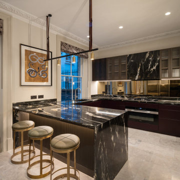
Wall colour: Slaked Lime Mid #149 by Little Greene | Ceilings in Loft White #222 by Little Greene | Pendant light is the Long John 4 light linear fixture by Rubn | Vesper barstools in Laguna Matt & Antique Brass from Barker & Stonehouse | Kitchen joinery custom made by Luxe Projects London (lower cabinetry is sprayed in Corboda #277 by Little Greene) | Stone countertops are Belvedere marble; slabs from Bloom Stones London; cut by AC Stone & Ceramic | Backsplash in toughened bronze mirror | Stone floors are Lombardo marble in a honed finish from Artisans of Devizes
1