854 Billeder af badeværelse med en væghængt håndvask og flerfarvet gulv
Sorteret efter:
Budget
Sorter efter:Populær i dag
41 - 60 af 854 billeder
Item 1 ud af 3
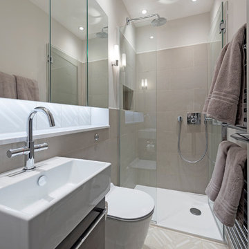
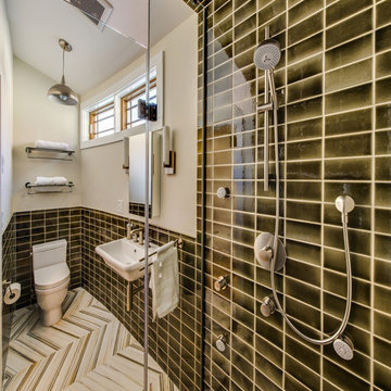
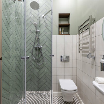
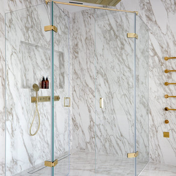
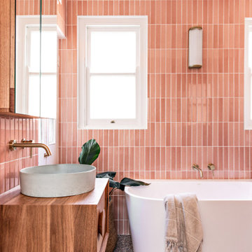
Family bathroom with patterned floor & niche tiles by Patricia Urquiola. Catalano sanitary and Hansgrohe brassware.
Photography: Pixangle
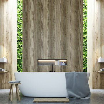
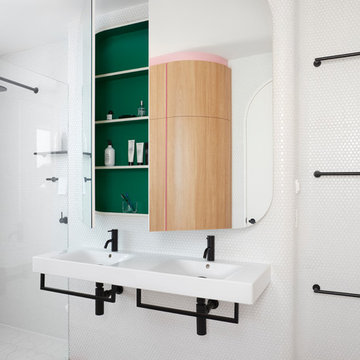
Modern Minimalist bathroom with wooden wall panel and built-in green/living wall to bring outdoors in.
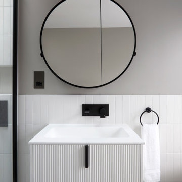
The image showcases a chic and contemporary bathroom vanity area with a focus on clean lines and monochromatic tones. The vanity cabinet features a textured front with vertical grooves, painted in a crisp white that contrasts with the sleek black handles and faucet. This combination of black and white creates a bold, graphic look that is both modern and timeless.
Above the vanity, a round mirror with a thin black frame reflects the clean aesthetic of the space, complementing the other black accents. The wall behind the vanity is partially tiled with white subway tiles, adding a classic bathroom touch that meshes well with the contemporary features.
A two-bulb wall sconce is mounted above the mirror, providing ample lighting with a minimalist design that doesn't detract from the overall simplicity of the decor. To the right, a towel ring holds a white towel, continuing the black and white theme.
This bathroom design is an excellent example of how minimalist design can be warm and inviting while still maintaining a sleek and polished look. The careful balance of textures, colors, and lighting creates an elegant space that is functional and stylish.
Download our free ebook, Creating the Ideal Kitchen. DOWNLOAD NOW
The homeowners came to us looking to update the kitchen in their historic 1897 home. The home had gone through an extensive renovation several years earlier that added a master bedroom suite and updates to the front façade. The kitchen however was not part of that update and a prior 1990’s update had left much to be desired. The client is an avid cook, and it was just not very functional for the family.
The original kitchen was very choppy and included a large eat in area that took up more than its fair share of the space. On the wish list was a place where the family could comfortably congregate, that was easy and to cook in, that feels lived in and in check with the rest of the home’s décor. They also wanted a space that was not cluttered and dark – a happy, light and airy room. A small powder room off the space also needed some attention so we set out to include that in the remodel as well.
See that arch in the neighboring dining room? The homeowner really wanted to make the opening to the dining room an arch to match, so we incorporated that into the design.
Another unfortunate eyesore was the state of the ceiling and soffits. Turns out it was just a series of shortcuts from the prior renovation, and we were surprised and delighted that we were easily able to flatten out almost the entire ceiling with a couple of little reworks.
Other changes we made were to add new windows that were appropriate to the new design, which included moving the sink window over slightly to give the work zone more breathing room. We also adjusted the height of the windows in what was previously the eat-in area that were too low for a countertop to work. We tried to keep an old island in the plan since it was a well-loved vintage find, but the tradeoff for the function of the new island was not worth it in the end. We hope the old found a new home, perhaps as a potting table.
Designed by: Susan Klimala, CKD, CBD
Photography by: Michael Kaskel
For more information on kitchen and bath design ideas go to: www.kitchenstudio-ge.com
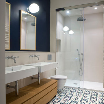
This image showcases the luxurious design features of the principal ensuite, embodying a perfect blend of elegance and functionality. The focal point of the space is the expansive double vanity unit, meticulously crafted to provide ample storage and countertop space for two. Its sleek lines and modern design aesthetic add a touch of sophistication to the room.
The feature tile, serves as a striking focal point, infusing the space with texture and visual interest. It's a bold geometric pattern, and intricate mosaic, elevating the design of the ensuite, adding a sense of luxury and personality.
Natural lighting floods the room through large windows illuminating the space and enhancing its spaciousness. The abundance of natural light creates a warm and inviting atmosphere, while also highlighting the beauty of the design elements and finishes.
Overall, this principal ensuite epitomizes modern luxury, offering a serene retreat where residents can unwind and rejuvenate in style. Every design feature is thoughtfully curated to create a luxurious and functional space that exceeds expectations.
Download our free ebook, Creating the Ideal Kitchen. DOWNLOAD NOW
The homeowners came to us looking to update the kitchen in their historic 1897 home. The home had gone through an extensive renovation several years earlier that added a master bedroom suite and updates to the front façade. The kitchen however was not part of that update and a prior 1990’s update had left much to be desired. The client is an avid cook, and it was just not very functional for the family.
The original kitchen was very choppy and included a large eat in area that took up more than its fair share of the space. On the wish list was a place where the family could comfortably congregate, that was easy and to cook in, that feels lived in and in check with the rest of the home’s décor. They also wanted a space that was not cluttered and dark – a happy, light and airy room. A small powder room off the space also needed some attention so we set out to include that in the remodel as well.
See that arch in the neighboring dining room? The homeowner really wanted to make the opening to the dining room an arch to match, so we incorporated that into the design.
Another unfortunate eyesore was the state of the ceiling and soffits. Turns out it was just a series of shortcuts from the prior renovation, and we were surprised and delighted that we were easily able to flatten out almost the entire ceiling with a couple of little reworks.
Other changes we made were to add new windows that were appropriate to the new design, which included moving the sink window over slightly to give the work zone more breathing room. We also adjusted the height of the windows in what was previously the eat-in area that were too low for a countertop to work. We tried to keep an old island in the plan since it was a well-loved vintage find, but the tradeoff for the function of the new island was not worth it in the end. We hope the old found a new home, perhaps as a potting table.
Designed by: Susan Klimala, CKD, CBD
Photography by: Michael Kaskel
For more information on kitchen and bath design ideas go to: www.kitchenstudio-ge.com
854 Billeder af badeværelse med en væghængt håndvask og flerfarvet gulv
3