195 Billeder af dagligstue med marmorgulv og pejseindramning i træ
Sorteret efter:
Budget
Sorter efter:Populær i dag
41 - 60 af 195 billeder
Item 1 ud af 3
Contemporary Style Single Family Home in Beautiful British Columbia Made in the finest style, this West Coast home has an open floor plan and lots of high ceilings and windows!
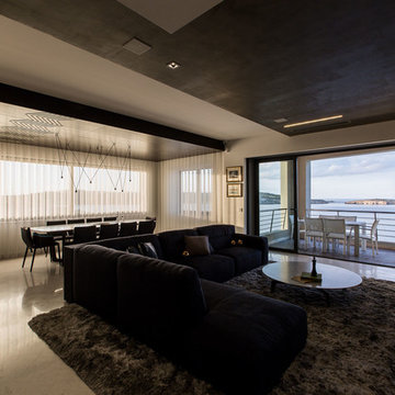
We were approached with a request to design the furnishings for an existing ‘finished’ apartment. The intention was to move in relatively fast, and the property already had an existing marble floor, kitchen and bathrooms which had to be kept. The property also boasted a fantastic 270 degree view, seen from most of the apartment. The clients had a very important role in the completion of the project. They were very involved during the design process and through various decoration choices. The final design was kept as a rigid guideline when faced with picking out all the different elements.
Once clear of all previous furniture, the space felt cold and bare; so we immediately felt the need for warmth, and raw, natural elements and textures to complement the cold marble floor while visually tying in the design of the whole apartment together.
Since the existing kitchen had a touch of dark walnut stain, we felt this material was one we should add to the palette of materials to contest the stark materials. A raw cement finish was another material we felt would add an interesting contrast and could be used in a variety of ways, from cabinets to walls and ceilings, to tie up the design of various areas of the apartment.
To warm up the living/dining area, keeping the existing marble floor but visually creating zones within the large living/dining area without hindering the flow, a dark timber custom-made soffit, continuous with a floor-to-ceiling drinks cabinet zones the dining area, giving it a degree of much-needed warmth.
The various windows with a stupendous 270 degree view needed to be visually tied together. This was done by introducing a continuous sheer [drape] which also doubled up as a sound-absorbing material along 2 of the 4 walls of the space.
A very large sofa was required to fill up the space correctly, also required for the size of the young family.
Services were integrated within the units and soffits, while a customized design in the corner between the kitchen and the living room took into consideration the viewpoints from the main areas to create a pantry without hindering the flow or views. A strategically placed floor-to-ceiling mirror doubles up the space and extends the view to the inner parts of the apartment.
The daughter’s bedroom was a small challenge in itself, and a fun task, where we wanted to achieve the perception of a cozy niche with its own enclosed reading nook [for reading fairy tales], behind see-through curtains and a custom-ordered wall print sporting the girl’s favorite colors.
The sons’ bedroom had double the requirements in terms of space needed: more wardrobe, more homework desk space, a tv/play station area… “We combined a raised platform area between the boys’ beds to become an area with cushions where the kids can lay down and play, and face a hidden screen behind the homework desk’s sliding back panel for their play station”. The color of the homework desk was chosen in relation to the boys’ ages. A more masculine material palette was chosen for this room, in contrast to the light pastel palette of the girl’s bedroom. Again, this colour can easily be changed over time for a more mature look.
PROJECT DATA:
St. Paul’s Bay, Malta
DESIGN TEAM:
Perit Rebecca Zammit, Perit Daniel Scerri, Elyse Tonna
OTHER CREDITS:
Photography: Tonio Lombardi
Styling : TKS
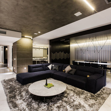
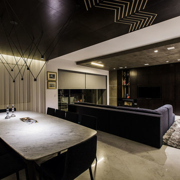
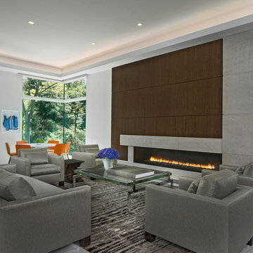
Soggiorno: boiserie in palissandro, camino a gas e TV 65". Sullo sfondo, le arcate che comunicano con zona studio e cucina.
---
Living room: rosewood paneling, gas fireplace and 65" TV. In the background, the arches that communicate with studio area and kitchen.
---
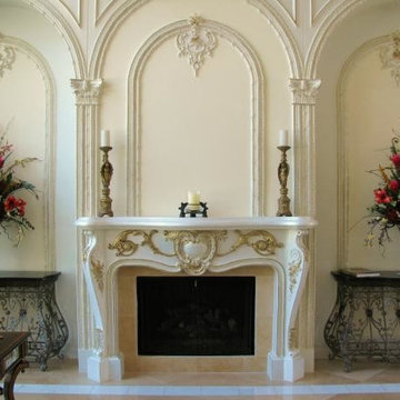
Omaggio allo stile italiano degli anni Quaranta, sostenuto da impianti di alto livello.
---
A tribute to the Italian style of the Forties, supported by state-of-the-art tech systems.
---
Photographer: Luca Tranquilli
I assisted in product selection, design, placement, custom furnishings, tile drawings, etc in this project with Michelle McManus. It was a new construction project that took around two years to complete.
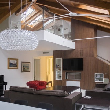
Esempio di zona giorno Loft in un sottotetto di un edificio storico, confortevole e moderno. Mobili su misura, camino rivestito in essenza scura, pavimento in seminato veneziano, soppalco, gioco di travi e capriate.
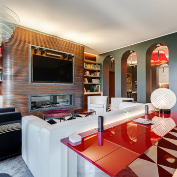
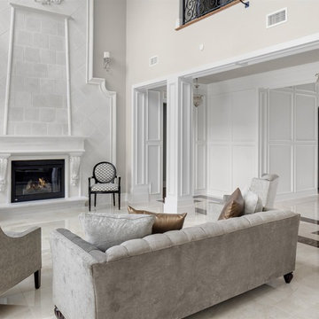
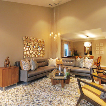
A stunning contemporary living room. Every aspect from wall coverings, window treatments and furniture were sourced by our interior design team and available through our showroom
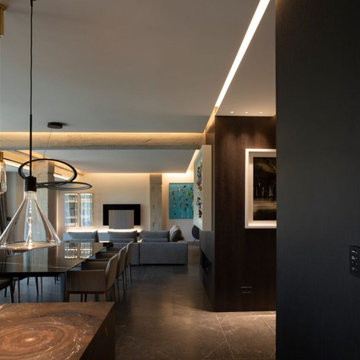
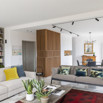
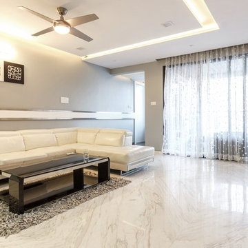
SP La planta baja se destina a estar-comedor-cocina, y también a un espacio polifuncional que puede ser flexible con el tiempo para diversos usos a gusto y necesidad de los propietarios, tan necesario actualmente en la vivienda post covid. Ambas zonas estás separadas sutilmente por la chimenea y por el alma de la casa, la escalera.
EN The ground floor is intended as a living-dining room-kitchen, and also as a multifunctional space that can be flexible over time for various uses to the taste and need of the owners, which is currently so necessary in post-covid housing. The two areas are subtly separated by the fireplace and the soul of the house, the stairs.
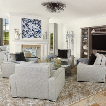
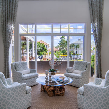
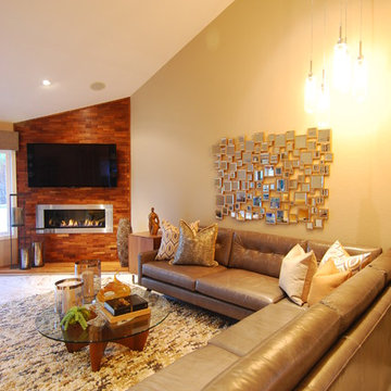
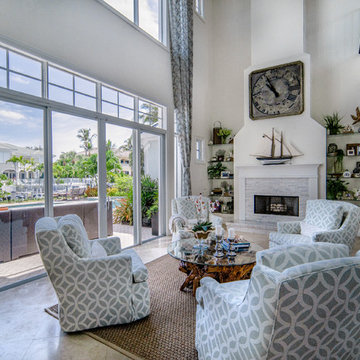
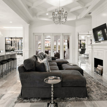
A serene comfort has been created in this golf course estate by combining contemporary furnishings with rustic earth tones. The lush landscaping seen in the oversized windows was used as a backdrop for each space working well with the natural stone flooring in various tan shades. The smoked glass, lux fabrics in gray tones, and simple lines of the anchor furniture pieces add a contemporary richness to the design of this family room. While the graphic art pieces, a wooden entertainment center, lush area rug and light fixtures are a compliment to the tropical surroundings.
We were approached with a request to design the furnishings for an existing ‘finished’ apartment. The intention was to move in relatively fast, and the property already had an existing marble floor, kitchen and bathrooms which had to be kept. The property also boasted a fantastic 270 degree view, seen from most of the apartment. The clients had a very important role in the completion of the project. They were very involved during the design process and through various decoration choices. The final design was kept as a rigid guideline when faced with picking out all the different elements.
Once clear of all previous furniture, the space felt cold and bare; so we immediately felt the need for warmth, and raw, natural elements and textures to complement the cold marble floor while visually tying in the design of the whole apartment together.
Since the existing kitchen had a touch of dark walnut stain, we felt this material was one we should add to the palette of materials to contest the stark materials. A raw cement finish was another material we felt would add an interesting contrast and could be used in a variety of ways, from cabinets to walls and ceilings, to tie up the design of various areas of the apartment.
To warm up the living/dining area, keeping the existing marble floor but visually creating zones within the large living/dining area without hindering the flow, a dark timber custom-made soffit, continuous with a floor-to-ceiling drinks cabinet zones the dining area, giving it a degree of much-needed warmth.
The various windows with a stupendous 270 degree view needed to be visually tied together. This was done by introducing a continuous sheer [drape] which also doubled up as a sound-absorbing material along 2 of the 4 walls of the space.
A very large sofa was required to fill up the space correctly, also required for the size of the young family.
Services were integrated within the units and soffits, while a customized design in the corner between the kitchen and the living room took into consideration the viewpoints from the main areas to create a pantry without hindering the flow or views. A strategically placed floor-to-ceiling mirror doubles up the space and extends the view to the inner parts of the apartment.
The daughter’s bedroom was a small challenge in itself, and a fun task, where we wanted to achieve the perception of a cozy niche with its own enclosed reading nook [for reading fairy tales], behind see-through curtains and a custom-ordered wall print sporting the girl’s favorite colors.
The sons’ bedroom had double the requirements in terms of space needed: more wardrobe, more homework desk space, a tv/play station area… “We combined a raised platform area between the boys’ beds to become an area with cushions where the kids can lay down and play, and face a hidden screen behind the homework desk’s sliding back panel for their play station”. The color of the homework desk was chosen in relation to the boys’ ages. A more masculine material palette was chosen for this room, in contrast to the light pastel palette of the girl’s bedroom. Again, this colour can easily be changed over time for a more mature look.
PROJECT DATA:
St. Paul’s Bay, Malta
DESIGN TEAM:
Perit Rebecca Zammit, Perit Daniel Scerri, Elyse Tonna
OTHER CREDITS:
Photography: Tonio Lombardi
Styling : TKS
195 Billeder af dagligstue med marmorgulv og pejseindramning i træ
3