844 Billeder af hvid dagligstue med grønne vægge
Sorteret efter:
Budget
Sorter efter:Populær i dag
141 - 160 af 844 billeder
Item 1 ud af 3
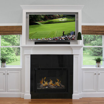
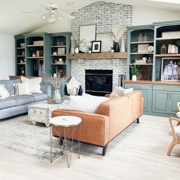
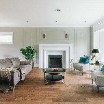
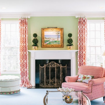
These South Shore clients approached Renovisions after seeing a custom fireplace with mantel and bookcase project they recently built for their family member and were awestruck with the completed details. They wanted a WOW look to fill in an empty wall space in their own family room and Renovisions was up for the challenge.
A more transitional approach was maintained in the design of this fireplace surround and mantel to accommodate the clients’ large screen TV, gas fireplace with decorative wood and stone accents and storage cabinetry. It was a great feature that pulled together the interior design of the large open family room with adjoining kitchen.
For a cohesive look, Renovisions matched the molding on the fireplace surround and mantel to the existing trim work in the room. The millwork on the kitchen island legs was the inspiration for the style of this custom piece. The mantle and pilasters in a white painted finish matched the existing woodwork which stands out against the polished black granite surround and the light seafoam green walls.
As you can see, a minimum amount of accessorizing is perfect on this mantel and cabinetry. This mantle and fireplace surround serves as both an architectural element and as a focal point!
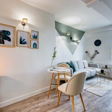
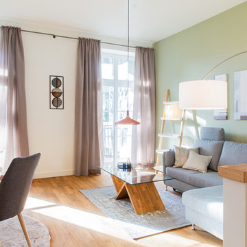
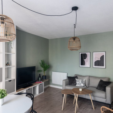
J'ai réalisé une rénovation partielle pour cet appartement, qui avait été refait récemment, mais qui manquait de caractère, de personnalité. Nous avons créé un petit cocon pour ce T2 de 27m2, à la décoration aux inspirations rétro et scandinave. Le traitement géométrique de la peinture crée le dynamisme qui manquait à cette espace. On retrouve la forme qui dicte l'aménagement et séquence l'espace, également avec le coin totalement noir de la cuisine, et la tête de lit suggérée par le bleu dans la chambre.

Our client’s charming cottage was no longer meeting the needs of their family. We needed to give them more space but not lose the quaint characteristics that make this little historic home so unique. So we didn’t go up, and we didn’t go wide, instead we took this master suite addition straight out into the backyard and maintained 100% of the original historic façade.
Master Suite
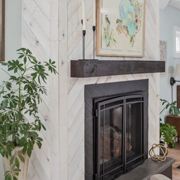
This master suite is truly a private retreat. We were able to create a variety of zones in this suite to allow room for a good night’s sleep, reading by a roaring fire, or catching up on correspondence. The fireplace became the real focal point in this suite. Wrapped in herringbone whitewashed wood planks and accented with a dark stone hearth and wood mantle, we can’t take our eyes off this beauty. With its own private deck and access to the backyard, there is really no reason to ever leave this little sanctuary.
Master Bathroom
The master bathroom meets all the homeowner’s modern needs but has plenty of cozy accents that make it feel right at home in the rest of the space. A natural wood vanity with a mixture of brass and bronze metals gives us the right amount of warmth, and contrasts beautifully with the off-white floor tile and its vintage hex shape. Now the shower is where we had a little fun, we introduced the soft matte blue/green tile with satin brass accents, and solid quartz floor (do you see those veins?!). And the commode room is where we had a lot fun, the leopard print wallpaper gives us all lux vibes (rawr!) and pairs just perfectly with the hex floor tile and vintage door hardware.
Hall Bathroom
We wanted the hall bathroom to drip with vintage charm as well but opted to play with a simpler color palette in this space. We utilized black and white tile with fun patterns (like the little boarder on the floor) and kept this room feeling crisp and bright.
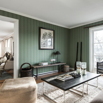
Ballentine Oak – The Grain & Saw Hardwood Collection was designed with juxtaposing striking characteristics of hand tooled saw marks and enhanced natural grain allowing the ebbs and flows of the wood species to be at the forefront.
L'utilisation d'une couleur originale juste sur une partie du salon permet de faire des jolis accents déco et séparer visuellement une pièce. Ce choix nous a permis de distinguer les deux zones : salon détente et salle à manger qui se trouve dans la même pièce.
Living room Design at William Residence (Custom Home) Designed by Linhan Design.
An open concept living room and dining. Very minimalist design. Modern approach of a living room with wood flooring. A Scandinavian style if Interior. Minimal to no window treatment to allow natural light to brighten the space.
Cuisine ouverte, salon séjour et large terrasse en rotonde forment un seul et même espace cohérent et aux tons chatoyants ouvert sur le jardin de ville : De quoi être connecté à sa Cité
Comme de nombreux projets marseillais, il s’agit ici d’un investissement locatif. Le principe est simple, acheter un bien le moins coûteux possible et à rénover , réfléchir à la typologie souhaitée : diviser la surface en plusieurs appartements , ou optimiser l’ensemble pour créer des espaces de colocations. Le but étant d’opter pour la formule qui marchera le mieux en fonction du marché locatif et de l’emplacement.
Ici il s'agissait ici d'une colocation à créer. Je suis intervenue dès la signature du compromis, cela m'a offert 2-3 mois pour penser le projet, établir les plans et un cahier des charges à chiffrer et enfin constituer l’équipe de chantier : ainsi les travaux ont pu débuter dès la signature de l'acte authentique.
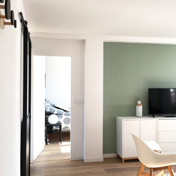
J'ai créé des espaces susceptibles de plaire à tous, avec une décoration légère et facile à s’approprier. Le vert d'eau apporte une touche de fraicheur à la pièce de vie et la porte atelier une touche contemporaine et industrielle : très contrastée, elle marque la séparation nette entre les espaces communs et les espaces privés.
Cozy and contemporary family home, full of character, featuring oak wall panelling, gentle green / teal / grey scheme and soft tones. For more projects, go to www.ihinteriors.co.uk
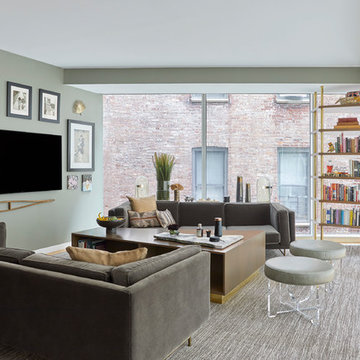
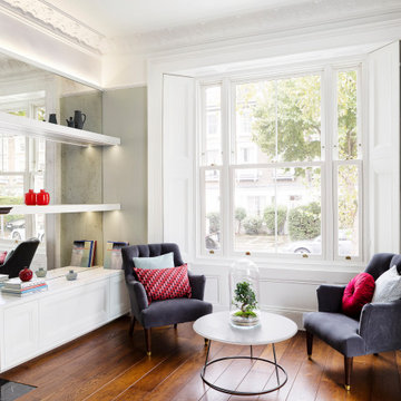
"The inspiration was the building itself and the strange shape of the room. The launching point was the two pieces that started the overall design: the coffee table and the shelving unit. There is a large column right in front of the window that we built the shelving unit around. Figuring that part out was tricky. I wanted to take advantage of the beautiful windows, which previously had a lot of things in front of them, including track lighting. I wanted to open that up so that it could feel like they are living on the inside and the outside at the same time."- Elizabeth Mercer
Interior Desing by mercer INTERIOR
Photography by Emily Gilbert Photo
844 Billeder af hvid dagligstue med grønne vægge
8