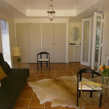
1.269 Billeder af lille dagligstue med gulv af keramiske fliser
Sorteret efter:
Budget
Sorter efter:Populær i dag
61 - 80 af 1.269 billeder
Item 1 ud af 3
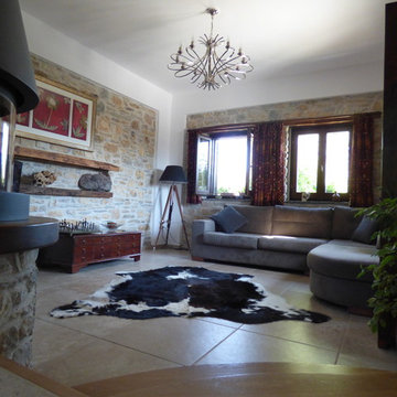
Open plan living area, retaining the natural stone and using reclaimed wooden lintels and shelving.
Jo Allright
L'inspiration pour la déco est partie des carreaux de ciment des sols.
Armoire sur-mesure Leroy Merlin
Canapé But, Tables basses scandinaves restauré par L'atelier Crisalide, fauteuil jaune Auchan, Fauteuil gris Conforama et la petite décoration : Confo, Gifi, Action, Paniers Emmaus, étagères en palette La Brocante Permanente à Camon (80) Suspension Leroy Merlin
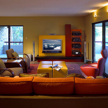
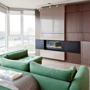
The Lounge:
A Ligne Roset Smalla day bed sofa sets the space off as multi functional with its simple adjustments it converts the space into a lounge or guest quarters.
Photo by: Jonn Coolidge
Photography by Richard Chivers https://www.rchivers.co.uk/
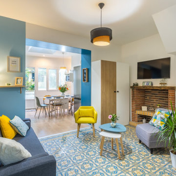
Marshall House is an extension to a Grade II listed dwelling in the village of Twyford, near Winchester, Hampshire. The original house dates from the 17th Century, although it had been remodelled and extended during the late 18th Century.
The clients contacted us to explore the potential to extend their home in order to suit their growing family and active lifestyle. Due to the constraints of living in a listed building, they were unsure as to what development possibilities were available. The brief was to replace an existing lean-to and 20th century conservatory with a new extension in a modern, contemporary approach. The design was developed in close consultation with the local authority as well as their historic environment department, in order to respect the existing property and work to achieve a positive planning outcome.
Like many older buildings, the dwelling had been adjusted here and there, and updated at numerous points over time. The interior of the existing property has a charm and a character - in part down to the age of the property, various bits of work over time and the wear and tear of the collective history of its past occupants. These spaces are dark, dimly lit and cosy. They have low ceilings, small windows, little cubby holes and odd corners. Walls are not parallel or perpendicular, there are steps up and down and places where you must watch not to bang your head.
The extension is accessed via a small link portion that provides a clear distinction between the old and new structures. The initial concept is centred on the idea of contrasts. The link aims to have the effect of walking through a portal into a seemingly different dwelling, that is modern, bright, light and airy with clean lines and white walls. However, complementary aspects are also incorporated, such as the strategic placement of windows and roof lights in order to cast light over walls and corners to create little nooks and private views. The overall form of the extension is informed by the awkward shape and uses of the site, resulting in the walls not being parallel in plan and splaying out at different irregular angles.
Externally, timber larch cladding is used as the primary material. This is painted black with a heavy duty barn paint, that is both long lasting and cost effective. The black finish of the extension contrasts with the white painted brickwork at the rear and side of the original house. The external colour palette of both structures is in opposition to the reality of the interior spaces. Although timber cladding is a fairly standard, commonplace material, visual depth and distinction has been created through the articulation of the boards. The inclusion of timber fins changes the way shadows are cast across the external surface during the day. Whilst at night, these are illuminated by external lighting.
A secondary entrance to the house is provided through a concealed door that is finished to match the profile of the cladding. This opens to a boot/utility room, from which a new shower room can be accessed, before proceeding to the new open plan living space and dining area.
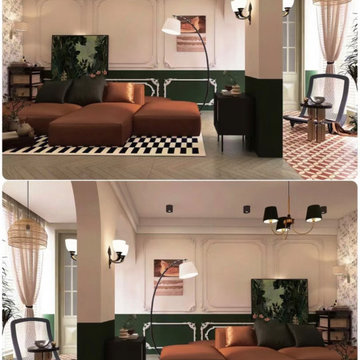
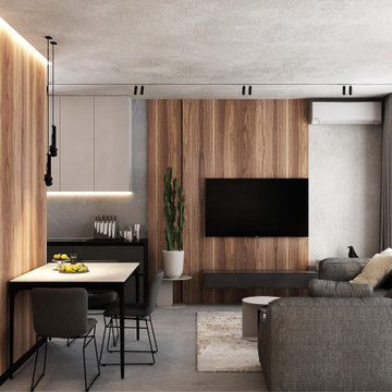
This project is a customer case located in Manila, the Philippines. The client's residence is a 95-square-meter apartment. The overall interior design style chosen by the client is a fusion of Nanyang and French vintage styles, combining retro elegance. The entire home features a color palette of charcoal gray, ink green, and brown coffee, creating a unique and exotic ambiance.
The client desired suitable pendant lights for the living room, dining area, and hallway, and based on their preferences, we selected pendant lights made from bamboo and rattan materials for the open kitchen and hallway. French vintage pendant lights were chosen for the living room. Upon receiving the products, the client expressed complete satisfaction, as these lighting fixtures perfectly matched their requirements.
I am sharing this case with everyone in the hope that it provides inspiration and ideas for your own interior decoration projects.
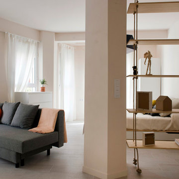
Raquel AbulailaMini apartamento situado en la primera planta de un edificio que combina alquiler de renta antigua con vacacional
Diseñado para albergar inquilinos de corta duración, procedentes del norte de Europa, por lo se hace hincapié en la luz, espacios diáfanos, colores mediterráneos, y materiales naturales.

1.269 Billeder af lille dagligstue med gulv af keramiske fliser
4