671 Billeder af sort lille badeværelse med hvid bordplade
Sorteret efter:
Budget
Sorter efter:Populær i dag
1 - 20 af 671 billeder
Item 1 ud af 3
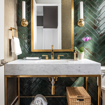
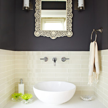
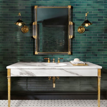
Powder room with a punch! Handmade green subway tile is laid in a herringbone pattern for this feature wall. The other three walls received a gorgeous gold metallic print wallcovering. A brass and marble sink with all brass fittings provide the perfect contrast to the green tile backdrop. Walnut wood flooring
Photo: Stephen Allen
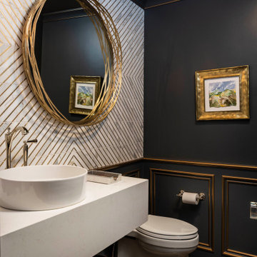
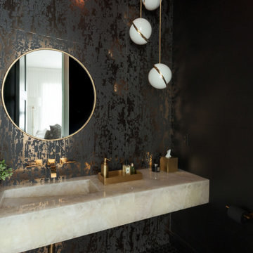
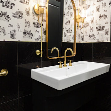
These homeowners came to us to renovate a number of areas of their home. In their formal powder bath they wanted a sophisticated polished room that was elegant and custom in design. The formal powder was designed around stunning marble and gold wall tile with a custom starburst layout coming from behind the center of the birds nest round brass mirror. A white floating quartz countertop houses a vessel bowl sink and vessel bowl height faucet in polished nickel, wood panel and molding’s were painted black with a gold leaf detail which carried over to the ceiling for the WOW.
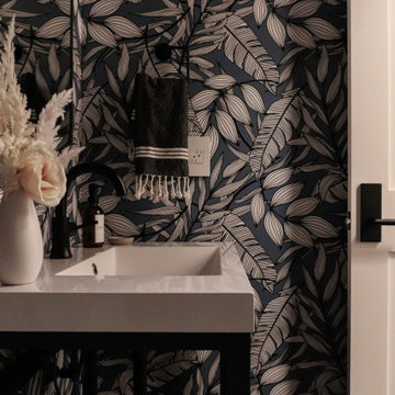
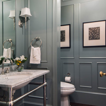
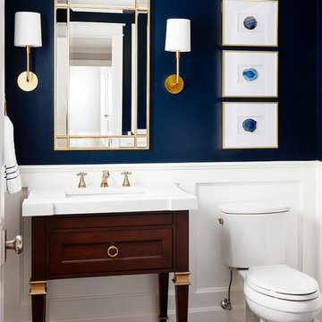
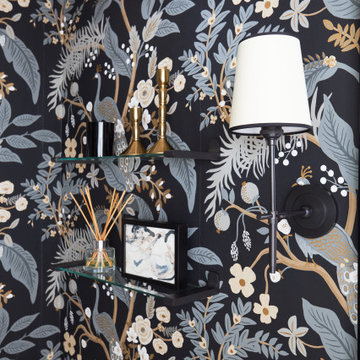
There is no better place for a mix of bold pattern, funky art, and vintage texture than a casual room that is tucked away - in this case, the powder room that is off the mudroom hallway. This is a delightful space that doesn't overpower the senses by sticking to a tight color scheme where blue is the only color on a black-and-white- base.
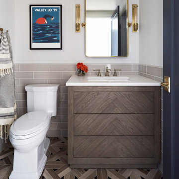
KitchenLab Interiors’ first, entirely new construction project in collaboration with GTH architects who designed the residence. KLI was responsible for all interior finishes, fixtures, furnishings, and design including the stairs, casework, interior doors, moldings and millwork. KLI also worked with the client on selecting the roof, exterior stucco and paint colors, stone, windows, and doors. The homeowners had purchased the existing home on a lakefront lot of the Valley Lo community in Glenview, thinking that it would be a gut renovation, but when they discovered a host of issues including mold, they decided to tear it down and start from scratch. The minute you look out the living room windows, you feel as though you're on a lakeside vacation in Wisconsin or Michigan. We wanted to help the homeowners achieve this feeling throughout the house - merging the causal vibe of a vacation home with the elegance desired for a primary residence. This project is unique and personal in many ways - Rebekah and the homeowner, Lorie, had grown up together in a small suburb of Columbus, Ohio. Lorie had been Rebekah's babysitter and was like an older sister growing up. They were both heavily influenced by the style of the late 70's and early 80's boho/hippy meets disco and 80's glam, and both credit their moms for an early interest in anything related to art, design, and style. One of the biggest challenges of doing a new construction project is that it takes so much longer to plan and execute and by the time tile and lighting is installed, you might be bored by the selections of feel like you've seen them everywhere already. “I really tried to pull myself, our team and the client away from the echo-chamber of Pinterest and Instagram. We fell in love with counter stools 3 years ago that I couldn't bring myself to pull the trigger on, thank god, because then they started showing up literally everywhere", Rebekah recalls. Lots of one of a kind vintage rugs and furnishings make the home feel less brand-spanking new. The best projects come from a team slightly outside their comfort zone. One of the funniest things Lorie says to Rebekah, "I gave you everything you wanted", which is pretty hilarious coming from a client to a designer.
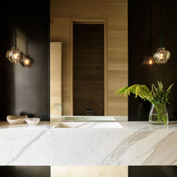
The seeming simplicity of forms and materiality of Five Shadows is the result of rigorous alignments and geometries, from the stone coursing on the exterior to the sequenced wood-plank coursing of the interior.
Architecture by CLB – Jackson, Wyoming – Bozeman, Montana. Interiors by Philip Nimmo Design.
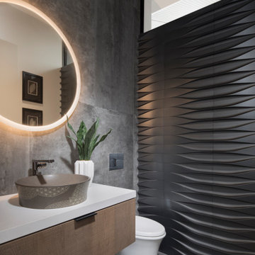
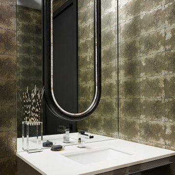
Drama in a small space! Elegant, dimensional Walker Zanger tile creates a dramatic focal point in this sophisticated powder bath. The rough hewn European oak floating cabinetry ads warmth and layered texture to the space while the crisp matt white quartz countertop is the perfect foil for the etched stone sink. The sensuous curves of smooth carved stone reveal a patchwork of Japanese sashiko kimono pattern depicting organic elements such as waves, mountains and bamboo. The circular LED lit mirror echoes the flowing liquid lines of the tile and circular vessel sink.
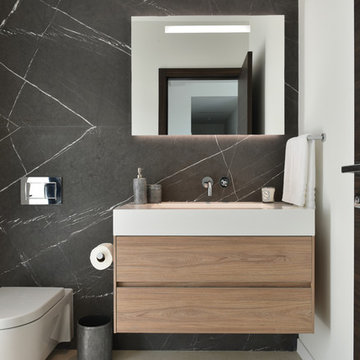
This 1966 contemporary home was completely renovated into a beautiful, functional home with an up-to-date floor plan more fitting for the way families live today. Removing all of the existing kitchen walls created the open concept floor plan. Adding an addition to the back of the house extended the family room. The first floor was also reconfigured to add a mudroom/laundry room and the first floor powder room was transformed into a full bath. A true master suite with spa inspired bath and walk-in closet was made possible by reconfiguring the existing space and adding an addition to the front of the house.
Architect: David Seidel AIA (www.wdavidseidel.com)
Contractor: Doran Construction (www.braddoran.com)
Designer: Lucy McLintic
Photo credit: Chris Gaede photography (www.chrisgaede.com)
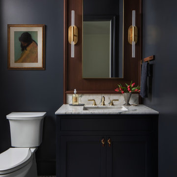
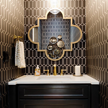
This dark and moody modern bathroom screams luxury. The gold accents and rustic western inspired wallpaper give it so much character. The black and white checkered tile floor gives it the final touch it needs to go from good to exceptional.
Download our free ebook, Creating the Ideal Kitchen. DOWNLOAD NOW
This family from Wheaton was ready to remodel their kitchen, dining room and powder room. The project didn’t call for any structural or space planning changes but the makeover still had a massive impact on their home. The homeowners wanted to change their dated 1990’s brown speckled granite and light maple kitchen. They liked the welcoming feeling they got from the wood and warm tones in their current kitchen, but this style clashed with their vision of a deVOL type kitchen, a London-based furniture company. Their inspiration came from the country homes of the UK that mix the warmth of traditional detail with clean lines and modern updates.
To create their vision, we started with all new framed cabinets with a modified overlay painted in beautiful, understated colors. Our clients were adamant about “no white cabinets.” Instead we used an oyster color for the perimeter and a custom color match to a specific shade of green chosen by the homeowner. The use of a simple color pallet reduces the visual noise and allows the space to feel open and welcoming. We also painted the trim above the cabinets the same color to make the cabinets look taller. The room trim was painted a bright clean white to match the ceiling.
In true English fashion our clients are not coffee drinkers, but they LOVE tea. We created a tea station for them where they can prepare and serve tea. We added plenty of glass to showcase their tea mugs and adapted the cabinetry below to accommodate storage for their tea items. Function is also key for the English kitchen and the homeowners. They requested a deep farmhouse sink and a cabinet devoted to their heavy mixer because they bake a lot. We then got rid of the stovetop on the island and wall oven and replaced both of them with a range located against the far wall. This gives them plenty of space on the island to roll out dough and prepare any number of baked goods. We then removed the bifold pantry doors and created custom built-ins with plenty of usable storage for all their cooking and baking needs.
The client wanted a big change to the dining room but still wanted to use their own furniture and rug. We installed a toile-like wallpaper on the top half of the room and supported it with white wainscot paneling. We also changed out the light fixture, showing us once again that small changes can have a big impact.
As the final touch, we also re-did the powder room to be in line with the rest of the first floor. We had the new vanity painted in the same oyster color as the kitchen cabinets and then covered the walls in a whimsical patterned wallpaper. Although the homeowners like subtle neutral colors they were willing to go a bit bold in the powder room for something unexpected. For more design inspiration go to: www.kitchenstudio-ge.com
671 Billeder af sort lille badeværelse med hvid bordplade
1