2.048 Billeder af spisestue med beige gulv
Sorteret efter:
Budget
Sorter efter:Populær i dag
81 - 100 af 2.048 billeder
Item 1 ud af 3
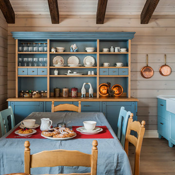
Кухня кантри. Вид из гостиной на кухню. Кухонная мебель выполнена мастерской Орнамент. Красивый синий буфет, обеденный стол, стулья. Кухня без верхних шкафов.
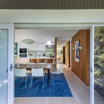
Dining Room with outdoor patio through right doors and Living Room beyond fireplace on left
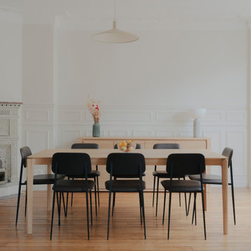
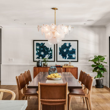
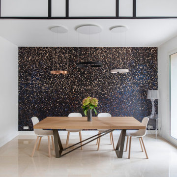
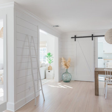
Large open-concept dining room featuring a black and gold chandelier, wood dining table, mid-century dining chairs, hardwood flooring, black windows, and shiplap walls.
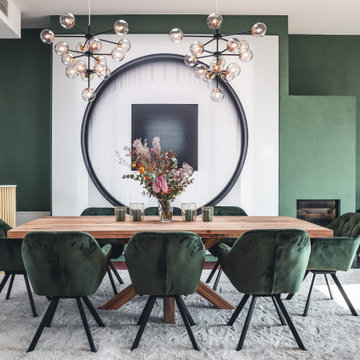
Fun, luxurious, space enhancing solutions and pops of color were the theme for this globe-trotter young couple’s downtown condo.
The result is a space that truly reflect’s their vibrant and upbeat personalities, while being extremely functional without sacrificing looks. It is a space that exudes happiness and joie de vivre, from the secret bar to the inviting patio.
Le salon et la salle à manger sont visuellement séparés par une verrière sur-mesure qui décore l'espace qui était auparavant très grand et vide. Nous avons également ajouté divers papiers peints pour apporter de la profondeur à cet espace, ainsi que de belles fonctionnalités d'éclairage.
Le résultat est une maison à la fois belle et fonctionnelle.
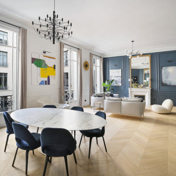
En tant que designer, j'ai toujours été fasciné par la rencontre entre l'ancien et le moderne. Le projet que je vous présente aujourd'hui incarne cette fusion avec brio. Au cœur d'un appartement haussmannien, symbole d'un Paris d'antan, se dévoile un séjour audacieusement revêtu de bleu foncé.
Cette nuance profonde et envoûtante ne se contente pas de donner une atmosphère contemporaine à la pièce ; elle met aussi en valeur les détails architecturaux si caractéristiques des intérieurs haussmanniens : moulures délicates, cheminées en marbre et parquets en point de Hongrie. Le bleu foncé, loin d'opprimer l'espace, le sublime en créant un contraste saisissant avec la luminosité naturelle qui baigne le séjour par ses larges fenêtres.
Ce choix audacieux témoigne de ma volonté constante de repousser les frontières du design traditionnel, tout en restant fidèle à l'âme et à l'histoire du lieu. Ce séjour, avec ses tonalités modernes nichées dans un écrin classique, est une ode à la beauté intemporelle et à l'innovation audacieuse.
In the early 50s, Herbert and Ruth Weiss attended a lecture by Bauhaus founder Walter Gropius hosted by MIT. They were fascinated by Gropius’ description of the ‘Five Fields’ community of 60 houses he and his firm, The Architect’s Collaborative (TAC), were designing in Lexington, MA. The Weiss’ fell in love with Gropius’ vision for a grouping of 60 modern houses to be arrayed around eight acres of common land that would include a community pool and playground. They soon had one of their own.The original, TAC-designed house was a single-slope design with a modest footprint of 800 square feet. Several years later, the Weiss’ commissioned modernist architect Henry Hoover to add a living room wing and new entry to the house. Hoover’s design included a wall of glass which opens to a charming pond carved into the outcropping of granite ledge.
After living in the house for 65 years, the Weiss’ sold the house to our client, who asked us to design a renovation that would respect the integrity of the vintage modern architecture. Our design focused on reorienting the kitchen, opening it up to the family room. The bedroom wing was redesigned to create a principal bedroom with en-suite bathroom. Interior finishes were edited to create a more fluid relationship between the original TAC home and Hoover’s addition. We worked closely with the builder, Patriot Custom Homes, to install Solar electric panels married to an efficient heat pump heating and cooling system. These updates integrate modern touches and high efficiency into a striking piece of architectural history.
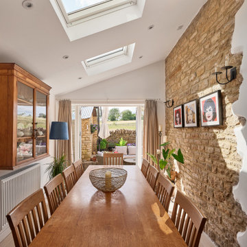
We were commissioned by our clients to design a light and airy open-plan kitchen and dining space with plenty of natural light whilst also capturing the views of the fields at the rear of their property. We not only achieved that but also took our designs a step further to create a beautiful first-floor ensuite bathroom to the master bedroom which our clients love!
Our initial brief was very clear and concise, with our clients having a good understanding of what they wanted to achieve – the removal of the existing conservatory to create an open and light-filled space that then connects on to what was originally a small and dark kitchen. The two-storey and single-storey rear extension with beautiful high ceilings, roof lights, and French doors with side lights on the rear, flood the interior spaces with natural light and allow for a beautiful, expansive feel whilst also affording stunning views over the fields. This new extension allows for an open-plan kitchen/dining space that feels airy and light whilst also maximising the views of the surrounding countryside.
The only change during the concept design was the decision to work in collaboration with the client’s adjoining neighbour to design and build their extensions together allowing a new party wall to be created and the removal of wasted space between the two properties. This allowed them both to gain more room inside both properties and was essentially a win-win for both clients, with the original concept design being kept the same but on a larger footprint to include the new party wall.
The different floor levels between the two properties with their extensions and building on the party wall line in the new wall was a definite challenge. It allowed us only a very small area to work to achieve both of the extensions and the foundations needed to be very deep due to the ground conditions, as advised by Building Control. We overcame this by working in collaboration with the structural engineer to design the foundations and the work of the project manager in managing the team and site efficiently.
We love how large and light-filled the space feels inside, the stunning high ceilings, and the amazing views of the surrounding countryside on the rear of the property. The finishes inside and outside have blended seamlessly with the existing house whilst exposing some original features such as the stone walls, and the connection between the original cottage and the new extension has allowed the property to still retain its character.
There are a number of special features to the design – the light airy high ceilings in the extension, the open plan kitchen and dining space, the connection to the original cottage whilst opening up the rear of the property into the extension via an existing doorway, the views of the beautiful countryside, the hidden nature of the extension allowing the cottage to retain its original character and the high-end materials which allows the new additions to blend in seamlessly.
The property is situated within the AONB (Area of Outstanding Natural Beauty) and our designs were sympathetic to the Cotswold vernacular and character of the existing property, whilst maximising its views of the stunning surrounding countryside.
The works have massively improved our client’s lifestyles and the way they use their home. The previous conservatory was originally used as a dining space however the temperatures inside made it unusable during hot and cold periods and also had the effect of making the kitchen very small and dark, with the existing stone walls blocking out natural light and only a small window to allow for light and ventilation. The original kitchen didn’t feel open, warm, or welcoming for our clients.
The new extension allowed us to break through the existing external stone wall to create a beautiful open-plan kitchen and dining space which is both warm, cosy, and welcoming, but also filled with natural light and affords stunning views of the gardens and fields beyond the property. The space has had a huge impact on our client’s feelings towards their main living areas and created a real showcase entertainment space.
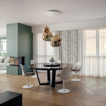
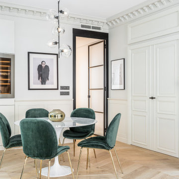
Vista dall'ingresso: in primo piano la zona pranzo con tavolo circolare in marmo, sedie tulip e lampadario Tom Dixon.
Sullo sfondo camino a legna integrato e zona salotto.
Parquet in rovere naturale con posa spina ungherese.
Pareti bianche e verde grigio. Tende bianche filtranti e carta da parati raffigurante tronchi di betulla.
2.048 Billeder af spisestue med beige gulv
5