kellybarnesy

Wall color to make picture 'pop'

Kel B
7 år siden

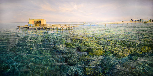
Hello! I have this beautiful painting and i am struggling with a color to paint the wall to make the picture stand out. White just won't cut it. The picture will be placed in a large room with exposed Oregon wood beams. The remainder of the walls and ceiling will be 'deluxe natural white' . We also have a fireplace with warm tones of grey and brown. Floorboards are wood (light oak). I also have two green chairs that will sit in the same room as the painting. What color should i paint the wall? Im thinking a blue....? Or would i be better going for the 'sand' or 'jetty' color?

(26) kommentarer

  • oklouise
    7 år siden

    what a gorgeous painting, how big is it and i'd have a rich greeny blue to match the darker colours in the painting

    Kel B thanked oklouise
  • georgi02
    7 år siden

    Hi Kelly, A lot will depend upon your frame and matting if there is any. For the matting I'd go for two mats - a finer one in the sandy/yellows of your picture and a much wider one in the midtone warm grey/greens that you pick from the picture and a dark dark brown or black frame (I'd make the matting as wide as I could to focus the eye on the centre which is your picture - remembing that wider mats will make your picture bigger and add to the impace). For the wall I'd try to pick up one of the warmer blue/greys but keep it lighter so that your walls blend. Good luck.

    Kel B thanked georgi02
  • bigreader
    7 år siden
    It is a beautiful painting. I love the colours. Art galleries use white walls all the time. The last thing you want to do is make it blend in. If you are planning on matting and framing, this may change your view of the White.
    Kel B thanked bigreader
  • Kel B
    Forfatter
    7 år siden

    At this stage it will remain unframed. thanks


  • KK1000
    7 år siden
    Wall colour doesn't make the painting pop it's the professional framing that does the trick. It looks unfinished.
  • John Henson
    7 år siden
    You don't frame a Mitchell. I like seeing them on a white wall.
    Kel B thanked John Henson
  • KK1000
    7 år siden
    It's personal taste , there's no rule, once you paid for it you can do what you like.
  • John Henson
    7 år siden
    Haha classic...don't think that Larry would have the same opinion.
  • georgi02
    7 år siden

    That's the interesting thing with art - opinions are like belly buttons - everyone has one.

    Kel B thanked georgi02
  • bigreader
    7 år siden
    If you'd like a sand colour that looks good with green have a look at Dulux Ecru. Looks great next to Natural White. You'll need to paint a large sample as it looks different in real life than to the sample cards.
    Kel B thanked bigreader
  • KK1000
    7 år siden
    Ecru looks different in different lights it can look green . Here is some examples to support my choice , it's grey or charcoal.
    Kel B thanked KK1000
  • KK1000
    7 år siden
    And some more
    Kel B thanked KK1000
  • KK1000
    7 år siden
    It depends what look you prefer, if you want fresh coastal style go for white, if you like it more classic and elegant go for darker colour. I would still frame it , then you can have any colour wall you like.
    Kel B thanked KK1000
  • Tilly
    7 år siden
    Charcoal. Get a sample pot and paint a large piece of cardboard to test.
    Kel B thanked Tilly
  • Sherri
    7 år siden
    What do you feel most drawn to in the painting? What is that part of the picture that carries your imagination to another place ? Once you have decided your favourite aspect I would either paint the wall a lighter mellow colour of that aspect or a mellow grey.
    Kel B thanked Sherri
  • girlguides
    7 år siden
    Choose a grey that matches harmonises with the fireplace and the lovely picture
    Kel B thanked girlguides
  • PRO
    Cordony Group
    7 år siden

    Our favourite is Lexicon Half! Such a versatile shade.

    Kel B thanked Cordony Group
  • philippawright
    7 år siden

    You may not be a fan of whites but If you have access to Resene colours I know many major galleries use 'Black White' as their backdrop which lets the art speak for itself.

    Thorndon Cream in double or triple may work and has a few of the tones in the painting.

    Good old Spanish white might also work but it is also worth thinking about the rest of your room and furniture and not just the art work.

    Kel B thanked philippawright
  • bigreader
    7 år siden
    As above. Resend Black White is amazing.
    Kel B thanked bigreader
  • henkjo
    7 år siden

    A soft grey will work nicely.

    Kel B thanked henkjo
  • Bernadette Staal
    7 år siden

    I would use a colour from the painting and the green chairs and maybe go for a very very lighter green of a similar tone but you need to also consider lighting as well, e.g. does the art piece need a spot light to draw the eye to it, does it have glass and if so is that glass non reflective and does the picture have a frame and frame surround (that is not shown). I would have said to chose white for the walls as that makes art pop but you have already ruled it out.

    Kel B thanked Bernadette Staal
  • tinap178
    7 år siden

    blue would make the picture blend into the wall and you do not want that. If you do not like white then try offwhite - so with a hit of either grey, sand, or yellow.

    PS Love this artists work - congrats on adding it to your collection

    Kel B thanked tinap178
  • Lyn Franke
    7 år siden

    Hello, that is a fabulous painting! If you bought from a gallery it stood out on a very white wall, with the warm colours of the timbers and fireplace and green chairs you already have, my colour choice would be white. Interestingly my walls are painted Dulux Natural white, and as an artist myself, I need my work on white walls but I am changing that to Lexicon white 1/4 strength. As our new kitchen is Resene black and "Lexicon White 1/4", I wanted a fresher look! I always find it difficult to choose the right wall colour. Maybe get sample pots and do test strips. Definitely do not frame the painting. Lynfranke

    Kel B thanked Lyn Franke
  • PRO
    Knight-Smith Images
    7 år siden

    Okay, firstly, this is very difficult to do without seeing the room in person. So rather than suggesting a colour, let me tell you some theory and hopefully you can work it out. The painting looks a little yellow on my screen, I think it would look different in person.

    You want the image to stand out. What you're looking for is contrast between the image and your surroundings. Contrast can give seperation between elements and that's what you're after, the wall to receed behind the painting.

    white is not cutting it because it's competing with the image. The image has some light bright tones ie it's bright and the white wall will be bright, so a while wall and the painting will both compete for your attention.

    the other problem you have is all of the other elements in the room are darker and warm timber, we notice warm colours before cooler colours (ie blues) first, so it's likely all of thu sis competing against each other.

    So to not compete with everything else, you want something cooler but also not saturated (without a lot of colour). You want people to forget about the wall.

    again it's very difficult without seeing the room, so any colour I give you is not going to work. Get a few swatches from Bunnings and take them home and hold them next to the picture in the room. Narrow it down the 3 paints then get a small canvas, Bunnings is cheap, paint that with your colours and rest them on the wall with the painting. Move the canvas around the wall.

    Good luck. Colour is difficult but just try and get something that doesn't compete with the painting.


    Kel B thanked Knight-Smith Images
  • Tyrian
    7 år siden

    Salmon pink. Teal. On trend - go for it! To hell with white!

    Kel B thanked Tyrian
Sponsored

Reload the page to not see this specific ad anymore

Danmark
Tilpas mine indstillinger ved hjælp af cookies

Houzz bruger cookies og lignende teknologier til at tilpasse min oplevelse, give mig relevant indhold og forbedre Houzz-produkter og -tjenester. Ved at klikke på 'Accepter' accepterer jeg dette, som beskrevet yderligere i Houzz-cookiepolitikken. Jeg kan afvise ikke-essentielle cookies ved at klikke på 'Administrer præferencer'.