Need help choosing pendants? *photos attached"
Hi Guys,
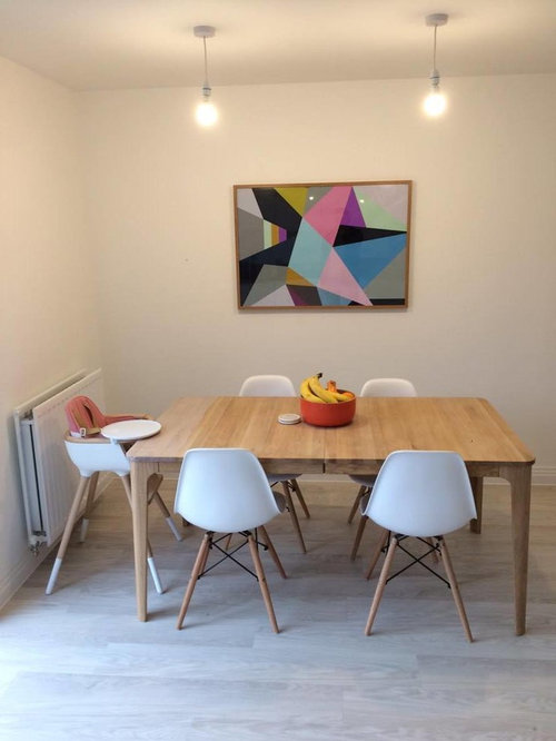
I'm really struggling on deciding which 2 pendant light fittings would finish our kitchen diner off. As you can see we have quite a pale colour palette.
Any suggestions welcome or advice welcome.

So far we are considering:

(20) kommentarer

Kayne Cross
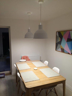
Forfatter7 år sidenI want the lights to be the statement piece of the room and maybe this cant work with the current art work? maybe i should move that into the living room...hmmm!

Lauren
7 år sidenSidst ændret: {last_modified_time}7 år sidenI prefer your second option style wise but personally I'd choose a pair of black shades to add drama and pick up on the black in the painting behind the table. Something like these:
https://www.wayfair.co.uk/1-Light-Mini-Pendant-151-HSU9464.html?piid%5B0%5D=16681636
 PRO
PROLuxDeco
7 år sidenA silver or pewter version of the second option would be lovely. Or if you prefer a slighter design, how about something like the Provence Pendant or the Shear Ceiling Pendant? Some sort of contrast, as Lauren suggested, would be much better whether it's a different colour or a darker metal. If you want real statement, consider a sputnik light.

Marie Mason
7 år sidenthe pendent in the second photo is classy would look lovely in your dining area would compliment the kitchen area too PRO
PROCaldicot Kitchen & Bathroom Centre
7 år sidenI think I prefer the second option too. The black could work, given the tones in the artwork behind, of you could opt for a gunmetal or copper.
 PRO
PROUser
7 år sidenHi Kayne, if the lights should be statement lights, maybe some of ours could be an idea as well. They would go perfectly with your table and the chairs. We ship for free inside EU and all ligths are handmade in Denmark. Best Nele | Yndlingsting
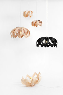 LOTUS Pendant lights · Mere information
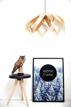 LOTUS MAPLE · Mere information
Myriam Cuylaerts
7 år sidenWe used a blue Fly Kartell with similar table and chairs and it is definitely a statement piece. Two of them might be a bit too much though, they are quite large. We also have a white kitchen next to it, with bare lamps in colourful fittings. These really come in any colour you want.

 PRO
PRORenaissance Interiors, Hartley Wintney
7 år sidenI would choose something with some colour. Choose whether this piece of art is staying or being replaced and take a colour from this piece to be your accent colour for the room. Everything is neutral and a splash of colour will really make it pop.
 PRO
PROLitecraft
7 år sidenSidst ændret: {last_modified_time}7 år sidenI think you should keep the artwork as it adds colour to the room and makes it look more lively. And I like the style of pendants you are going for. You can always add more colour with kitchen accessories and some foliage if you prefer the lights to stay white.
If I had to choose from the two I'd go for the second one.
Here are few other options.
Industrial Parabolic Pendants (available in duck egg, white, grey)
The Duck Egg coloured pendant would match your artwork and add more colour...

1 Light Gourd Drop Shaped Ceiling Pendant - White

Norway 1 Light Wood & Metal Ceiling Pendant - Light Wood

Good luck and we'd like to see what you have chosen in the end.
 PRO
PROLightmaster Direct
7 år sidenA copper coloured pendant might be a nice option here - something like the Boleta or PLA by Milan (http://www.milan-iluminacion.com/en/p/442/mln-boleta-6607-6608-6609 http://www.milan-iluminacion.com/en/p/437/mln-pla-6592-6593-6594-6595)
- PRO
Isidora Markovic
7 år sidenSidst ændret: {last_modified_time}7 år sidenHi Kayne,
Definitely the second one, and I agree re: having a splash of colour in the room but perhaps not in the hanging pendant lights - colourful ones will inevitably date quicker and I think it's always best to go for a neutral base with permanent fixtures, because then you can always choose when and if you want to build colour on top of that base. Black would create more of a contrast and monochrome feel that would fit in perfectly with the Scandi minimalism and light colour palette, but white is always a classic. P. S. What a beautiful kitchen!
catherinehale7
7 år sidenWe have similar pale/wood scheme and opted for habitat Marlowe which works well - copper tones nicely with woodblock and prevents its looking too bland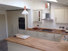

charlie_bill
7 år sideni like the ones that Nele has posted as you get the statement of the light but can see through to the art too. We had the same issue with our light obstructing the view into our garden and went for this Habitat have just launched some similar but can't see the smaller ones on the shop section on in the images
- PRO
User
7 år sidenHi Charlie, happy to hear you like them!
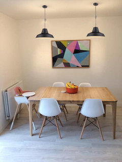
And Kayne, below a picture of how they can look above a dining table.
It is the small black one though.
Best Nele | Yndlingsting
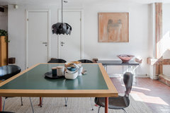 Homestyling Blekingegatan · Mere information
  PRO
PROCuriousa
7 år sidenHi Charlie
What a beautiful kitchen, and I love the artwork you have behind the table. We're all about colour at Curiousa so I would have to agree with Renaissance Interiors and suggest going for something colourful to add that extra wow factor.
Some ideas about our colours and pendants here for you: http://www.curiousa.co.uk/pendants

Kayne Cross
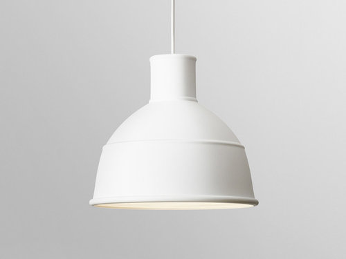
Forfatter7 år sidenHi guys, thanks for all the suggestions. In the end i went with my gut and got a great deal on the Unfold pendants. I'm really happy... now for a table centre piece!
 PRO
PROPeriod Property Store
7 år sidenHi Kayne Cross, to add a little colour and variety to the room, I think a copper tone pendant would work really well. Here are a few examples of the ones we supply. We also do them in grey / graphite tones, but I think the copper would complement the wood worktop. Hope this helps!
 Vintage Industrial Style Metal Dome Lamp Shade - Copper - 13 inch · Mere information
 Vintage Industrial Style Metal Dome Lamp Shade - Brass - 13 inch · Mere information
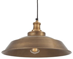 Vintage Style Step Style Metal Lampshade - Brass - 16 inch · Mere information

Reload the page to not see this specific ad anymore
Juliet Docherty