need help on roman shade color.
sokpeng
11 år siden
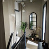
I have 4 windows in my living rooms. 2 of them are on the feature green wall shown in the picture. The other 2 windows are on the adjacent with the fireplace. The wall is off white( ivory). What color should I use for the roman shades on those window.?
Fremhævet svar
Sorter efter:Ældste
(16) kommentarer

latifeh hammad
11 år sidenhttp://houzz.com/photos/2321737
Roman shades aren't cheap so this color will work now and when you get board of your apple green paint
sokpeng
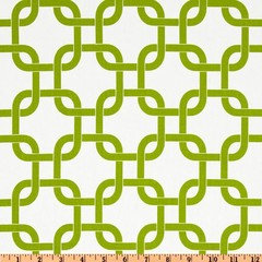
Forfatter11 år sidenLatifeh, is the shade to plain on the ivory wall. I plan to use one of the below. Wonder if it is too messy, too much green? BTW, I made the shades so the cost isn't, too much too bear.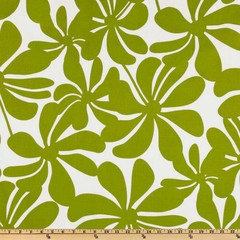
pearlmelba
11 år sidenSidst ændret: {last_modified_time}11 år sidenHi why not have a plain blind and then a coloured window dressing clever lady making the blinds saves on the cost having said that like the above choices they are nice you could maybe even go with a colour of one of your nice cushions just a thought good luck with it allpearlmelba
11 år sidenSidst ændret: {last_modified_time}11 år sidenwindow dressing only here maybe the colour is close to your cushion colour window dressing is not as modern as your room can we see the rest of your room

Carolina
11 år sidenI like the flower fabric on the left. And if you have the fabric for the shades, make a couple of pillows for the couch too. PRO
PROASVInteriors
11 år sidenYour apartment is modern and I feel that the panels will be more on keeping with the look. However, I would try to do something like covering the two windows in the designs that sokpeng posted and then find a matching wallpaper and do a feature wallpaper panel in the same design behind the sofa. You would then need to build up more textural qualities: such as silk or satin cushions that have a reflection and movement...Carolina
11 år sidenAnd your art is too soft coloured and to high up the wall. I'd prefer a block of 4 or 6 or 8 or 9 pictures (depending on the size of the pics) on that wall. It would show the green between the pictures and it will be a large enough in total to make a good statement. Wood Branch Wall Decor · Mere information
 Cities Set of Three Prints · Mere information
How much do you love the green? Because I was thinking, on the other wall something like this wallpaper? Or for a more subtle approach the second one: Eclectic Wallpaper · Mere information
 Trellis Wallpaper -Green Double Roll - Ballard Designs · Mere information
Carolina
11 år sidenAnd I would throw in some black, dark gray, teal or navy blue to take the edge off it. Vicksburg · Mere information
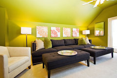 Jeffrey Johnson · Mere information
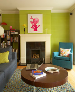 Quirky House Renovation · Mere information
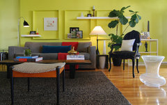 MJ Lanphier · Mere information
 PRO
PROSmilow + Mathiesen
11 år sidenThis is a perfect example for me of how size of art matters and is crucial--your existing piece is too small in my opinion. If you mirror the size of the space (a little more horizontal than tall but almost a square--width being the width of the sofa or a little bit smaller...height being the same as your existing panels on the sides--you will create a nice look....I would suggest a fun contemporary piece that is less light in weight...Here are some examples of a type of piece--not necessarily in these colors...

latifeh hammad
11 år sidenBoth very beautiful but take a swatch with you before you cut to make sure it's in the same green family as long as you're making them go with what you love and when you get board sew different onespearlmelba
11 år sidensmilow yes the art is a little small the ones you have suggested are fab brings more colour to the room maybe a new center light and a small table with a nice table lamp just a thought PRO
PROBlinds.com
11 år sidenWe agree with carolins, incorporating some black will tone down the bright green. We just rolled out a whole new line of fabrics for our roman shades. The Donetta Licorice would be beautiful in your space: http://blnds.cm/U8JSte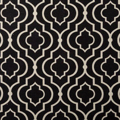

 PRO
PRODavid Tisdale Design
11 år sidenI agree with Smilow + Mathiesen, begin with a great piece of art as per the examples shown, larger and with color. Then use a color or colors from the art as detail in the roman shade fabric. The shades should be more neutral to offset the green wall. The throw pillows should also pick up on the colors in the art.

Sponsored
Reload the page to not see this specific ad anymore
Flere diskussioner
A Crew of Two