stephmorris123

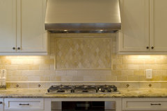
Which tile looks better with the cabinets and counter?

stephmorris123
10 år siden
Option 1 and 3 are the same. Option 2 and 4 are the same, just included the cabinet.

(14) kommentarer

  • PRO
    Carolyn Albert-Kincl, ASID
    10 år siden
    Sidst ændret: {last_modified_time}10 år siden
    All the tile samples look too pink to me to go with the countertop which has gold tones in it. But computer screens are notoriously bad at color renditions.
  • stephmorris123
    Forfatter
    10 år siden
    I agree. The option 2 and 4 actually have gold and gray tones to it but it is hard to see in the picture. It is a limestone which seems to have more gold.
  • PRO
    LB Interiors
    10 år siden
    Sidst ændret: {last_modified_time}10 år siden
    I'm not seeing either option. You may need to have a yellow creamy beige undertone.
  • stephmorris123
    Forfatter
    10 år siden
    I have made 8 trips to the tile shop. It is really hard. I want a lighter tile that doesn't seem too busy with the counter. I like the stone look over the glass tile and I really don't want subway.
  • PRO
    Carolyn Albert-Kincl, ASID
    10 år siden
    If there is a Materials Marketing store near you, they offer a wide variety of stone colors and have very helpful sales people who could help you find just the right tile for you.
  • stephmorris123
    Forfatter
    10 år siden
    Any in Kansas City?
  • User
    10 år siden
    Sidst ændret: {last_modified_time}10 år siden
    Better to make a few more trips to get it right than look at the wrong tile everyday, saying hmmm, maybe I should have put in glass subway tile :)
  • PRO
    Carolyn Albert-Kincl, ASID
    10 år siden
    There is no Materials Marketing showroom in Kansas City, but other tile suppliers have showrooms there and I am certain that some of them have designers on staff who would be able to help you.
  • PRO
    Anna Marie Fanelli - Floor & Decor
    10 år siden
    Are you committed to these colors? There are so many great options out there if you think outside of the shades of beige
  • PRO
    LB Interiors
    10 år siden
    Design Savvy · Mere information
  • PRO
    LB Interiors
    10 år siden
    Maybe something that is a little darker contrast in the brown family.
    Kitchen · Mere information
  • kadodi
    10 år siden
    Most stone tile has a pattern and so does your granite. I think they will always clash and fight each other which makes it too busy. You would ultimately be happier with a solid color for the backsplash.
  • lefty47
    10 år siden
    HI -- Don't try to match the colors , either go lighter or darker than the counter . If it was mine I would go lighter. Also watch the format size -- try to go with a bigger size tile so it doesn't get too busy looking. The counter already has a very busy look.
Sponsored

Reload the page to not see this specific ad anymore

Danmark
Tilpas mine indstillinger ved hjælp af cookies

Houzz bruger cookies og lignende teknologier til at tilpasse min oplevelse, give mig relevant indhold og forbedre Houzz-produkter og -tjenester. Ved at klikke på 'Accepter' accepterer jeg dette, som beskrevet yderligere i Houzz-cookiepolitikken. Jeg kan afvise ikke-essentielle cookies ved at klikke på 'Administrer præferencer'.