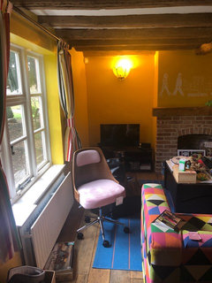
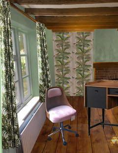
wallpaper dilemma


(28) kommentarer

J Hen
5 år sidenI’m not an expert but from first glance I’d be looking to go with the background colour of the paper - the mid pink?
I think the green would be too much. Lovely paper though.
Good luck
Tani H-S
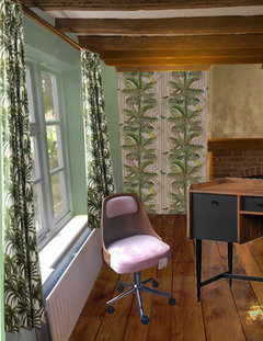
5 år sidenLovely wallpaper! I would go the palest of pinks to match the wallpaper but even lighter. Or a creamy warm light sand perhaps to mirror the gold geometrics PRO
PROMay Interiors
5 år sidenI think with the darker furniture pieces and the beams I’d go light. Looking at the wall paper print the gold lines almost fade into a warm cream colour at the lower right corner. That would be perfect - maybe with a shimmer to I keep with the paper. I think that would keep the room bright, not draw from the wallpaper and still allow for the darker furniture with being over whelming.
rinked
5 år sidenDepending on what flooring and the layout of the room, I'd say gold paint (doesn't need to be shiny), would be fun though. Maybe pink on the bottom half, a slath in the color of your other trim/baseboards, then gold on the upper half. Or the entire room pink bottom, thin gold slath, paper upper half. Again, all depends on the space and furniture.
Note: I have a similar pale pink on my lvingroom ceiling (walls offwhite).
Juliet Docherty
5 år sidenI wouldn't go for pink or green but the pale caramel colour. Sometimes called 'nude' it can look good with pink.
rinked
5 år sidenAnd what about the pale pink from the bird? Looks great with every shade of wood, gold, black, white, green, etc.


laura_0
5 år sidenSuch gorgeous wallpaper! Can I ask what it's called?
I agree with the others and would go for a pale cream/pink to tie in with the background colour. Or maybe wallpaper the whole room?
Justine Kenny
Forfatter5 år sidenThank you all so much! I’m a bit torn. One of my friends also suggested a dark blue.. the paper is by Holden decor and it’s called Akello. They do it in a few different colours. :)
rachelmidlands
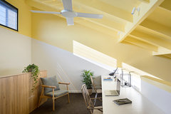
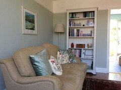
5 år sidenFunky wallpaper! I’ve seen the darker version a few times on furniture and it looks really jazzy. Sticking with the Art Deco style I might go for a pale jade or mint green which I think would look lovely in a bright room (sort of Miami style). Some pics so you can see how the colours work together and included an image with olive green sofa just because I liked it (click pics to enlarge).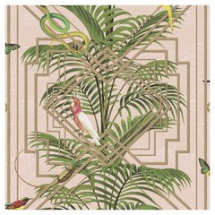


rachelmidlands
5 år sidenWow that’s yellow! He he:) If you did decide on a pale minty blue or green then I might try to keep it quite pale and muted. Cromarty by F&B might be worth a tester. Although hard to say without seeing the colours in real life. If @forzaitalia sees this she might share some pics as she recently painted her lounge this colour and it’s lovely. Should go really well with the wallpaper I think.Justine Kenny
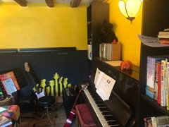
Forfatter5 år sidenHa @rachelmidlands it is really yellow! Thanks if not seen Cromarty and it actually looks lovely. I shall invest in a tester...
Sonia
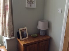
5 år sidenI think the soft pale pink as suggested by Rachelmidland and others would be fabulous with your gorgeous wallpaper. Here is a pic of Cromarty on my sitting room walls and I have teamed it with pinky red cushions and a red Persian rug. It’s such a lovely soft sage green. Pink and green look so good together, just look at nature!

Justine Kenny
Forfatter5 år sidenThis is really interesting @rinq thank you... I hadn’t thought of this sort of thing and I love the goldAMB
5 år sidenI'm voting for pale green. It's restful for an office space and you can bring out the pink in accessories - I see you already have the chair ready and waiting!Sonia
5 år siden@ED I was just showing the Cromarty wall colour haha. Yes even I’m sick of my sitting room and bookcases.......:-)


Reload the page to not see this specific ad anymore

rinked