Which tiles for my kitchen splashback?
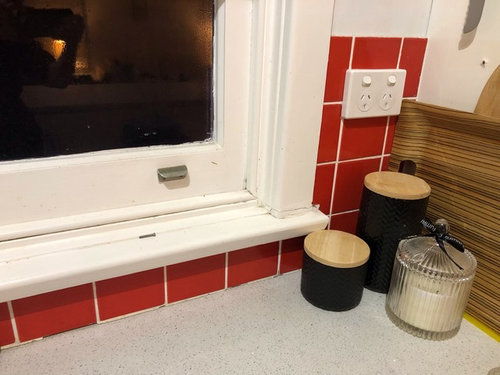
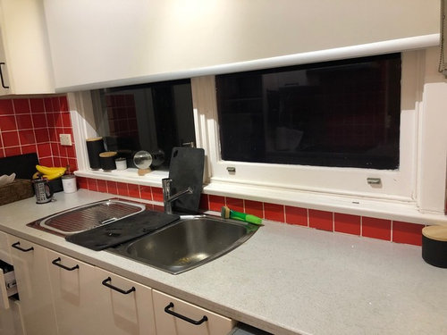
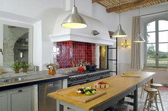
Hi there, I have a tiler coming next week to update our red tile kitchen splashback and I had thought I would replace with the same size and shape in white but realise I have an opportunity to make a change... But not sure what would look best. Currently there are red square tiles 100 X 100 in an open plan galley style kitchen. Wish we could renovate the whole kitchen but it will just be the walls for now. The rest of the room decor is shades of teal and light blues and greys with timber and black accents, so I thought simple white tiles would not look too busy. But too boring? And not sure if subway shape would work in the small spaces (also I might be a bit over subway tiles). Would love ideas from you clever stylish creatives! Thanks


(64) kommentarer

torneyteam
Forfatter4 år sidenShame about the cabinet handles, I really like them! I guess they do look a bit cheap (because they were!).
torneyteam
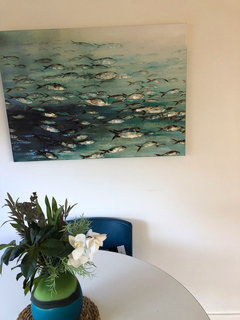
Forfatter4 år sidenAnd here is a painting that has always been a bit of a colour inspiration for me
 PRO
PROInterior Concepts
4 år sidenHi
I would suggest you place stainless steel splash back at cooktop and tile to opposite wall and my reasoning behind this- the height variable on both walls-
The tiles at cooktop run to the range hood where on opposite wall they are under window and wall cabinets- placing same tile to opposite areas I feel creates imbalance.
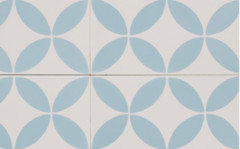
Looking at the images of your home and noting you mention teal, grey etc.. I would look toward deisgntiles - something like
Also, agree you should change your handles on cabinetry to create a more contemporary look.
Atorneyteam
Forfatter4 år sidenHi there, that is an interesting observation about the height imbalance, I hadn't really noticed it. Absolutely love this tile too, but I wonder if a it would be too busy in an already busy space?
torneyteam
Forfatter4 år sidenYes, that is what Dreamer was suggesting, there were some beautiful coloured gloss tiles in that comment. I'm beginning to think a little colour won't hurt, as long as it works in with my other decor as you mention.
dreamer
4 år sidenTorneyteam, you have a wonderful, inviting space. Gloss tiles will enhance your style. In my opinion stainless steel is not your style.
I also think the red tiles look good, but, as is said, a change is as good as a holiday. A very pleasant room.torneyteam
Forfatter4 år sidenThank you so much Dreamer, that's such a lovely compliment! You're right I don't think stainless is my style regardless of it's practicality. I do like the warmth of tiles, and am going to look further into the gloss textured glass ones. They are lovely. Thanks again! Making me feel much better about the place!

siriuskey
4 år sidenI actually love your red tiles, very 70s 80s vibe when done with the 2" x 1" sorry can't think in cms, I also like your simple handles, but I would change the wall clock to be multi coloured and have the range hood finished off and enclosed, the metal box shouldn't be exposed, lovely space

torneyteam
Forfatter4 år sidenThank you SIriuskey! What a cool clock - yes, the villa was built in the 70's and I think the reno of the kitchen was done in the 80's or 90's so the best of all worlds!
siriuskey
4 år sidenThanks for posting the extra photos it really helps, also forgot to mention that I love the biscuit barrel on top of the cupboard. Those red splash back tiles will really work with a simple French Country look, adding a couple of pendant lights over the island
torneyteam
Forfatter4 år sidenThanks yes I have been pondering pendant lights too, but we already have a couple of nice pendants in the open plan space so might be a bit busy to add more. Thanks re the biscuit barrell... That's our Koko the Clown. According to our family lore, my father gave this to my mother when my brother was born in 1960. Some women get diamonds..... Then again, I don't recall any gifts being exchanged when I came along!
siriuskey
4 år sidenGo figure, but then you have ended up with it Yes KoKo fits with that vintage, a bit french also. I think if the pendants were simple they would be OK
legendaryflame
4 år sidenI would go for teal or green tiles. White will loose all the character and it will become bland. Add some cool new handles and you will have a different look. I love your space btw!
kbodman14
4 år sidenFor me you need that small pop of colours. All blue is very cold and can be uninviting. The red works because it is a blue based red. For me again, the jarring colour is the grey of the bench top. It appears to be a yellow based grey and appear a grubby against all the other colours. I would be investing in new bench top, not a back splash.

Mattie
4 år sidenI like the red tiles as well. What would happen if you introduced a bit of the same red in the dining area? A vase perhaps?
torneyteam
Forfatter4 år sidenAll very interesting comments, thank you. The remark about losing the character if we go all white really resonated. I agree the benchtop is a bit of a problem.. it's stone but has been damaged somehow before we came and has marks and looks murky. But that would need to be part of a whole new kitchen I think which we just can't commit to at the moment. I just can't picture integrating red into the rest of the decor, especially with our teal dining chairs which I love and the majority of our artwork. But also I don't want it to be too 'matchy matchy', and I don't hear the red tiles in isolation. More food for thought which is why I love this forum. Thank you so much everyone! I might play around with some terracotta pots I have in the courtyard to see how they could work with the blues.
torneyteam
Forfatter4 år sidenBy the way, I thought the handles on my cabinets were quite cool actually, I'd love to know why they don't work!

julie herbert
4 år sidenHi torneyteam, what a gorgeous home you have, I love your painting that inspired you for your colour scheme, I love dreamers suggestion of the soft blue Devonshire gloss tile for your kitchen, it would look wonderful and bring your whole space together, love your fabulous floors, and I am with you, your handles are pretty cool too.
torneyteam
Forfatter4 år sidenThanks so much Julie! I was starting to get a complex about those handles! Thanks for the lovely compliments.

KK1000
4 år sidenHi again , looking at your new photos and I must say I don’t see problem with the tiles it’s the white grout that would bother me, if grout was darker I am not sure what colour maybe darker red or something else you would have a completely new look and as others suggested get yourself a large mid century red vase or Murano glass bowl , rug with a bit of red in it and you are done.
siriuskey
4 år siden
Red works well with all shades of blues and greens. Your black leather lounges relate to the black handles. I would save your money and have the range hood fitted correctly that's the thing that stands out, and wait until you feel you are ready to update the whole kitchen. As a last resort I would paint the red tiles.torneyteam
Forfatter4 år sidenYes grout would be an easy fix and I'm starting to worry about being too blue/green especially as the rest of the house is pretty much full of it. I've moved around some vase type vessels but it doesn't quite work yet. I might take a trip to some vintage shops to see what I can find some nice Murano art glass, brilliant suggestion.. thanks yet again.
Mattie
4 år siden<?xml version="1.0" encoding="UTF-8"?><md>I would love to see an update when you’re happy with the result. I think you’re pretty close - you have created a stunning living, dining area. In my mind I’d be thinking “wow, how much money have I just saved!” And then, “what shall I use that money for instead!”julie herbert
4 år sidenHi torneyteam, if your son loves retro how would these gorgeous planters look on your bench, the bird is from Etsy but you could find any that you love and spray them , the air plant looks fab.


 PRO
PRODonna Weir Design
4 år sidenI think that you could take the inspiration for the beautiful fish painting and replicate with the tile in soft greys or more ocean based colours.
torneyteam
Forfatter4 år siden<?xml version="1.0" encoding="UTF-8"?><md>Thanks so much Mattie, you're spot on, I AM thinking about what I could put the money towards instead!torneyteam
Forfatter4 år sidenI adore these planters Donna! I actually have a disproportionate number of "things" with faces of various types - vintage glass Kosta Boda 'people' decanters and ceramic planters and vessels. So these are right up my alley!
torneyteam
Forfatter4 år sidenSorry was Julie with the planters, excuse me! But Donna, such a clever suble idea about the fish scale shape tiles. I think I'll take one last look today at tiles but I think I am leaning towards keeping the red for now, fixing up the grout on them and working on integrating the shade throughout the room. It would certainly be a big saving and with all this wonderfully positive feedback I'm really quite liking the individuality of them now! Thanks so much everyone. I will definitely post an update when I have it done, one way or the other!
L H
4 år sidenI’m so glad you’re keeping them because I think they’re fantastic and you can make them work with the rest of your beautiful space (love your bunny planter btw!). The two things I would spend money on is boxing in the rangehood (sorry it looks unfinished) and a fabulous new clock. And if you need a new dishwasher before you do a full kitchen reno go for black :-)
Sue Gelade
4 år sidenHow about shiny black tiles? Goes with anything and is thoroughly timeless, but also with your handles, so wouldn’t need expense of their change....
torneyteam
Forfatter4 år sidenIsn't it funny LH I had never really noticed the rangehood till it was mentioned here and now it's really bothering me! In fact can probably redirect funds to a whole new one anyway and have it covered up from the beginning. And I've never seen a black dishwasher, I'll have to check them out. Ours isn't that old yet though, and have just had to replace the oven
torneyteam
Forfatter4 år siden<?xml version="1.0" encoding="UTF-8"?><md>Hadn't thought of black tiles either, but at least they would lend support to my poor unloved handles!Lorraine Shiels
4 år sidenUnable to see colours you mention but the big deal for couple of years out of Milan as I read it, hahha is dark, why not keep the red and go a change on the bench tops only - not expensive, just a laminex and paint the cupboards and change the handles. I am now doing that for the 2nd time since 2006. Good joinery company does the benchtops, drops in the same sink and cook tops - try not to damage tiles and special prepaint on cupboards not too expensive, the paint work on mine has held really well and just wanting to change colour. put pics up of adjoining room colours for all to see for more comments. Loz
 PRO
PRODigital art on glass.
4 år sidenHave you thought of Glass splashback.here are a few samples you can see www.digitalartonglss.com
kbodman14
4 år sidenWhere are you situated? There are services and products to get rid of the stain in the bench. The stone guys throughout Australia.
Have you thought of a new kitchen blind to tied both areas together? It is seen from all angles.
torneyteam
Forfatter4 år sidenThanks Lorraine, yes, I think the red is a keeper (can't believe I've decided that!) And will think about changing bench and painting cupboards as you suggest. But then if we do ever do a new kitchen, at least in the coming few years or so, it might be overkill doing all that now.
torneyteam
Forfatter4 år sidenThanks DAOGS, they look gorgeous, definitely works of art. Probably not my style and I definitely think would be beyond our modest budget.
torneyteam
Forfatter4 år sidenKbodman14, we had a 'stone guy' come look at the bench when we first moved and he was stumped and didn't think he could help. Blinds are an interesting thought. The rollers we have on the patio doors and kitchen window are actually the same colour but the kitchen one has a backing blind too, to block out the granny flat that's been built too close for comfort, so it looks like a different colour. The other side of the room are timber Venetians which we like for there. They are super big windows and plantation shutters would cost a bomb and also probably block some light.
Lorraine Shiels
4 år sidenHi again, Lorraine here, I looked closer at your pictures of the area. I also noted your comment regarding "what if" you re do your kitchen. So, we all can do that and then time tics away and we dont do anything and frustration sets in as you really just want to change the things you have been looking for many years.
The picture you have taken tonings from is very near your kitchen. the chairs to the table are the most pronounced of the colour you are seeking. Around the larger part of the room there are only little touches of the tone you like. Your rooms are very light with the blinds up. So I think the kitchen can take darker colours. Like the very deep grey outline of the fishes or the deep blue/grey in the painting or colour of the chairs.
Laminex limed cement is a wonderful deep colour and will bring the benches alive. Then with removing the heavy door handles and seeing if you can use the push and clip fittings - you wont have any door handles but use a neater steel looking knob for your drawers or brushed steel handles on cupboards if you cant get the push and clip things inside. Paint the front board looking into the lounge and the cupboards a deep grey/blue colour to fit with the, mid deeper colour in the painting and the outline of the fish and the red will fit in nicely. Keeping your blinds up allowing the light in more than not will bring the room to life. Take out the floor runner. Do you use your stools? with the table right there are the stools necessary? if not take them away and ensure that area of the cupboards at front is painted - this gives a clearer area defining "kitchen".
hope this helps Loztorneyteam
Forfatter4 år sidenThank you for putting so much thought into these lovely ideas Loz! I'm sure you are right that time goes and procrastinating is easy to do. I had a look at the laminex limed concrete which is remarkably similar to the stone we have and I do like the shade. Hadn't thought of adding colour to the front of the bench, but a nice idea. I deliberately only hay few bits of teal/blue in the living areas so it doesn't look imbalanced, also there aren't that many surfaces to place things. Anyway thank you for your fabulous suggestions for integrating the colour schemes and updating the kitchen, really appreciate it!
Lorraine Shiels
4 år sidenYour welcome - I didnt realise you have stone benches, no dont get rid of these, they were costly, just get a painter to do the paint job. They charge about $40 per hour and go buy a couple of sample pots $10 each, Paint it on cardboard....not the cupboards.....to see the effect. I am sure with the light you have in the whole area the darker colour cupboards will be your answer. Loz
torneyteam
Forfatter4 år sidenThanks so much Loz, OK and great tip re painting on cardboard not the cupboards!
kbodman14
4 år sidenAs for colours, some points. Ensure that all have a primary blue base colour. Try a deep forest green, very dark - not black. Black will just make the red scream. Take the green from your painting. Leave the upper cupboards as they are or paint in a light sand colour, against blue base. Small dark maybe gloomy. Paints either have a blue or yellow pigment base, this allows for complimentary of contrasting colours. Best of luck.
kbodman14
4 år sidenToday in Houzz
Colour | Bedrooms | Picture Perfect | Popular Houzz Series | Decorating | Decorating Ideas
Picture Perfect: 25 Rooms That Use Red to Dial up the Drama
Our coffee-break escape offers you five minutes' worth of images to inspire and delight. Jump right in...
12:00 pmThere is red tiled bathroom with black grout, I wonder what dark green or very dark aquarium would be like.
Enjoy a cupcake and ponder

Reload the page to not see this specific ad anymore
torneyteamForfatter