Looking for some suggestions on a backsplash for our kitchen. We have hickory cabinets with medium toned wood floors, and a very busy granite countertop that I’m in love with. Trying to find something that brings it all together.
Beautiful kitchen. I like your countertop. I would stick to a simple cream color backsplash so it does not compete with your countertop❣️I think your choice of tan walls is a good idea too. Post a picture when you complete your kitchen❣️
just a creamy white subway. but if you get the vibe of this: a black backsplash would unite w the counter choice and stand up to the hickory species . it would need to be a big enough kitchen so the dark areas don't create a black hole......some good light, and choose the black tile carefully...but it could work and expand on the themes you've initiated.
normally I'd say yes (to the white or cream) but there is no cream in that countertop. (there are gold tones) there are no white cabinets, or white/cream anything, except the window trim)
IMO, throwing in a white/cream color would look disjointed and relate to nothing (unless maybe there is a white island or white living room near by???
I see plenty of light in there. She already has black countertops. doing a black tile will continue the same color up the back and give a more coordinated look.
Here. I've photoshopped 3 colors
here's the white.
and here is Cloe in the Cream color. has more yellow tones than the white
it's not horrible, if you can find the perfect cream color tile w/the right amount of gold in it to match the wood and the veining.
and one w/the black basalt.
(don't forget the black outlets)
I think doing the black works great w/the hardware and the granite.
black/gold pendant
Runner
could always bring in a creamy loom chair if there's an island
the black or near black gets my vote. maybe the OP Heidi can bring in some samples of light and dark and see what happens when they are in her space. We can't see the whole kitchen. She has to play w these options a bit. Get used to the dark. Beth's pictures are all quite varied and each beautiful . Classy/ upgrades the look !!!!
Thank you all for the input! These are great suggestions! My husband likes the idea of the black but 1) I’m afraid it will close in the kitchen. It is an open concept main floor with the dining/living and kitchen together, but there is not a ton of natural light coming into the space. Four can lights in the kitchen. I love the idea of bringing in the black/gold with pendant lights, but we didn’t add any additional lighting to the space. 2) my husband just changed out all of the outlets and light switches to white.
There are some very subtle cream tones in the granite along with the tan and bronze ones. I’m leaning more towards a cream/ tan matte or honed tile that can bring those colors out more.
I think I’m off to get more samples!!! I will find the right option one of these days. I also was against the dark countertops in the beginning but love them now.
The black tiles do look good, but i can understand your concern. Have you thought any about a seamless metal backsplash like stainless steel, copper or my suggestion-brass? It would be reflective and work as a solid element, not competing with the granite or the hickory grain.
that right one...dark taupe would work if thats better for you. it's neutral and kind of a non-statement. dont like the light cream. I think more a white would be better than cream....something that blends w window trim basically.
You need a really rich, creamy caramel-goldish colored tile if you don’t go with black. You also need to get more light in the room. And don’t worry about outlet covers - change them to black where you need to. Can we see a longer view of the whole space? It will help to get ideas on how to lighten it up if you want to consider the black backsplash (which looks perfect IMO). I love, love your countertop!
My favorite so far for your kitchen. When you click on it and look at the other pictures, it has more veining and some quite dark, which I think would make a nice compliment, but keep the kitchen light, but there are a lot of great suggestions here.
Suggestion for deciding, get a box of the ones that you like, tape them up to fill a section of the kitchen, or multiple sections, live with each for a few days, then decide which one you liked best. :)
Good Luck, can't wait to see what you decide, you've done amazing so far!
Gentle Net Calacatta and Brass Luxury Waterjet Mosaic · Mere information
Thank you all for these amazing suggestions. This gives me a lot to think about and digest. Going to go share them with my husband and start ordering some new samples!!
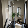
In situations like yours these decisions are not isolated...you need the “mood” of the kitchen to match all the adjoining spaces...what is your style?..if you are impacted by poor natural light i would aim for the black counters to be an accent...not try to add more dark influences...if we could see the adjoining spaces there may be some inspiration there for a more unexpected ...but lighter ...influence
Time to get other samples. Try the coppery look, the black and Lisa’s idea. And a rug in the kitchen will also,pull it together. Your kitchen really looks great so far. Backsplash choices are, by far, the hardest part of doing a kitchen.
Ahhh! Your home has quite a “rustic?” feel...lots of wood an most of the surfaces natural wood color....the underlying tones are golden ..so if i changed anything it would be the wall and trim colors..to colors that come more from nature ....perhaps a pale golden green for the walls?..and the trim in a warmer golden creamy white...the next thing needed IMO...would be some understated but colorful patterned rugs to define the different areas..you could use southwestern ...floral...or oriental patterns for the rugs depending on what you like...at this point i would say choose a color from any of the colors added to the room that you like ....or are dominant...and use that color for the backsplash...with what you have already i would not aim for neutral backsplash...but for one with a little more pop..
Painting the doors and trim in a slight variation of the new wall color would be even better as they now sort of stand out a little too much.and are clumped together in placement somewhat
Sponsored
Reload the page to not see this specific ad anymore
Houzz bruger cookies og lignende teknologier til at tilpasse min oplevelse, give mig relevant indhold og forbedre Houzz-produkter og -tjenester. Ved at klikke på 'Accepter' accepterer jeg dette, som beskrevet yderligere i Houzz-cookiepolitikken. Jeg kan afvise ikke-essentielle cookies ved at klikke på 'Administrer præferencer'.


Heidi Van GiesonForfatter
kculbers
herbflavor
Beth H. :
Houzz-bruger-ID-187528210
calidesign
Beth H. :
herbflavor
Heidi Van GiesonForfatter
Heidi Van GiesonForfatter
Beth H. :
Maureen
Heidi Van GiesonForfatter
Heidi Van GiesonForfatter
HH Furr Architecture & Development
herbflavor
HH Furr Architecture & Development
RedRyder
Lisa Caudill Designs
Heidi Van GiesonForfatter
Beth H. :
BeverlyFLADeziner
Heidi Van GiesonForfatter
Lisa Caudill Designs
Heidi Van GiesonForfatter
btydrvn
btydrvn
Heidi Van GiesonForfatter
RedRyder
kellyschaller
Heidi Van GiesonForfatter
btydrvn
btydrvn