tazzman2

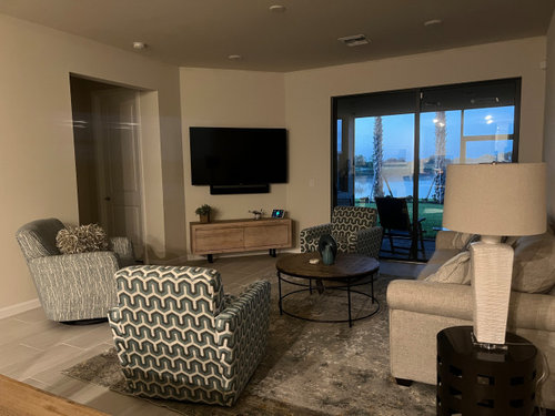
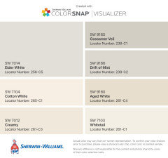
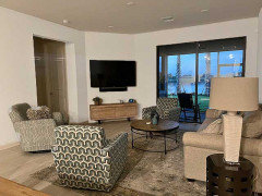
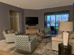
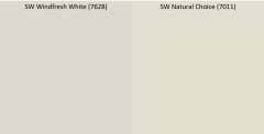
paint color for walls

tazzman2
10 måneder siden

I need a wall color that makes my furniture pop. The walls are currently painted SW Natural Choice. It's a 15'x20' room.


(18) kommentarer

  • jackowskib
    10 måneder siden

    Are there adjoining spaces that need to be considered? It’s a nice looking room and I see lots of whites in your decor so maybe explore soft whites for walls, like SW Snowbound, Alabaster and BM Simply White.

  • Susie .
    10 måneder siden

    You could go warm or cool in this space. Here are some ideas to get you started thinking.

    tazzman2 thanked Susie .
  • kandrewspa
    10 måneder siden

    Do you want more of a color than a neutral? How do you feel about dark colors? Can you post a couple more shots of the room from different angles? Maybe you could do an accent wall behind the sofa. It looks like the sofa might blend in with the wall color too much. However, accent walls aren't always appropriate so it would be helpful to see more of the room.

    tazzman2 thanked kandrewspa
  • PRO
    Celery. Visualization, Rendering images
    10 måneder siden
    Sidst ændret: {last_modified_time}10 måneder siden

    Warm off-white or white would work good


    tazzman2 thanked Celery. Visualization, Rendering images
  • PRO
    Celery. Visualization, Rendering images
    10 måneder siden

    or blue-gray that goes good with tan and brown.


    tazzman2 thanked Celery. Visualization, Rendering images
  • PRO
    Celery. Visualization, Rendering images
    10 måneder siden
    Sidst ændret: {last_modified_time}10 måneder siden

    If room get enough light


    tazzman2 thanked Celery. Visualization, Rendering images
  • tazzman2
    Forfatter
    10 måneder siden

    Thanks for responding
    My room is a bit small so a lighter shade of the tone you sent would be better. Any suggestions for lighter in this family? A soothing feeling in the room is what I’m trying to achieve.

  • PRO
    Celery. Visualization, Rendering images
    10 måneder siden
    Sidst ændret: {last_modified_time}10 måneder siden

    I like Cloud White BM


    tazzman2 thanked Celery. Visualization, Rendering images
  • eld6161
    10 måneder siden

    Try SW Alabaster

    tazzman2 thanked eld6161
  • tazzman2
    Forfatter
    10 måneder siden

    Thank you for all the responses. My walls are currently painted with SW Natural Choice, which is a cream color. Do you think paintiing them with a white such as Cloud White or something like that will make a difference? I want the furniture to pop. i thought a tan shade would work but am concerned about making the room look smaller. The room is open concept which includes kitchen and gathering room. Thoughts?

  • tazzman2
    Forfatter
    10 måneder siden

    thoughts on SW 7628 Windfresh White


    ?

  • jackowskib
    10 måneder siden

    Maybe compare your sample of Windfresh White with Shoji White, it’s fairly subtle.

  • PRO
    Ward 5 Design
    10 måneder siden

    Hi! Since your furniture is mostly gray and white, with blue undertones in the grays, I think a light blue or seafoam green would look beautiful. I would recommend SW 6213 Halcyon Green, its a soft but slightly darker blue green color. We've made a palette with this paint color, called The Tracy Paint Palette, which is a paint palette with design documents that feature walls, trim, doors, and ceiling colors in Behr, Sherwin Williams, Benjamin Moore, and Farrow + Ball. Check it out! https://thespecbinder.com/collections/interior-paint-palettes/products/the-tracy-interior-color-palette

  • Susie .
    10 måneder siden

    Windfresh White is marginally lighter than your current color (probably not discernable to the naked eye). Sherwin Williams says it has a "violet tinge" - I see pinker version of beige than what you currently have. It may work with your tile (I think I see tile under the chair on the left - let me know if I'm wrong).


    A "soothing feeling" doesn't jive with colors popping in my mind. Think about the colors you have there - hard flooring, rug, upholstery. I would look for something to pull it together instead of setting it apart.

  • kl23
    10 måneder siden

    @tazzman2 that view looks like a feature. I assume you want to highlight that too? The way to highlight something is to provide contrast and choose something less exciting than the thing you want to feature. To accomplish your stated goal, a dark wall color is needed. A dark color will highlight the view and camouflage the big black box. It also will bring out the furniture better. And it will really show off your artwork. Someone said they saw blue in your furniture. I don't but perhaps you can get a better shot that shows colors. I see green I think. If you want blue, I suggest something like SW Anchors Aweigh. Green? SW Jasper. Teal? SW Dark Night. 

    To achieve your stated goal avoid neutrals or pale colors. Worst is beige for your goal.

  • ptreckel
    10 måneder siden

    I don’t understand what you mean about wanting your furnishings to “pop.” They are lovely. The VIEW is wonderful. I would keep your walls in a very light color, perhaps a bluer white, but light. NOT colorful at all. Calm. Cool. Your view is the star.

  • Shawna
    10 måneder siden

    Don’t paint. Just get a more colorful rug. The paint is nice.

Sponsored

Reload the page to not see this specific ad anymore

Danmark
Tilpas mine indstillinger ved hjælp af cookies

Houzz bruger cookies og lignende teknologier til at tilpasse min oplevelse, give mig relevant indhold og forbedre Houzz-produkter og -tjenester. Ved at klikke på 'Accepter' accepterer jeg dette, som beskrevet yderligere i Houzz-cookiepolitikken. Jeg kan afvise ikke-essentielle cookies ved at klikke på 'Administrer præferencer'.