Help me pull my room together - rug, curtains, pillows, etc!
katrice9000
10 år siden
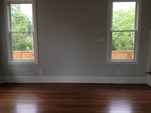
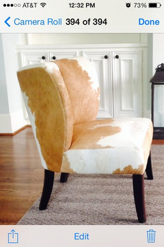
I've made furniture selections (will post other selections) but have yet to find a rug or fabric/ ready made curtains pillows. I'm stuck. I could really use some help. The room is painted SW sea salt. I'm considering painting the inside of the bookcase grey or black. I don't want the room to be too dark. Thanks for your help!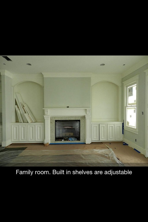
Fremhævet svar
Sorter efter:Ældste
(90) kommentarer

katrice9000
Forfatter10 år sidenNancy, thanks! I do like this look. Please tell me the paint selections for the grey and yellow/gold. And the rug. Appreciate your help.katrice9000
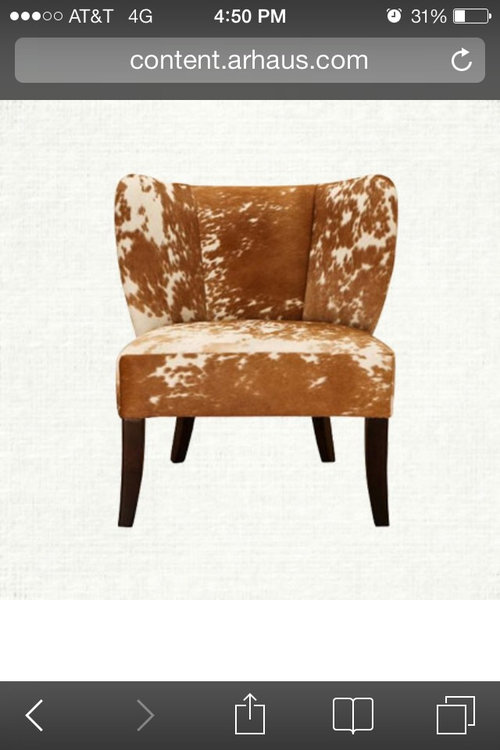
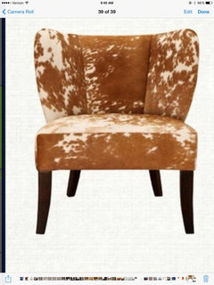
Forfatter10 år sidenLB thanks. I do like the anthropologie chair. Fortunately it's out of stock - their prices are usually too high for me! And I've already purchased the hide chair which it would clash with.
Momof5x
10 år sidenHere are some very nice layout ideas from Houzz, see the whole view of room. I find it easier to follow a room sample to put me in the right direction: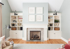 My Houzz: Traditional Home With Cottage Flair · Mere information
http://www.houzz.com/living-rooms-with-white-fire-places-and-white-inbuilt-bookcases Kara Weik © 2012 Houzz · Mere information
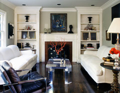 Luxe West Hollywood Residence · Mere information
Nancy Walton
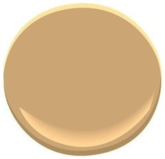
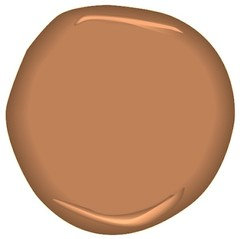
10 år sidenThe gray is BM Storm, and the Yellow-gold is BM Ginger Root, although I didn't inclue this one, which is also nice--BM Fire Glow. Don't forget that blue and orange are complementary colors...

karemore55
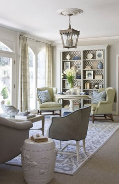
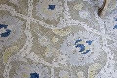
10 år sidenKatrice, thought I'd share a couple of pics of back painted built-in and wallpapered one. Note the wallpaper is more of a quatrefoil or some kind of trellis pattern, and possibly easier to work with than the lotus flower pattern. Third pic is the rug that was used in second pic, from Stark Carpets. Probably won't be cheap though. But it gives you more patterns to study, and might trigger something to help you decide exactly what you want to do.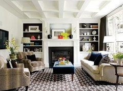
Nancy Walton
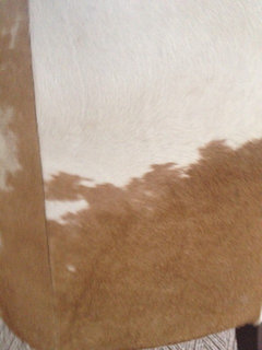
10 år sidenKatrice, I tried the orange-gold and the coppery color in your room, and I have to say I really like the fire glow better (one on the right). It blends with the hide chair better.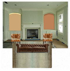
karemore55
10 år sidenJust getting some visuals again. I really like the rug pick, Nancy. I'm thinking maybe patterned might now be the way to go, since the rug pattern is quite subdued.
I'm wondering if that back paint color on the right should have more brown in it, though.
katrice9000
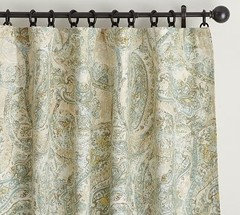
Forfatter10 år sidenThanks Nancy! Can we see the bookcases w/ more brown on one side and grey on the other? I like your rug w/ the paisley curtains.
Natalie
10 år sidenLove the wallpaper! I'd paper the inside of the built-ins with it.
Excellent choices thus far. Good Luck!
[houzz=] Bruce Avenue Residence Lower-Level Family Room 4 · Mere information
katrice9000
Forfatter10 år sidenI like the tandoori. But also considering brighter orange like in the chair below
katrice9000
Forfatter10 år sidenKaremore- I found the wallpaper you suggested. I like the paper but it looks off with the chair.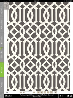
dldd
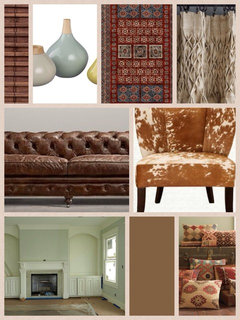
10 år sidenSidst ændret: {last_modified_time}10 år sidenI don't see orange in this room... darker shade of wall tone in bookcase or similar paper color with wool rug in beige/creme with blue green accents in the room (throws and pillows) and silver/glass accents and large bold art workNancy Walton
10 år sidenThe hide-covered chair is a shade of orange. She wants to "spice" it up a little, so it won't seem flat.dldd
10 år sidenSidst ændret: {last_modified_time}10 år sideni understand the chair is orange... I meant the room doesn't need more... there is plenty of orange and brown in the room with the couch, chair and shades PRO
PROTreasure Gallery
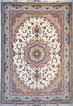
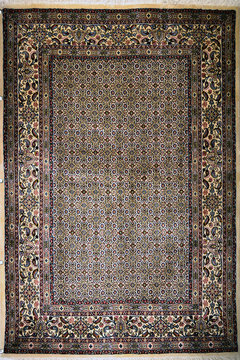
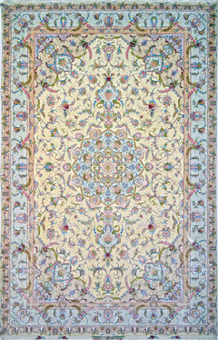
10 år sidenHi, Here are few rug options if you like the more traditional type high quality Persian design.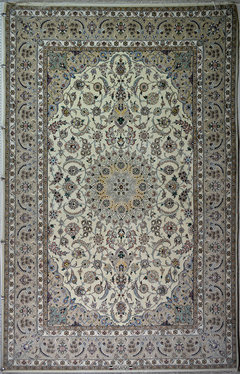
karemore55
10 år sidenKatrice, I think your color for the back painted shelves (and curtains, pillows, etc.) will be easier once you select your rug. Rest assured that there will be lots of choices, especially with paint colors, once you make that decision.karemore55
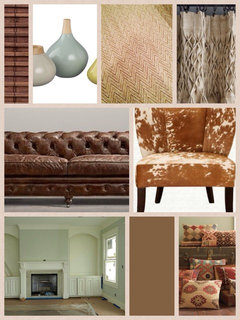
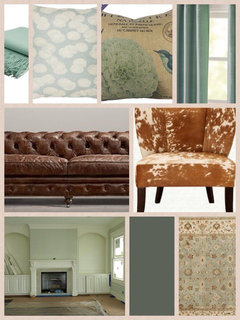
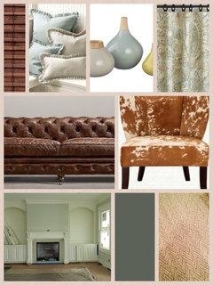
10 år sidenOk, this is my attempt to do kind of what Nancy did. First pic is a college of the main elements in the room (some undecided). Second pic, I've inserted some back painting possibilities for the built-ins. I don't see oranges working here, and feel that deep, dramatic colors will give the best feel to your room.
This little app is a lot of fun, so you'll probably see all sorts of crazy collages coming up - hope you don't mind! Thank you, Nancy, for inspiring me to stretch my iPad capabilities a little bit. I'm trying to master the Sherwin-Williams app (on someone else's post) but haven't mastered yet.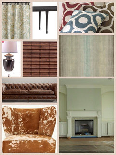
karemore55
10 år sidenNancy, thank you for the info. I went to the site on my iPad and they said it was temporarily de-activated for tablet version, so I'll try again some other time. Did you use specific paint colors from a paint company, or was there a palette on Olioboard that you chose from?Nancy Walton
10 år sidenThere are different tabs for items you can find on the Internet, but there is also a tab where you can import photos from your own computer, which is what I do most often. I go to the paint/stains and glazes under Products on Houzz to save photos of paint samples, and other sites to save photos.karemore55
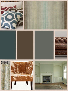
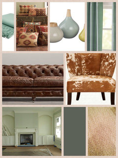
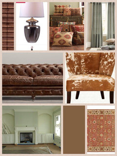
10 år sidenWell, I just spent an hour setting up as many different possibilities for your room as I could think of, and of course there are so many more. Hope this helps you narrow it down some. It was a lot of fun doing this, let me tell you!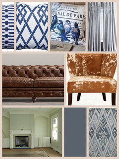
katrice9000
Forfatter10 år sidenKaremore55 These are great! I love the first one. What's the source of the pillowslepstein
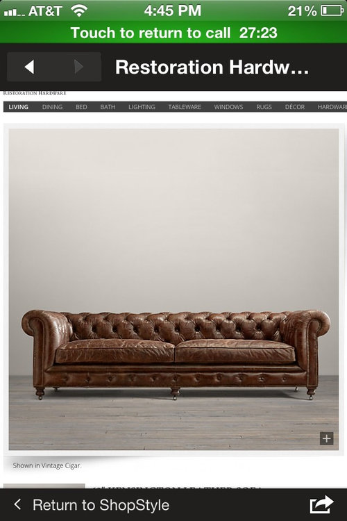
10 år sidenBeautiful room and furniture choices. Don't like wallpaper, but think back paint will add drama to traditional wall. Have you thought about using a darker version of the dining room colour? Go as deep as the colour in your cowhide chair. It will be opposite on the colour wheel and move the colour through your rooms.karemore55
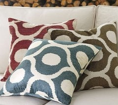
10 år sidenLatrice, Good morning! And I say that because I sat up too late doing these collages and I'm just now drinking my morning coffee lol! That wasn't wallpaper in the first pic - it's actually a rug, the Alhambra from Ballard Designs. The paint color (I think) is S-W Moody Blue. The pillows: bird one is a vendor on etsy - I could get more info on that if you decide to pursue it. The other two pillows are tonicliving.com. They have a great selection of up-to-the-minute patterns and colors, and sell the cover, which zips off for washing,mas well as foam inserts. I recommend using down-filled inserts which you can buy at Pottery Barn in the same sizes as the Tonic Living ones. They are way more comfortable than foam inserts - you can really sink into them. You can also get the down inserts in the 20" size only at Ikea, and theirs are comfy too. Once you try down, you'll never go back!
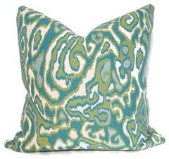
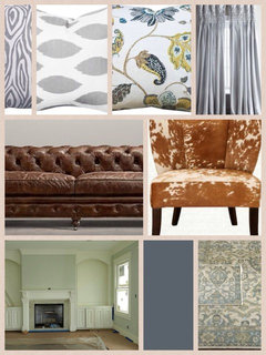
As I did all these mock-ups, it reminded me that my own decorating approach, as well as advice I've read over and over again in design magazines, suggests starting with a neutral base that can be changed easily. This first one that you love (and I love it too!) won't be quite as flexible because you would always be working around the rug pattern. If you think you would want more flexibility than that, I recommend the neutral rug with the diamond pattern you picked out, which I showed in a couple of the collages. For curtains, you won't go wrong with Pottery Barn dupioni silk panels in the blue-green I showed in a couple of the pics. Same for back painting the built-ins - either this Moody Blue or the color I showed in a couple of them that is two shades darker than your Sea Salt color. I believe it was suggested in the post above also. It's guaranteed to be harmonious. With this neutral envelope, you could use warm reds in the winter - the killim pillows, for example - and go to teals and darker blue pillows come spring, and finally light blue-greens in the summer. You can switch out some of your knick knacks - even your artwork, if you want - and change your look often, and also satisfy the wide range of colors and patterns that appeal to you.
If you find other rugs or curtains or whatever, I'd be happy to do the collage again!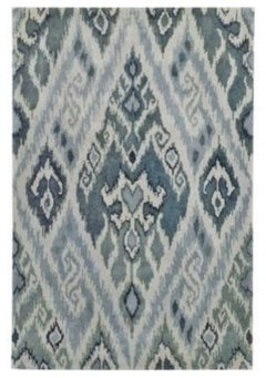

karemore55
10 år sidenI should mention that the dupioni silk panels would offer some soft, feminine contrast to the more rugged materials in the sofa, hide chairs and metal frames on the coffee tables. A bit of bling is good!karemore55
10 år sidenOh Katrice, Your DR is beautiful! Yes, I think you've found your palette then, for the FR. And layering the Alhambra rug over the chevron pattern one is excellent - they share a similar zig zag pattern, so it will look wonderful.karemore55
10 år sidenBtw, no it wasn't Olioboard. The site for iPads was temporarily down, so I'll give that one a try some other time.karemore55
10 år sidenI also like how back painting the walls in the blue will connect the room to the DR.katrice9000
Forfatter10 år sidenThanks again. I'll update with pictures once everything is in place. BTW what's the etsy source for the bird pillows?Nancy Walton
10 år sidenI'm concerned that the blue Karemore showed is too clear blue, while the walls have a green tint to them. I think you need to stay in the blue-green or aqua tones or your walls will look green.katrice9000
Forfatter10 år sidenNancy Walton - Thanks ! you're right the sea salt does have green undertones. It's not a large wall; if the colors are off I'll adjust. The pic below (yournestdesign.blogspott.com) is a good pic of the current undertones.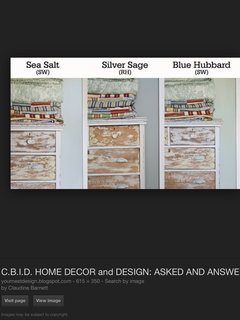
karemore55
10 år sidenKatrice, Here's the link to the etsy vendor. Looking forward to the "after" pics! http://www.etsy.com/listing/67477970/pillow-cover-bluebird-french-paris-blue PRO
PROPaul D'Amico - Period Design
10 år sidenSo many beautiful colours and patterns here to invest that equally attractive room.


Sponsored
Reload the page to not see this specific ad anymore
Flere diskussioner

katrice9000Forfatter