
428 Billeder af orange, hvidt lille badeværelse med gråt gulv
Sorteret efter:
Budget
Sorter efter:Populær i dag
1 - 20 af 428 billeder
Item 1 ud af 4

 Studio Black Interiors
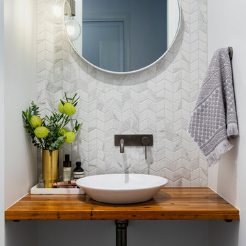
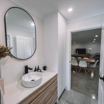
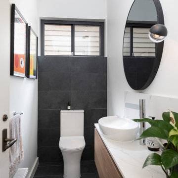
A modern powder room, with small marble look chevron tiles and concrete look floors. Round mirror, floating timber vanity and gunmetal tap wear. Built by Robert Paragalli, R.E.P Building. Photography by Hcreations.
 User
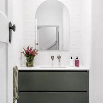
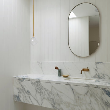
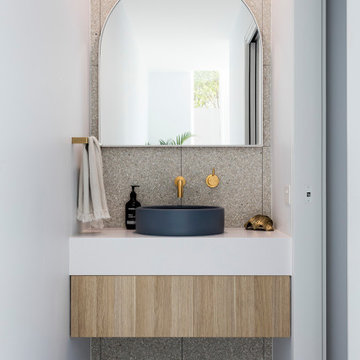
UserThe floor plan of the powder room was left unchanged and the focus was directed at refreshing the space. The green slate vanity ties the powder room to the laundry, creating unison within this beautiful South-East Melbourne home. With brushed nickel features and an arched mirror, Jeyda has left us swooning over this timeless and luxurious bathroom






 Chrysalide Architecture
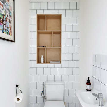
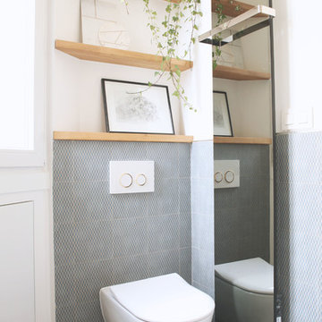
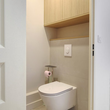
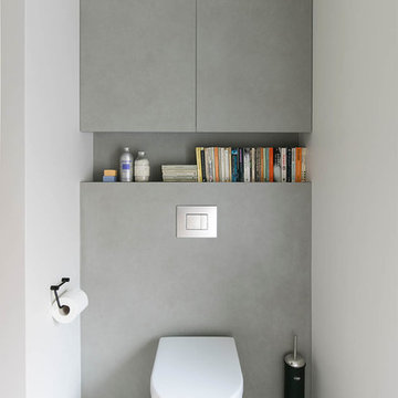
Nous avons enlevé le revêtement en parement pierres pour faire des murs lisses peints dans la couleur de la faïence et créer une ambiance moderne et feutrée. Un carrelage marbré a été installé au sol. Nous avons installé un wc suspendu avec un meuble sur mesure au dessus afin de ranger les produits d'entretien. Un faux plafond avec spot a été créé pour moderniser la pièce qui disposait d'une simple applique.
 Minosa | Design Life Better
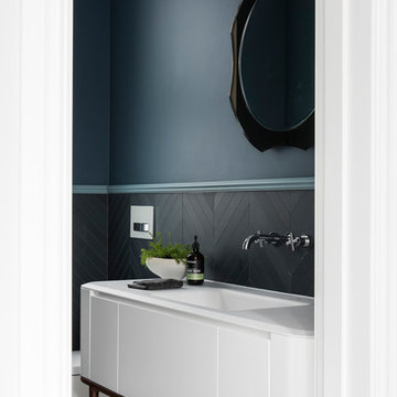
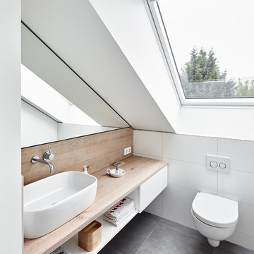
The Classic Modern nature of this home lead to this stunning renovation; Chevron tiles with detailed mouldings and amazing bathroom furniture hand made in Italy creates a warm powder room for guests to enjoy.
Image by Nicole England
Design by Minosa


 SDA Architects
After the second fallout of the Delta Variant amidst the COVID-19 Pandemic in mid 2021, our team working from home, and our client in quarantine, SDA Architects conceived Japandi Home.
The initial brief for the renovation of this pool house was for its interior to have an "immediate sense of serenity" that roused the feeling of being peaceful. Influenced by loneliness and angst during quarantine, SDA Architects explored themes of escapism and empathy which led to a “Japandi” style concept design – the nexus between “Scandinavian functionality” and “Japanese rustic minimalism” to invoke feelings of “art, nature and simplicity.” This merging of styles forms the perfect amalgamation of both function and form, centred on clean lines, bright spaces and light colours.
Grounded by its emotional weight, poetic lyricism, and relaxed atmosphere; Japandi Home aesthetics focus on simplicity, natural elements, and comfort; minimalism that is both aesthetically pleasing yet highly functional.
Japandi Home places special emphasis on sustainability through use of raw furnishings and a rejection of the one-time-use culture we have embraced for numerous decades. A plethora of natural materials, muted colours, clean lines and minimal, yet-well-curated furnishings have been employed to showcase beautiful craftsmanship – quality handmade pieces over quantitative throwaway items.
A neutral colour palette compliments the soft and hard furnishings within, allowing the timeless pieces to breath and speak for themselves. These calming, tranquil and peaceful colours have been chosen so when accent colours are incorporated, they are done so in a meaningful yet subtle way. Japandi home isn’t sparse – it’s intentional.
The integrated storage throughout – from the kitchen, to dining buffet, linen cupboard, window seat, entertainment unit, bed ensemble and walk-in wardrobe are key to reducing clutter and maintaining the zen-like sense of calm created by these clean lines and open spaces.
The Scandinavian concept of “hygge” refers to the idea that ones home is your cosy sanctuary. Similarly, this ideology has been fused with the Japanese notion of “wabi-sabi”; the idea that there is beauty in imperfection. Hence, the marriage of these design styles is both founded on minimalism and comfort; easy-going yet sophisticated. Conversely, whilst Japanese styles can be considered “sleek” and Scandinavian, “rustic”, the richness of the Japanese neutral colour palette aids in preventing the stark, crisp palette of Scandinavian styles from feeling cold and clinical.
Japandi Home’s introspective essence can ultimately be considered quite timely for the pandemic and was the quintessential lockdown project our team needed.
 Amberth
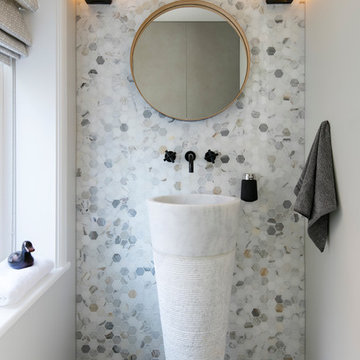
On the opposite side of the cloak room, a more sleek, polished look that provides a calming feel. We used a porcelain tile called Pietra Di Osso from Neolith. (photo: David Giles)

 Ameo Concept
Cet appartement de 65m2 situé dans un immeuble de style Art Déco au cœur du quartier familial de la rue du Commerce à Paris n’avait pas connu de travaux depuis plus de vingt ans. Initialement doté d’une seule chambre, le pré requis des clients qui l’ont acquis était d’avoir une seconde chambre, et d’ouvrir les espaces afin de mettre en valeur la lumière naturelle traversante. Une grande modernisation s’annonce alors : ouverture du volume de la cuisine sur l’espace de circulation, création d’une chambre parentale tout en conservant un espace salon séjour généreux, rénovation complète de la salle d’eau et de la chambre enfant, le tout en créant le maximum de rangements intégrés possible. Un joli défi relevé par Ameo Concept pour cette transformation totale, où optimisation spatiale et ambiance scandinave se combinent tout en douceur.



1