
87 Billeder af lukket dagligstue med orange vægge og lyserøde vægge
Sorteret efter:
Budget
Sorter efter:Populær i dag
1 - 20 af 87 billeder
Item 1 ud af 5
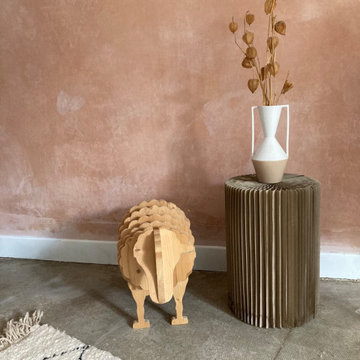
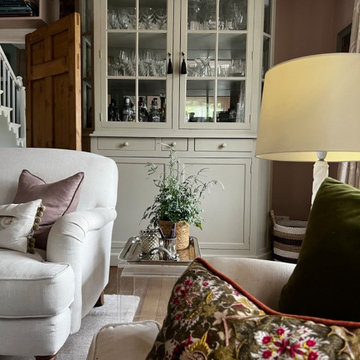
 Projet Wabi-sabi
Février 2021 : à l'achat la maison est inhabitée depuis 20 ans, la dernière fille en vie du couple qui vivait là est trop fatiguée pour continuer à l’entretenir, elle veut vendre à des gens qui sont vraiment amoureux du lieu parce qu’elle y a passé toute son enfance et que ses parents y ont vécu si heureux… la maison vaut une bouchée de pain, mais elle est dans son jus, il faut tout refaire. Elle est très encombrée mais totalement saine. Il faudra refaire l’électricité c’est sûr, les fenêtres aussi. Il est entendu avec les vendeurs que tout reste, meubles, vaisselle, tout. Car il y a là beaucoup à jeter mais aussi des trésors dont on va faire des merveilles...
3 ans plus tard, beaucoup d’huile de coude et de réflexions pour customiser les meubles existants, les compléter avec peu de moyens, apporter de la lumière et de la douceur, désencombrer sans manquer de rien… voilà le résultat.
Et on s’y sent extraordinairement bien, dans cette délicieuse maison de campagne.
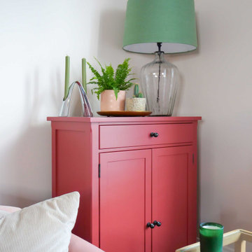
 LNDesignsUK
Having designed other rooms in the client’s house for use by the rest of her family, the living space was to be her sanctuary, but it was desperate for some love and colour. We started with the sofas, the largest pieces of furniture and focal points in the room. It was important that the style complemented the property’s older features but still felt current, and the client fell in love with the rusty pink options. This set the tone for the rest of the room with pinks, blushes and greens carried throughout.
The lighting was a key part of the design for this room as it was originally only fit with spotlights. I sought out a company in the UK who hand blow glass, and after comparing lots of samples, shapes and colour combinations, together with the client we designed this one-of-a-kind piece to light the room.
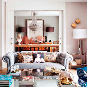

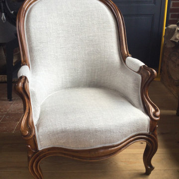

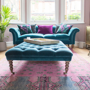
 Louise Misell Interiors
Two Victorian terrace reception rooms have been knocked into one, each has been given its own clearly defined style and function, but together they make a strong style statement. Colours are central to these rooms, with strong teals offset by blush pinks, and they are finished off with antiqued mirrored tiles and brass and gold accents.
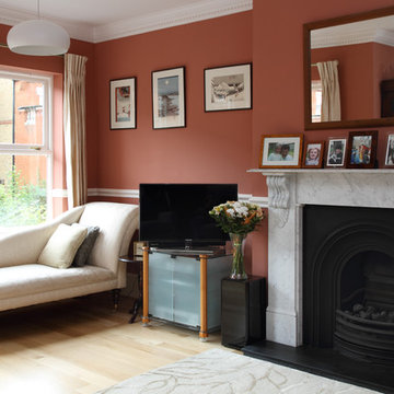
 Balance Design Ltd
The wallcolour and colour palette for other rooms was taken from the Japanese prints the client owned.
Photos: Tony Timmington
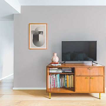
 Matteo Magnabosco
Il salottino dedicato alla zona lettura e televisione è direttamente collegato con il soggiorno.
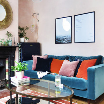
 Run Wild Interiors
Soft pink tadelakt walls, combined with a sultry dark blue and bursts of warming colours.
Layers of fabrics, soften the room and houseplants in different shapes - many of which reflecting the circular repeating within the room - create a calm and nourishing space in which to cocoon.
 Charlotte Thomas Studio Limited
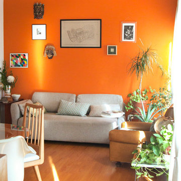
This was a drab room that needed warming up and making cosy. The use of plaster pink, painted on all walls and the ceiling, created a cocooning atmosphere. Complementary shades of green adds interest, as does texture in accessories. Neutral furniture creates a calm backdrop, while a gallery wall of sentimental art and a disco ball add character.

 LNDesignsUK
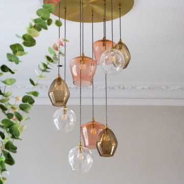
Having designed other rooms in the client’s house for use by the rest of her family, the living space was to be her sanctuary, but it was desperate for some love and colour. We started with the sofas, the largest pieces of furniture and focal points in the room. It was important that the style complemented the property’s older features but still felt current, and the client fell in love with the rusty pink options. This set the tone for the rest of the room with pinks, blushes and greens carried throughout.
The lighting was a key part of the design for this room as it was originally only fit with spotlights. I sought out a company in the UK who hand blow glass, and after comparing lots of samples, shapes and colour combinations, together with the client we designed this one-of-a-kind piece to light the room.
 Elodie Ricord Agence
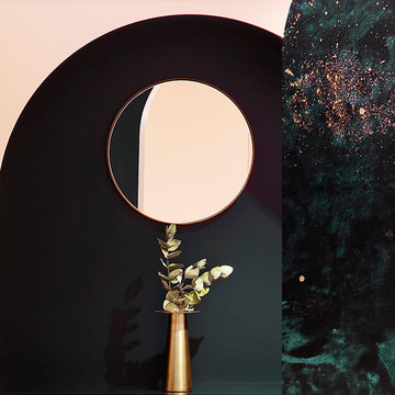
Détail de notre magnifique niche en forme d'ogive qui à été réalisé sur-mesure, en laqué mat. L'intérieur de la niche bleu canard exprime le côté rock tattoo de la clientèle et l'extérieur de la niche rose exprime la féminité. Des codes identitaires fort, où le positionnement de ces trois arches représente symétrie, et élévation sacrée.
https://www.elodiericord.com/desoleepapaprintempshaussmann
Crédit Photo : Jean Marc Palisse
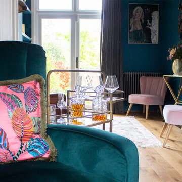 Louise Misell Interiors
Two Victorian terrace reception rooms have been knocked into one, each has been given its own clearly defined style and function, but together they make a strong style statement. Colours are central to these rooms, with strong teals offset by blush pinks, and they are finished off with antiqued mirrored tiles and brass and gold accents.
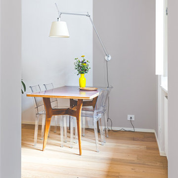 Matteo Magnabosco
Gli arredi vintage si affiancano ad arredi più moderni, in una palette cromatica tenue con tocchi di colore accesi.
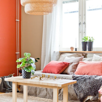

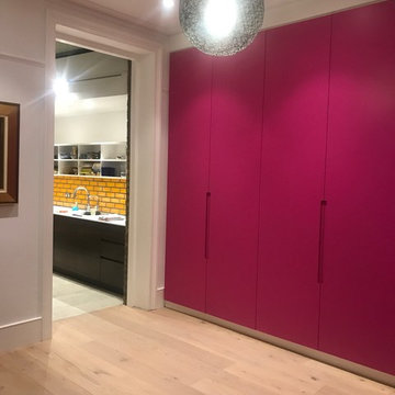


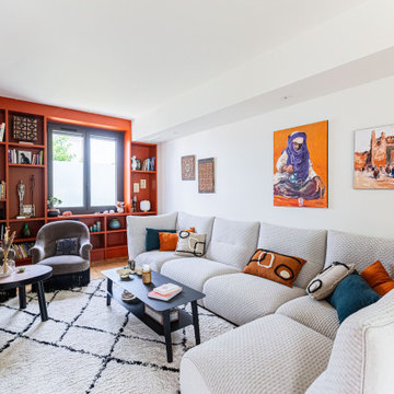
 Soul Sens Architecture
Salon, aux couleurs Feng Shui. Bibliothèque sur-mesure. Ambiance marocaine. Canapé Roche Bobois. Tapis berbère.

1