369 Billeder af hjemmekontor med grå vægge og vægtapet
Sorteret efter:
Budget
Sorter efter:Populær i dag
21 - 40 af 369 billeder
Item 1 ud af 3
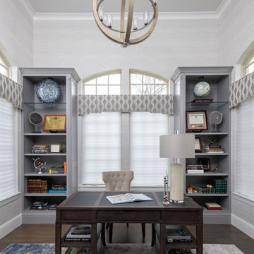
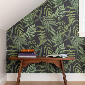
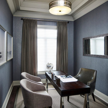
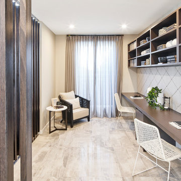
This study is full of character and style. The subtle textured wallpaper provide the perfect back drop for the custom window treatments and built-in shelving. The area rug and accents allow for hints of color throughout. The grand light fixture pulls your eye up to the ceiling detail. This space is functional and sophisticated.
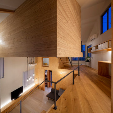
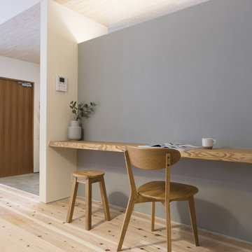
Klare Linien, klare Farben, viel Licht und Luft – mit Blick in den Berliner Himmel. Die Realisierung der Komplettplanung dieser Privatwohnung in Berlin aus dem Jahr 2019 erfüllte alle Wünsche der Bewohner. Auch die, von denen sie nicht gewusst hatten, dass sie sie haben.
Fotos: Jordana Schramm
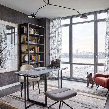
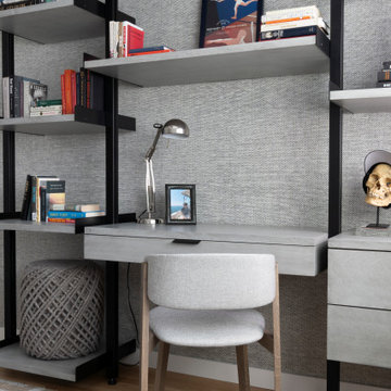
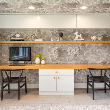
Modern art is flanked by two etageres in this home office. Meanwhile, the dark wallpaper is juxtaposed by the bespoke toile window dressing.
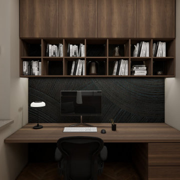
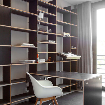
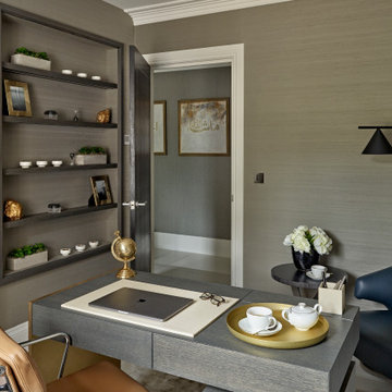
Das warme Nussbaumholz der individuell designten Schreibtisch Kombination passt zu dem männlich markanten Stil der gesamten Wohnung. Auch hier taucht die Tapete wieder auf und schafft einen tollen Hintergrund für das warme Holz. Stauraum ist im Homeoffice das wichtigste, um Ordnung zu halten, daher empfiehlt sich eine Kombination aus offenen und geschlossenen Elementen.
Destination Bloomsbury
Bloomsbury is one of central London’s hidden in-between gems, offering much history and great places to live, with many purpose-built flats from the beginning of the last century.
When refurbishing such spaces, it is vital to reflect the charm of the original without the need to be nostalgic. It is about small details, material choice, proportions, fixtures and fittings, kitchen and bathroom style and all over quality of execution.
The apartments in the building at hand had already been desecrated by previous refurbishments but this did not prevent finding a contemporary visual tone well suited for the flat at hand. What we were looking for was to bring some of its intended gentle character back to life in a contemporary fashion. A basic requirement to make a space work is to look at its proportions and material choices of fixtures and fittings, colour, wallpaper, tiles and of course furniture. This might be obvious, but it is surprising how often the subtle differences are not observed and therefore not beneficial for the space.
For this small 2-bedroom top floor flat we initially looked at previous added elements we could remove to ‘open’ the space visually, then decided what contemporary character the space would benefit from and listened to what would make the client comfortable. The owners general brief was to present the space visually as ‘clean’ as possible with a warm touch.
To create this, we chose one base colour to set the tone, same colour for doors, doorframes, skirting, built in wardrobes, etc. A similar tone of couleur was chosen for transition spaces, bedrooms and bathrooms but gave the entrance and kitchen cabinets their own tone. The made to measure kitchen was chosen for its style and quality of craftsmanship, well suited for the small space and character of the flat. It has good proportions with simple handle detail, no added fixtures to keep the visual impression uninterrupted but offering a colour contrast and point of interest.
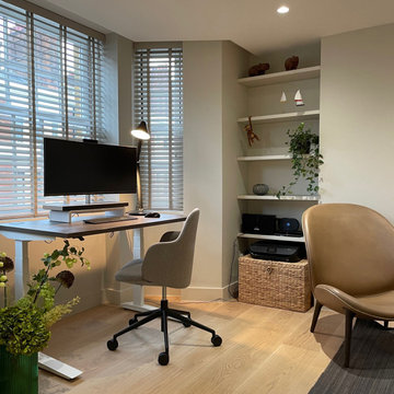
The client preferred venetian blinds, we found a version in same colour as the walls, this way the visual impression of the background stays non interrupted.
In the master bedroom we moved one wall towards the shower room to free some space to fit a super king size bed. Both bedrooms received new built-in wardrobes with sliding doors, well suited for small spaces.
The bathroom tiles and furniture chosen in matt ceramics work well with the over-all colour of the flat. The sanitary ware and fittings are light in character of perfect proportion for the space and have a timeless feel. We installed underfloor heating in all rooms to free wall space.
The furniture was to be tone in tone to keep a ‘quiet’ flow. To create variety, we chose different surface textures. Now art- work will add highlights and dynamics to the space.
All in all, the result was delivered on time with slight budget additions due to changes requested during the process, everyone is happy, and a new home is enjoyed by its owner.
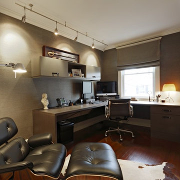
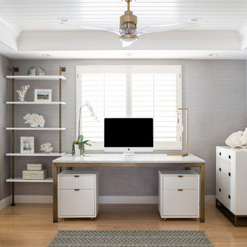
This glamorous home office features a recessed ceiling, wallpaper, brass hardware, plenty of storage and work spaces.
369 Billeder af hjemmekontor med grå vægge og vægtapet
2