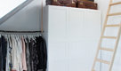
Billeder og indretningsidéer
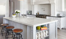
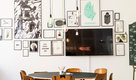
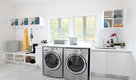
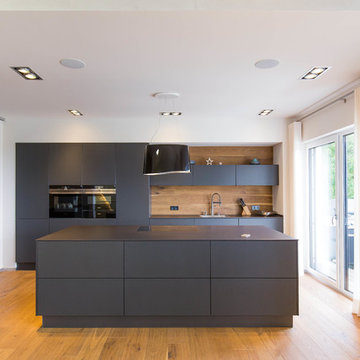
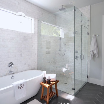
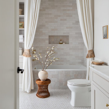
This project was a complete home design plan for a large new construction luxury home on the south-end of Mercer Island. The contrasting colors utilized throughout emit a chic modern vibe while the complementing darker tones invites a sense of warmth to this modern farmhouse style.
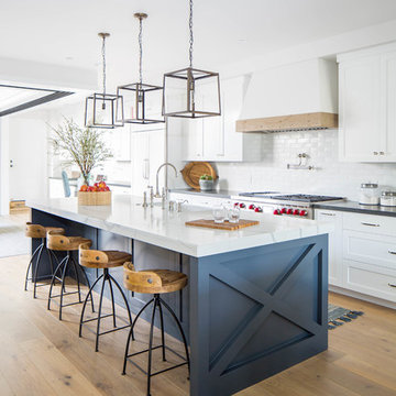
Build: Graystone Custom Builders, Interior Design: Blackband Design, Photography: Ryan Garvin
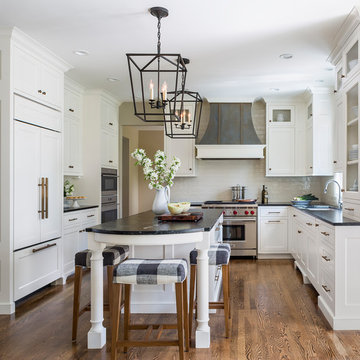
Cooking for Two
Location: Plymouth, MN, United States
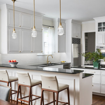
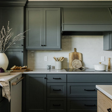
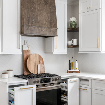
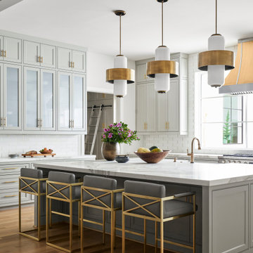
When this couple’s last child graduated from college they began the process of looking for a new home. After a lengthy search they decided to stay with the neighborhood they loved, saving money by remodeling rather than starting over.
The top priorities on their wish list were adding character to their 1990’s era home with a classic white kitchen and a larger island while keeping within the existing footprint. With the intention of honing their cooking skills, they were also considering better appliances and two ovens.
Challenges and Solutions
Design a larger island with seating for at least two. The existing island was small and the area behind the seating was less than recommended clearances.
To solve this challenge, the seating area of the island was extended out into the open area of the kitchen. This created a larger island with seating for three, extra storage and a bookshelf across from the range.
The original kitchen had a range with microwave above, so adding another oven was a challenge with limited wall space.
Because the adjoining dining room is used infrequently, the homeowner was open to placing the second oven and microwave in the walkway. This made room for the small buffet between the built in refrigerator and ovens, creating one of her favorite areas.
The client requested a white painted kitchen but wanted to make sure it had warmth and character. To achieve this the following elements were chosen:
1) Cabinets painted with Benjamin Moore Capitol White, a luminous and warm shade of white.
2) The Range hood was painted with warm metallic shades to reflect the bronze of the Ashley Norton hardware.
3) Black Aqua Grantique granite was chosen for countertops because it looks like soapstone and adds contrast.
4) Walker Zanger Café tile in Latte was chosen for it’s handmade look with uneven edges.
5) The to-the-counter-cabinet with glass door shows off serving dishes and lends sophisticated charm.
The result is a welcoming classic kitchen, where this couple enjoys cooking more often and sharpening their skills with gourmet appliances.
Liz Schupanitz Designs
Photographed by: Andrea Rugg Photography
Free ebook, CREATING THE IDEAL KITCHEN
Download now → http://bit.ly/idealkitchen
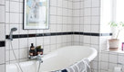
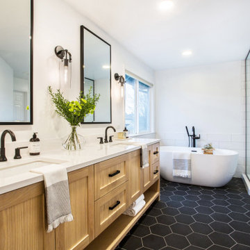
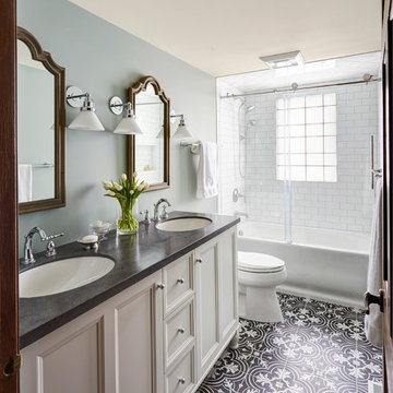
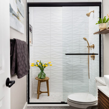
The hall bath for this client started out a little dated with its 1970’s color scheme and general wear and tear, but check out the transformation!
The floor is really the focal point here, it kind of works the same way wallpaper would, but -- it’s on the floor. I love this graphic tile, patterned after Moroccan encaustic, or cement tile, but this one is actually porcelain at a very affordable price point and much easier to install than cement tile.
Once we had homeowner buy-in on the floor choice, the rest of the space came together pretty easily – we are calling it “transitional, Moroccan, industrial.” Key elements are the traditional vanity, Moroccan shaped mirrors and flooring, and plumbing fixtures, coupled with industrial choices -- glass block window, a counter top that looks like cement but that is actually very functional Corian, sliding glass shower door, and simple glass light fixtures.
The final space is bright, functional and stylish. Quite a transformation, don’t you think?
Designed by: Susan Klimala, CKD, CBD
Photography by: Mike Kaskel
For more information on kitchen and bath design ideas go to: www.kitchenstudio-ge.com
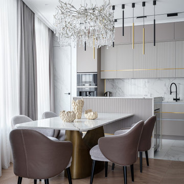
Интерьер для интеллигентной пары с 3-мя детьми. У семьи утонченный вкус и пожелание видеть изящность, комфорт и функциональность. Аккуратная отделка в нейтральной цветовой гамме создает фон для отдыха, общения, работы. Открытое пространство без сложных конструктивных элементов, часто с панорамным остеклением. Оригинальные аксессуары, арт-объекты, произведения концептуального искусства. Цветовая гамма квартиры предпочтительно светлая в светло-серых, в пудровых, бежевых оттенках. Добавили немного динамики в обстановку через контрастирующие акценты – интенсивный синий, терракотовый, темно-зеленый, бордовый и шоколадный цвета. Лаконичный, уютный и теплый интерьер.
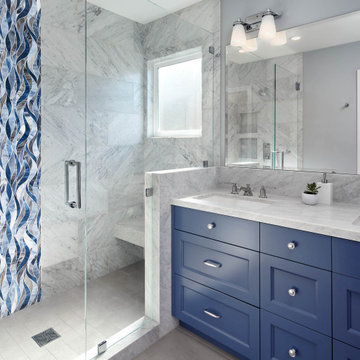
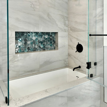
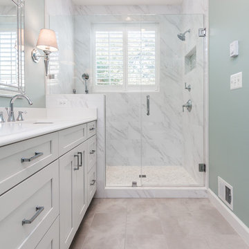
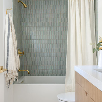
A master bathroom gets an update with a dramatic blue glass tile waterfall accenting the large format Carrara tile shower wall. The blue vanity pulls the color around the room.
This dressed up and sophisticated bathroom was outdated and did not work well as the main guest bath off the formal living and dining room. We just love how this transformation is sophisticated, unique and is such a complement to the formal living and dining area.
Billeder og indretningsidéer
6